- Power BI forums
- Updates
- News & Announcements
- Get Help with Power BI
- Desktop
- Service
- Report Server
- Power Query
- Mobile Apps
- Developer
- DAX Commands and Tips
- Custom Visuals Development Discussion
- Health and Life Sciences
- Power BI Spanish forums
- Translated Spanish Desktop
- Power Platform Integration - Better Together!
- Power Platform Integrations (Read-only)
- Power Platform and Dynamics 365 Integrations (Read-only)
- Training and Consulting
- Instructor Led Training
- Dashboard in a Day for Women, by Women
- Galleries
- Community Connections & How-To Videos
- COVID-19 Data Stories Gallery
- Themes Gallery
- Data Stories Gallery
- R Script Showcase
- Webinars and Video Gallery
- Quick Measures Gallery
- 2021 MSBizAppsSummit Gallery
- 2020 MSBizAppsSummit Gallery
- 2019 MSBizAppsSummit Gallery
- Events
- Ideas
- Custom Visuals Ideas
- Issues
- Issues
- Events
- Upcoming Events
- Community Blog
- Power BI Community Blog
- Custom Visuals Community Blog
- Community Support
- Community Accounts & Registration
- Using the Community
- Community Feedback
Register now to learn Fabric in free live sessions led by the best Microsoft experts. From Apr 16 to May 9, in English and Spanish.
- Power BI forums
- Forums
- Get Help with Power BI
- Desktop
- Line Chart showing a gap of 5 Months in between ea...
- Subscribe to RSS Feed
- Mark Topic as New
- Mark Topic as Read
- Float this Topic for Current User
- Bookmark
- Subscribe
- Printer Friendly Page
- Mark as New
- Bookmark
- Subscribe
- Mute
- Subscribe to RSS Feed
- Permalink
- Report Inappropriate Content
Line Chart showing a gap of 5 Months in between each Month such that in between Months were hidden.
Hello Experts,
I want to show 3 years data in a line chart in x-axis, by a year-month combination lets say starting from 2019 Jan and then showing only 2019 July like wise all the 3 years months will be fitted in a single line chart so that in between months were hidden in showing. My main intention is if we present like this way it will be more engaging for the end user. It is a easy one I believe but I am new to Power BI.
Any help is appreciated. Thanks in advance.
- Mark as New
- Bookmark
- Subscribe
- Mute
- Subscribe to RSS Feed
- Permalink
- Report Inappropriate Content
if I understand correctly you can try to create a calculated column on the data table.
Sign with 1 only the month that you want to show and with 0 the others.
Then filter the x axis with the 1 values only.
You can write a dax like this:
ShowValues = SWITCH(Datatable[MonthNumber], 1, 0, 2, 0, 3, 0, 4, 0, 5, 0, 6, 1, 7, 0, 8, 0, 9, 0, 10, 0, 11, 0, 12, 1, 0)
Let me now if it is a solution.
If you post a pbix i can try to resolve on it.
- Mark as New
- Bookmark
- Subscribe
- Mute
- Subscribe to RSS Feed
- Permalink
- Report Inappropriate Content
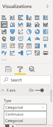
@Anonymous , You can change axis type to categorical
Microsoft Power BI Learning Resources, 2023 !!
Learn Power BI - Full Course with Dec-2022, with Window, Index, Offset, 100+ Topics !!
Did I answer your question? Mark my post as a solution! Appreciate your Kudos !! Proud to be a Super User! !!
- Mark as New
- Bookmark
- Subscribe
- Mute
- Subscribe to RSS Feed
- Permalink
- Report Inappropriate Content
Hi Amith,
Thanks for the quick reply.
It is not allowing me to do. Currently I created a calculated table with year month , year, month combination columns writing a dax. I am using that year month combination column in our line chart x axis. Since the column has many values ranging from 2019, 2020,2021,2022 I am unable to show these with a gap interval of 6 months.
I am able to show these in x axis but with continuous month year combination.
I am wondering from the past 3 hours how to do so
- Mark as New
- Bookmark
- Subscribe
- Mute
- Subscribe to RSS Feed
- Permalink
- Report Inappropriate Content
Hi, @Anonymous
Can you provide some sample data or simple pbix files? Sensitive information can be removed in advance. What kind of expected results do you expect? You can also show it with pictures.
How to provide sample data in the Power BI Forum - Microsoft Power BI Community
Best Regards,
Community Support Team _Charlotte
If this post helps, then please consider Accept it as the solution to help the other members find it more quickly.
Helpful resources

Microsoft Fabric Learn Together
Covering the world! 9:00-10:30 AM Sydney, 4:00-5:30 PM CET (Paris/Berlin), 7:00-8:30 PM Mexico City

Power BI Monthly Update - April 2024
Check out the April 2024 Power BI update to learn about new features.

| User | Count |
|---|---|
| 105 | |
| 97 | |
| 80 | |
| 67 | |
| 63 |
| User | Count |
|---|---|
| 147 | |
| 110 | |
| 108 | |
| 85 | |
| 64 |

