Jumpstart your career with the Fabric Career Hub
Find everything you need to get certified on Fabric—skills challenges, live sessions, exam prep, role guidance, and a 50 percent discount on exams.
Get started- Power BI forums
- Updates
- News & Announcements
- Get Help with Power BI
- Desktop
- Service
- Report Server
- Power Query
- Mobile Apps
- Developer
- DAX Commands and Tips
- Custom Visuals Development Discussion
- Health and Life Sciences
- Power BI Spanish forums
- Translated Spanish Desktop
- Power Platform Integration - Better Together!
- Power Platform Integrations (Read-only)
- Power Platform and Dynamics 365 Integrations (Read-only)
- Training and Consulting
- Instructor Led Training
- Dashboard in a Day for Women, by Women
- Galleries
- Community Connections & How-To Videos
- COVID-19 Data Stories Gallery
- Themes Gallery
- Data Stories Gallery
- R Script Showcase
- Webinars and Video Gallery
- Quick Measures Gallery
- 2021 MSBizAppsSummit Gallery
- 2020 MSBizAppsSummit Gallery
- 2019 MSBizAppsSummit Gallery
- Events
- Ideas
- Custom Visuals Ideas
- Issues
- Issues
- Events
- Upcoming Events
- Community Blog
- Power BI Community Blog
- Custom Visuals Community Blog
- Community Support
- Community Accounts & Registration
- Using the Community
- Community Feedback
Earn a 50% discount on the DP-600 certification exam by completing the Fabric 30 Days to Learn It challenge.
- Power BI forums
- Forums
- Get Help with Power BI
- Desktop
- Lat/Long Coloring/layering Bubbles
- Subscribe to RSS Feed
- Mark Topic as New
- Mark Topic as Read
- Float this Topic for Current User
- Bookmark
- Subscribe
- Printer Friendly Page
- Mark as New
- Bookmark
- Subscribe
- Mute
- Subscribe to RSS Feed
- Permalink
- Report Inappropriate Content
Lat/Long Coloring/layering Bubbles
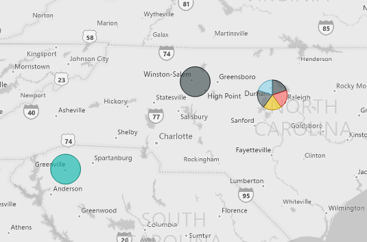
I have a set of 1,000 companies with lat/long coordinates, each assigned a different index value from 0-9. I have plotted each of the coordinates with success using different colored bubble in the legend.
| CUSTOMER | INDEX | LATITUDE | LONGITUDE |
| 1004050 | 4 | 42.61938 | -83.0321 |
| 1009252 | 4 | 34.8586 | -82.3955 |
| 1010250 | 5 | 36.07659 | -80.1817 |
| 1007132 | 5 | 35.89308 | -78.8645 |
| 1002161 | 6 | 39.98421 | -82.8698 |
| 1008239 | 6 | 35.89308 | -78.8645 |
| 1000801 | 7 | 39.98421 | -82.8698 |
| 1007199 | 7 | 35.89308 | -78.8645 |
| 1002539 | 8 | 33.90199 | -118.387 |
| 1007905 | 8 | 39.98421 | -82.8698 |
| 1008515 | 8 | 35.89308 | -78.8645 |
| 1001924 | 9 | 39.98421 | -82.8698 |
| 1006311 | 9 | 39.98421 | -82.8698 |
| 1010409 | 9 | 35.89308 | -78.8645 |
However, when I have multiple companies at the exact lat/long with a different index, it is giving me a pie-chart type bubble. Is there a work around so I can have 1 bubble for each index color on/around that coordinate (doesn't have to be perfect location)? Perhaps a formula for using an approximation for the lat/long?
Thanks in advance,
Carly
- Mark as New
- Bookmark
- Subscribe
- Mute
- Subscribe to RSS Feed
- Permalink
- Report Inappropriate Content
Hi Carly,
As we can see from the sample data, there is a scenario that one pair of lat/long has many customers. I afraid we can't display one place as many bubbles. If it's possible to make little changes in the lat/long?
Best Regards,
Dale
If this post helps, then please consider Accept it as the solution to help the other members find it more quickly.
- Mark as New
- Bookmark
- Subscribe
- Mute
- Subscribe to RSS Feed
- Permalink
- Report Inappropriate Content
Hi Dale, thanks for responding. These are likely customers all located at the same location, like a large office building or mall. We could make tiny modifications (would have to do this in Power BI), but what if we have a large number of companies at the same location, would it still be feasible?


