European Microsoft Fabric Community Conference
The ultimate Microsoft Fabric, Power BI, Azure AI, and SQL learning event! Join us in Stockholm, Sweden from September 24-27, 2024.
2-for-1 sale on June 20 only!
- Power BI forums
- Updates
- News & Announcements
- Get Help with Power BI
- Desktop
- Service
- Report Server
- Power Query
- Mobile Apps
- Developer
- DAX Commands and Tips
- Custom Visuals Development Discussion
- Health and Life Sciences
- Power BI Spanish forums
- Translated Spanish Desktop
- Training and Consulting
- Instructor Led Training
- Dashboard in a Day for Women, by Women
- Galleries
- Community Connections & How-To Videos
- COVID-19 Data Stories Gallery
- Themes Gallery
- Data Stories Gallery
- R Script Showcase
- Webinars and Video Gallery
- Quick Measures Gallery
- 2021 MSBizAppsSummit Gallery
- 2020 MSBizAppsSummit Gallery
- 2019 MSBizAppsSummit Gallery
- Events
- Ideas
- Custom Visuals Ideas
- Issues
- Issues
- Events
- Upcoming Events
- Community Blog
- Power BI Community Blog
- Custom Visuals Community Blog
- Community Support
- Community Accounts & Registration
- Using the Community
- Community Feedback
Find everything you need to get certified on Fabric—skills challenges, live sessions, exam prep, role guidance, and more. Get started
- Power BI forums
- Forums
- Get Help with Power BI
- Desktop
- Key Influencers visualization - likelihood figure ...
- Subscribe to RSS Feed
- Mark Topic as New
- Mark Topic as Read
- Float this Topic for Current User
- Bookmark
- Subscribe
- Printer Friendly Page
- Mark as New
- Bookmark
- Subscribe
- Mute
- Subscribe to RSS Feed
- Permalink
- Report Inappropriate Content
Key Influencers visualization - likelihood figure doesn't match
Hi,
In the Key Influencers visualization, shouldn't the likelihood figure be the difference between the selected inluencer and the average of all other factors?
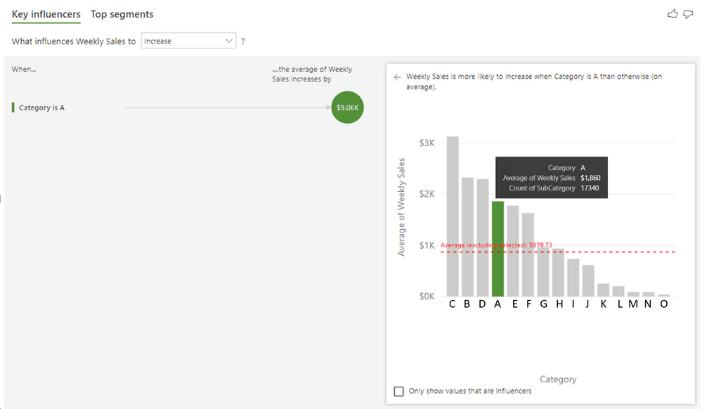
E.g. the top influencer is Category A, with average weekly sales of $1860. Whilst the average weekly sales of all other category is $870.73.
So the difference is $989.27. So shouldn't it be that: If product is in Category A, the average weekly sales is $989.27 higher than all other category?
Why is the graph showing $9.60k instead?
Kind regards,
PJ
- Mark as New
- Bookmark
- Subscribe
- Mute
- Subscribe to RSS Feed
- Permalink
- Report Inappropriate Content
Hi @PJ-292 ,
Kindly share your sample data and excepted result to me if you don't have any Confidential Information. Please upload your files to One Drive and share the link here.
If this post helps, then please consider Accept it as the solution to help the others find it more quickly.
- Mark as New
- Bookmark
- Subscribe
- Mute
- Subscribe to RSS Feed
- Permalink
- Report Inappropriate Content
Hi @v-frfei-msft ,
I've re-created a masked data .pbix (note: the numbers are slightly different than my original post due to rounding issue, but the main problem is still there).
https://1drv.ms/u/s!AuKPBCJSdtVKvmrM3-OdWij0afT5?e=yuXnYT
What I expected to see is that:
"Weekly Sales is more likely to increase by $989.22, when Category is A than otherwise (on average)."
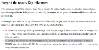
From the Microsoft article, it says that "The number in the bubble is still the difference between the red dotted line and green bar but it’s expressed as a number".
In my data:
Influencer (blue bar) = Category A = $1859.95
Average of all other category (red dotted line) = $870.73
$1859.95 - $870.73 = $989.22
So, it should be: When it's Category A, the average Weekly Sales increase by $989.22. I'm not sure why the chart is showing it as $9.09k.
Kind regards,
PJ
- Mark as New
- Bookmark
- Subscribe
- Mute
- Subscribe to RSS Feed
- Permalink
- Report Inappropriate Content
Hi!
I had the same problem, and I'm pretty sure the issue is that 0/zeros are not included in the average calculation for the influencers. So would be really nice if this is fixed asap, it does not seem like a user-issue but a design issue:)
KR Larsen
Helpful resources

Europe’s largest Microsoft Fabric Community Conference
Join the community in Stockholm for expert Microsoft Fabric learning including a very exciting keynote from Arun Ulag, Corporate Vice President, Azure Data.

Power BI Monthly Update - June 2024
Check out the June 2024 Power BI update to learn about new features.

| User | Count |
|---|---|
| 106 | |
| 102 | |
| 82 | |
| 62 | |
| 55 |
| User | Count |
|---|---|
| 253 | |
| 119 | |
| 115 | |
| 95 | |
| 70 |


