- Power BI forums
- Updates
- News & Announcements
- Get Help with Power BI
- Desktop
- Service
- Report Server
- Power Query
- Mobile Apps
- Developer
- DAX Commands and Tips
- Custom Visuals Development Discussion
- Health and Life Sciences
- Power BI Spanish forums
- Translated Spanish Desktop
- Power Platform Integration - Better Together!
- Power Platform Integrations (Read-only)
- Power Platform and Dynamics 365 Integrations (Read-only)
- Training and Consulting
- Instructor Led Training
- Dashboard in a Day for Women, by Women
- Galleries
- Community Connections & How-To Videos
- COVID-19 Data Stories Gallery
- Themes Gallery
- Data Stories Gallery
- R Script Showcase
- Webinars and Video Gallery
- Quick Measures Gallery
- 2021 MSBizAppsSummit Gallery
- 2020 MSBizAppsSummit Gallery
- 2019 MSBizAppsSummit Gallery
- Events
- Ideas
- Custom Visuals Ideas
- Issues
- Issues
- Events
- Upcoming Events
- Community Blog
- Power BI Community Blog
- Custom Visuals Community Blog
- Community Support
- Community Accounts & Registration
- Using the Community
- Community Feedback
Register now to learn Fabric in free live sessions led by the best Microsoft experts. From Apr 16 to May 9, in English and Spanish.
- Power BI forums
- Forums
- Get Help with Power BI
- Desktop
- Is this possible - lookup and iteration adding num...
- Subscribe to RSS Feed
- Mark Topic as New
- Mark Topic as Read
- Float this Topic for Current User
- Bookmark
- Subscribe
- Printer Friendly Page
- Mark as New
- Bookmark
- Subscribe
- Mute
- Subscribe to RSS Feed
- Permalink
- Report Inappropriate Content
Is this possible - lookup and iteration adding numbers in a calculated column
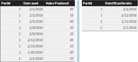
I've got a model with two tables, one with records of when a mechanical component was used and one with dates of the last time that component was serviced.
ComponentData:
- PartId
- Date used
- Value Produced
ComponentServiceDates
- PartId
- DateOfLastService
I would like to know if it is possible and if so what is the best way to achieve add a calculated column? to the ComponentData table that has the number of uses since the last service.
Does anyone know if this is actually possible?
I'm assuming as a first stage I need to create a lookup column that gets the most recent DateOfLastService value ComponentServiceDates for the specific PartId.
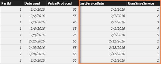
An example of data shape that I require would be:
PartId, Date used, value Produced, DateOfLastService, UsesSinceService
1, 2016-02-01, 65, 2016-02-01, 1
1, 2016-02-02, 55, 2016-02-01, 2
1, 2016-02-03, 45, 2016-02-01, 3
1, 2016-02-08, 35, 2016-02-01, 4
1, 2016-02-09, 25, 2016-02-01, 5
1, 2016-02-12, 65, 2016-02-12, 1
1, 2016-02-15, 55, 2016-02-12, 2
2, 2016-01-20, 65, 2016-01-12, 1
2, 2016-02-02, 55, 2016-02-01, 2
Any help would be more than welcome, I'm totally new to DAX and power query!
Thanks again
Solved! Go to Solution.
- Mark as New
- Bookmark
- Subscribe
- Mute
- Subscribe to RSS Feed
- Permalink
- Report Inappropriate Content
If you have two tables like below, you can create two columns of LastServiceDate and UsesSinceService in ComponentData table. Then you should be able to draw the graph you wanted.
LastServiceDate =
CALCULATE (
    MAX ( ComponentServiceDates[DateOfLastService] ),
    FILTER (
        ComponentServiceDates,
        ComponentServiceDates[PartId] = ComponentData[PartId]
            && ComponentServiceDates[DateOfLastService] <= ComponentData[Date used]
    )
)
UsesSinceService =
CALCULATE (
COUNTROWS ( ComponentData ),
FILTER (
ComponentData,
ComponentData[Date used] <= EARLIER ( ComponentData[Date used] )
&& ComponentData[PartId] = EARLIER ( ComponentData[PartId] )
&& ComponentData[LastServiceDate] = EARLIER ( ComponentData[LastServiceDate] )
)
)
Best Regards,
Herbert
- Mark as New
- Bookmark
- Subscribe
- Mute
- Subscribe to RSS Feed
- Permalink
- Report Inappropriate Content
It is possible, and also normal to *think* this is what you need. But it is not what you should do. Have a read of this article I wrote on the topic. http://exceleratorbi.com.au/calculated-columns-vs-measures-dax/
So so what is the end state of what you are trying to do? Regardless, you should create a new lookup table that has all the components. It sounds to me like your tabkes are both data tabkes. Read about connecting multiple data tables here http://exceleratorbi.com.au/multiple-data-tables-power-pivot/
then in post back with info about your end state for further advice.
- Mark as New
- Bookmark
- Subscribe
- Mute
- Subscribe to RSS Feed
- Permalink
- Report Inappropriate Content
Hi Matt,
Thanks for the reply,
I did state that I wanted to know what the best way to do what I want was, that was what I was asking - maybe I should not have writen what I though the solution may be - I am happy to be corrected as I am completely new to this and from a programming and sql background not excel.
The end result of what I was trying to do was to have a graph with a line for each Component with the value at use on the y-axis vs the number of uses on the x-axis to see degradation over uses.
The above approach has been scraped - the number of uses is now being brough out of the database directly so I no longer need to shape the data in the way I was asking about.
Thanks again
Helpful resources

Microsoft Fabric Learn Together
Covering the world! 9:00-10:30 AM Sydney, 4:00-5:30 PM CET (Paris/Berlin), 7:00-8:30 PM Mexico City

Power BI Monthly Update - April 2024
Check out the April 2024 Power BI update to learn about new features.

| User | Count |
|---|---|
| 108 | |
| 105 | |
| 87 | |
| 74 | |
| 66 |
| User | Count |
|---|---|
| 124 | |
| 112 | |
| 96 | |
| 80 | |
| 72 |


