New Offer! Become a Certified Fabric Data Engineer
Check your eligibility for this 50% exam voucher offer and join us for free live learning sessions to get prepared for Exam DP-700.
Get Started- Power BI forums
- Get Help with Power BI
- Desktop
- Service
- Report Server
- Power Query
- Mobile Apps
- Developer
- DAX Commands and Tips
- Custom Visuals Development Discussion
- Health and Life Sciences
- Power BI Spanish forums
- Translated Spanish Desktop
- Training and Consulting
- Instructor Led Training
- Dashboard in a Day for Women, by Women
- Galleries
- Community Connections & How-To Videos
- COVID-19 Data Stories Gallery
- Themes Gallery
- Data Stories Gallery
- R Script Showcase
- Webinars and Video Gallery
- Quick Measures Gallery
- 2021 MSBizAppsSummit Gallery
- 2020 MSBizAppsSummit Gallery
- 2019 MSBizAppsSummit Gallery
- Events
- Ideas
- Custom Visuals Ideas
- Issues
- Issues
- Events
- Upcoming Events
Don't miss out! 2025 Microsoft Fabric Community Conference, March 31 - April 2, Las Vegas, Nevada. Use code MSCUST for a $150 discount. Prices go up February 11th. Register now.
- Power BI forums
- Forums
- Get Help with Power BI
- Desktop
- Is there any option to format the colour of whole ...
- Subscribe to RSS Feed
- Mark Topic as New
- Mark Topic as Read
- Float this Topic for Current User
- Bookmark
- Subscribe
- Printer Friendly Page
- Mark as New
- Bookmark
- Subscribe
- Mute
- Subscribe to RSS Feed
- Permalink
- Report Inappropriate Content
Is there any option to format the colour of whole Dial Gauge?
Hi,
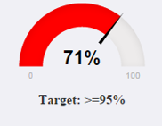
Is there any option to change the colour of the whole dial gauge dynamically based on the value instead of having three colour?
Like if target <1 whole dail gauge should be in red,
if target is betweeen target and threshold should in amber.
if target >1 whole dail gauge should be in Green.
- Mark as New
- Bookmark
- Subscribe
- Mute
- Subscribe to RSS Feed
- Permalink
- Report Inappropriate Content
Hi @mihart, @Vaishnavi_M , @v-yulgu-msftI was also looking for the same functionality as mentioned above that if measure value is less than 35 (say 30), pointer must point to 30 and Fill color should be red and if value of measure is greater than 35 (say 40) then Fill color must be green and needle should point to 40. I do not want 3 colors on Gauge/Tachometer.
Is there any way or workaround to achieve this functionality?
Thanks in Advance!!
- Mark as New
- Bookmark
- Subscribe
- Mute
- Subscribe to RSS Feed
- Permalink
- Report Inappropriate Content
- Mark as New
- Bookmark
- Subscribe
- Mute
- Subscribe to RSS Feed
- Permalink
- Report Inappropriate Content
Hi @Vaishnavi_M
In this scenario, you are attempting to dynamically change the fill color of whole Dial Gauge, right? While there isn't an option right now for changing the gauge fill color, it's not available now.
Besides, I am confused about "instead of having three colour" you asked. Based on my understanding, if the target value is less than 1, then the fill of guage (from 0 to 100) should be colored red. You should know that in a radial gauge, the target value is represented by the line (needle). And the actual value that represents that progress is shown in bold inside the arc. All possible values are spread evenly along the arc, from the minimum (left-most value) to the maximum (right-most value).
Reference: Tutorial: radial gauge charts in Power BI
If I have something misunderstood, please share more detailed information about your expect result.
Best regards,
Yuliana Gu
If this post helps, then please consider Accept it as the solution to help the other members find it more quickly.
Helpful resources

Join us at the Microsoft Fabric Community Conference
March 31 - April 2, 2025, in Las Vegas, Nevada. Use code MSCUST for a $150 discount! Prices go up Feb. 11th.

Power BI Monthly Update - January 2025
Check out the January 2025 Power BI update to learn about new features in Reporting, Modeling, and Data Connectivity.

| User | Count |
|---|---|
| 146 | |
| 85 | |
| 66 | |
| 52 | |
| 47 |
| User | Count |
|---|---|
| 215 | |
| 90 | |
| 83 | |
| 66 | |
| 58 |

