Fabric Data Days starts November 4th!
Advance your Data & AI career with 50 days of live learning, dataviz contests, hands-on challenges, study groups & certifications and more!
Get registered- Power BI forums
- Get Help with Power BI
- Desktop
- Service
- Report Server
- Power Query
- Mobile Apps
- Developer
- DAX Commands and Tips
- Custom Visuals Development Discussion
- Health and Life Sciences
- Power BI Spanish forums
- Translated Spanish Desktop
- Training and Consulting
- Instructor Led Training
- Dashboard in a Day for Women, by Women
- Galleries
- Data Stories Gallery
- Themes Gallery
- Contests Gallery
- Quick Measures Gallery
- Visual Calculations Gallery
- Notebook Gallery
- Translytical Task Flow Gallery
- TMDL Gallery
- R Script Showcase
- Webinars and Video Gallery
- Ideas
- Custom Visuals Ideas (read-only)
- Issues
- Issues
- Events
- Upcoming Events
Get Fabric Certified for FREE during Fabric Data Days. Don't miss your chance! Learn more
- Power BI forums
- Forums
- Get Help with Power BI
- Desktop
- Re: Implementing Year-To-Date, Month-To-Date, and ...
- Subscribe to RSS Feed
- Mark Topic as New
- Mark Topic as Read
- Float this Topic for Current User
- Bookmark
- Subscribe
- Printer Friendly Page
- Mark as New
- Bookmark
- Subscribe
- Mute
- Subscribe to RSS Feed
- Permalink
- Report Inappropriate Content
Implementing Year-To-Date, Month-To-Date, and Today via ChicletSlicer
- Mark as New
- Bookmark
- Subscribe
- Mute
- Subscribe to RSS Feed
- Permalink
- Report Inappropriate Content
I'm still struggling with this issue. Can someone help me?
- Mark as New
- Bookmark
- Subscribe
- Mute
- Subscribe to RSS Feed
- Permalink
- Report Inappropriate Content
Hi @Anonymous
in my test, today is 2019/1/15
Create measures in Table1
selected = SELECTEDVALUE(Table2[cate])

value_1 =
SWITCH (
    [selected],
    "Y", YEAR ( MAX ( Table1[Date] ) ),
    "M", MONTH ( MAX ( Table1[Date] ) ),
    "T", DAY ( MAX ( Table1[Date] ) )
)

value_2 =
SWITCH (
    [selected],
    "Y", YEAR ( TODAY () ),
    "M", MONTH ( TODAY () ),
    "T", DAY ( TODAY () )
)

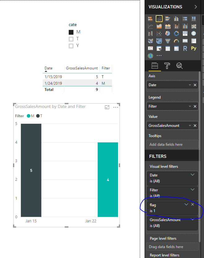
flag = IF([value_1]=[value_2],1,0)
don't create any relationship between Table 1and Table2,
add [flag] in the visual level filter
“
Community Support Team _ Maggie Li
If this post helps, then please consider Accept it as the solution to help the other members find it more quickly.
“
Best Regards
maggie
- Mark as New
- Bookmark
- Subscribe
- Mute
- Subscribe to RSS Feed
- Permalink
- Report Inappropriate Content
Thanks, but this only works if I'm displaying the data in a table or a matrix. I need to display the data in a clustered bar chart.
- Mark as New
- Bookmark
- Subscribe
- Mute
- Subscribe to RSS Feed
- Permalink
- Report Inappropriate Content
Hi @Anonymous
Is this what you want?
Best Regrads
Maggie
- Mark as New
- Bookmark
- Subscribe
- Mute
- Subscribe to RSS Feed
- Permalink
- Report Inappropriate Content
Hello @v-juanli-msft
I want to display the GrossSalesAmount by Branch. I forgot to mention that there is a Branch column in the Sales table. Now the bar chart has the Axis as Branch, and the Value is GrossSalesAmount. I want to use the ChicletSlicer as a DateCategory filter. Meaning that I select YTD, MTD, or Today and the values of the bar chart change based on my selection.
Helpful resources

Fabric Data Days
Advance your Data & AI career with 50 days of live learning, contests, hands-on challenges, study groups & certifications and more!

Power BI Monthly Update - October 2025
Check out the October 2025 Power BI update to learn about new features.


