Fabric Data Days starts November 4th!
Advance your Data & AI career with 50 days of live learning, dataviz contests, hands-on challenges, study groups & certifications and more!
Get registered- Power BI forums
- Get Help with Power BI
- Desktop
- Service
- Report Server
- Power Query
- Mobile Apps
- Developer
- DAX Commands and Tips
- Custom Visuals Development Discussion
- Health and Life Sciences
- Power BI Spanish forums
- Translated Spanish Desktop
- Training and Consulting
- Instructor Led Training
- Dashboard in a Day for Women, by Women
- Galleries
- Data Stories Gallery
- Themes Gallery
- Contests Gallery
- Quick Measures Gallery
- Visual Calculations Gallery
- Notebook Gallery
- Translytical Task Flow Gallery
- TMDL Gallery
- R Script Showcase
- Webinars and Video Gallery
- Ideas
- Custom Visuals Ideas (read-only)
- Issues
- Issues
- Events
- Upcoming Events
Get Fabric Certified for FREE during Fabric Data Days. Don't miss your chance! Learn more
- Power BI forums
- Forums
- Get Help with Power BI
- Desktop
- Re: Ignoring a visual level filter from a matrix i...
- Subscribe to RSS Feed
- Mark Topic as New
- Mark Topic as Read
- Float this Topic for Current User
- Bookmark
- Subscribe
- Printer Friendly Page
- Mark as New
- Bookmark
- Subscribe
- Mute
- Subscribe to RSS Feed
- Permalink
- Report Inappropriate Content
Ignoring a visual level filter from a matrix in a pie chart
Hi!
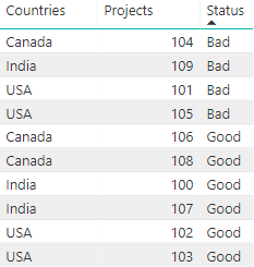
I'm having a bit trouble with combining a matrix and a pie chart. I have a set of data which tells me the status of a project per country. In the matrix visual, I've set a visual level filter on "bad" as the status. This indicates me which projects need attention. See examples.
Dataset:
Filter on the matrix
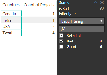
Pie chart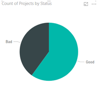
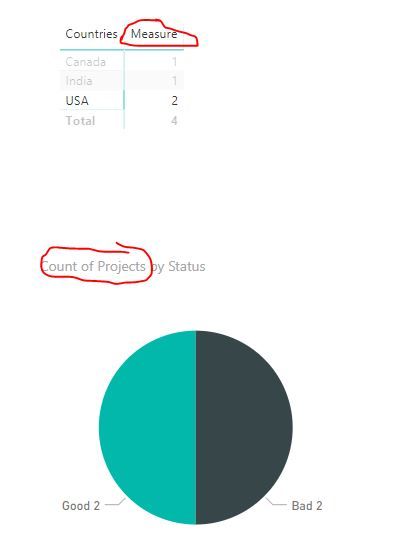
The problem I encounter is when I select a country in the matrix visual, the visual level filter from the matrix applies to the pie chart. For example, when I select USA, the pie chart will only show me the projects which are bad according to their status. See example.

For the pie chart, I want to see all the projects from USA (good and bad). For the matrix, I don't want anything to change. I've tried using variaties of measures with ALL and ALLEXCEPT, but I can't seem to figure it out. Does somebody know how I would fix this sort of problem?
Thanks in advance,
Lars
Solved! Go to Solution.
- Mark as New
- Bookmark
- Subscribe
- Mute
- Subscribe to RSS Feed
- Permalink
- Report Inappropriate Content
hi, @Anonymous
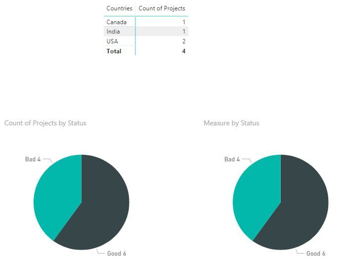
After my research, when you do an interaction between two or more visuals, the visual level filter will affect other visuals too. so you could try this way:
Don't set visual level filter on matrix visual and use a measure instead of "Count of Countries"
Measure = CALCULATE(COUNTA('Table'[Projects]),'Table'[Status]="Bad")
Then set "Count of Countries" for pie chart.
Result:
Best Regards,
Lin
If this post helps, then please consider Accept it as the solution to help the other members find it more quickly.
- Mark as New
- Bookmark
- Subscribe
- Mute
- Subscribe to RSS Feed
- Permalink
- Report Inappropriate Content
hi, @Anonymous
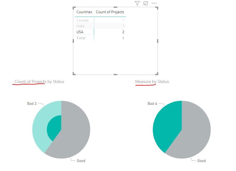
You could use All Function to add a measrue
Measure = CALCULATE(COUNTA('Table'[Projects]),ALL('Table'[Countries]))
Result:
Here is pbix file, please try it.
Best Regards,
Lin
If this post helps, then please consider Accept it as the solution to help the other members find it more quickly.
- Mark as New
- Bookmark
- Subscribe
- Mute
- Subscribe to RSS Feed
- Permalink
- Report Inappropriate Content
Hi Lin,
Thanks for your reply!
The formula works, but it isn't giving the result I desire.
When I filter on a country, the pie chart shows me a total of all the bad projects.
When I filter the matrix on a country (for example: USA), I want the pie chart to display all the projects which belong to the chosen country (2 good, 2 bad).
I feel like this isn't an extreme difficult task, but I can't seem to figure it out 😞
Thanks in advance!
Best regards,
Lars van de Bunt
- Mark as New
- Bookmark
- Subscribe
- Mute
- Subscribe to RSS Feed
- Permalink
- Report Inappropriate Content
hi, @Anonymous
After my research, when you do an interaction between two or more visuals, the visual level filter will affect other visuals too. so you could try this way:
Don't set visual level filter on matrix visual and use a measure instead of "Count of Countries"
Measure = CALCULATE(COUNTA('Table'[Projects]),'Table'[Status]="Bad")
Then set "Count of Countries" for pie chart.
Result:
Best Regards,
Lin
If this post helps, then please consider Accept it as the solution to help the other members find it more quickly.
- Mark as New
- Bookmark
- Subscribe
- Mute
- Subscribe to RSS Feed
- Permalink
- Report Inappropriate Content
Helpful resources

Fabric Data Days
Advance your Data & AI career with 50 days of live learning, contests, hands-on challenges, study groups & certifications and more!

Power BI Monthly Update - October 2025
Check out the October 2025 Power BI update to learn about new features.

