New Offer! Become a Certified Fabric Data Engineer
Check your eligibility for this 50% exam voucher offer and join us for free live learning sessions to get prepared for Exam DP-700.
Get Started- Power BI forums
- Get Help with Power BI
- Desktop
- Service
- Report Server
- Power Query
- Mobile Apps
- Developer
- DAX Commands and Tips
- Custom Visuals Development Discussion
- Health and Life Sciences
- Power BI Spanish forums
- Translated Spanish Desktop
- Training and Consulting
- Instructor Led Training
- Dashboard in a Day for Women, by Women
- Galleries
- Community Connections & How-To Videos
- COVID-19 Data Stories Gallery
- Themes Gallery
- Data Stories Gallery
- R Script Showcase
- Webinars and Video Gallery
- Quick Measures Gallery
- 2021 MSBizAppsSummit Gallery
- 2020 MSBizAppsSummit Gallery
- 2019 MSBizAppsSummit Gallery
- Events
- Ideas
- Custom Visuals Ideas
- Issues
- Issues
- Events
- Upcoming Events
Don't miss out! 2025 Microsoft Fabric Community Conference, March 31 - April 2, Las Vegas, Nevada. Use code MSCUST for a $150 discount. Prices go up February 11th. Register now.
- Power BI forums
- Forums
- Get Help with Power BI
- Desktop
- I want to set the value itself on the y-axis of a ...
- Subscribe to RSS Feed
- Mark Topic as New
- Mark Topic as Read
- Float this Topic for Current User
- Bookmark
- Subscribe
- Printer Friendly Page
- Mark as New
- Bookmark
- Subscribe
- Mute
- Subscribe to RSS Feed
- Permalink
- Report Inappropriate Content
I want to set the value itself on the y-axis of a line graph
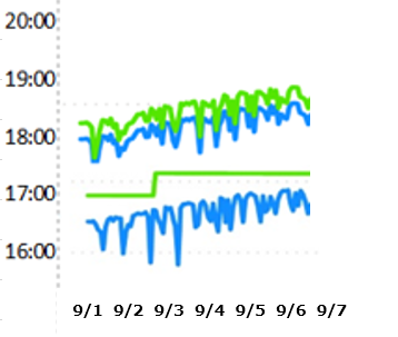
I would like to create a line graph with the x-axis set to date and time and the y-axis set to time (hh:mm).
I would like to know the time trends from this graph.
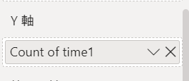
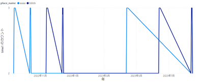
However, when I create a graph, the y-axis displays count values instead of time values.
How should I solve this?
The type of the time column is "time". I also tried the "text" type, but the result was the same.
Settings other than count cannot be made.
I want to create a graph like this.↓
- Mark as New
- Bookmark
- Subscribe
- Mute
- Subscribe to RSS Feed
- Permalink
- Report Inappropriate Content
- Mark as New
- Bookmark
- Subscribe
- Mute
- Subscribe to RSS Feed
- Permalink
- Report Inappropriate Content
thank you for your reply.
The data in tabular format is below.
| place_name | date | time1 |
| aaaa | 2022/9/12 | 18:10 |
| aaaa | 2022/9/12 | 19:35 |
| aaaa | 2022/9/13 | 6:10 |
| aaaa | 2022/9/13 | 18:30 |
| aaaa | 2022/9/13 | 18:45 |
| aaaa | 2022/9/14 | 6:45 |
| aaaa | 2022/9/14 | 18:00 |
| aaaa | 2022/9/14 | 18:30 |
| aaaa | 2022/9/15 | 7:00 |
| aaaa | 2022/9/15 | 18:30 |
| aaaa | 2022/9/15 | 18:45 |
| aaaa | 2022/10/12 | 8:30 |
| aaaa | 2022/10/12 | 17:10 |
| aaaa | 2022/10/13 | 17:25 |
| aaaa | 2022/10/13 | 7:10 |
| aaaa | 2022/10/13 | 17:30 |
| aaaa | 2022/10/14 | 18:30 |
| aaaa | 2022/10/14 | 6:45 |
| aaaa | 2022/10/14 | 17:00 |
| aaaa | 2022/10/15 | 17:30 |
| aaaa | 2022/10/15 | 7:00 |
| aaaa | 2023/4/12 | 18:10 |
| aaaa | 2023/4/12 | 19:25 |
| aaaa | 2023/4/13 | 6:10 |
| aaaa | 2023/4/13 | 18:30 |
| aaaa | 2023/4/13 | 18:45 |
| aaaa | 2023/4/14 | 6:45 |
| aaaa | 2023/4/14 | 18:00 |
| aaaa | 2023/4/14 | 18:30 |
| aaaa | 2023/4/15 | 7:00 |
| aaaa | 2023/4/15 | 18:30 |
| aaaa | 2023/4/15 | 18:45 |
| aaaa | 2023/8/12 | 8:30 |
| aaaa | 2023/8/12 | 17:10 |
| aaaa | 2023/8/13 | 17:25 |
| aaaa | 2023/8/13 | 7:10 |
| aaaa | 2023/8/13 | 17:30 |
| aaaa | 2023/8/14 | 18:30 |
| aaaa | 2023/8/14 | 6:45 |
| aaaa | 2023/8/14 | 17:00 |
| aaaa | 2023/8/15 | 17:30 |
| aaaa | 2023/8/15 | 7:00 |
| bbbb | 2022/11/12 | 18:10 |
| bbbb | 2022/11/12 | 19:35 |
| bbbb | 2022/11/13 | 6:10 |
| bbbb | 2022/11/13 | 18:30 |
| bbbb | 2022/11/13 | 18:45 |
| bbbb | 2022/11/14 | 6:45 |
| bbbb | 2022/11/14 | 18:00 |
| bbbb | 2022/11/14 | 18:30 |
| bbbb | 2022/11/15 | 7:00 |
| bbbb | 2022/11/15 | 18:30 |
| bbbb | 2022/11/15 | 18:45 |
| bbbb | 2022/12/12 | 8:30 |
| bbbb | 2022/12/12 | 17:10 |
| bbbb | 2022/12/13 | 17:25 |
| bbbb | 2022/12/13 | 7:10 |
| bbbb | 2022/12/13 | 17:30 |
| bbbb | 2022/12/14 | 18:30 |
| bbbb | 2022/12/14 | 6:45 |
| bbbb | 2022/12/14 | 17:00 |
| bbbb | 2022/12/15 | 17:30 |
| bbbb | 2022/12/15 | 7:00 |
| bbbb | 2023/6/12 | 18:10 |
| bbbb | 2023/6/12 | 19:25 |
| bbbb | 2023/6/13 | 6:10 |
| bbbb | 2023/6/13 | 18:30 |
| bbbb | 2023/6/13 | 18:45 |
| bbbb | 2023/6/14 | 6:45 |
| bbbb | 2023/6/14 | 18:00 |
| bbbb | 2023/6/14 | 18:30 |
| bbbb | 2023/6/15 | 7:00 |
| bbbb | 2023/6/15 | 18:30 |
| bbbb | 2023/6/15 | 18:45 |
| bbbb | 2023/8/12 | 8:30 |
| bbbb | 2023/8/12 | 17:10 |
| bbbb | 2023/8/13 | 17:25 |
| bbbb | 2023/8/13 | 7:10 |
| bbbb | 2023/8/13 | 17:30 |
| bbbb | 2023/8/14 | 18:30 |
| bbbb | 2023/8/14 | 6:45 |
| bbbb | 2023/8/14 | 17:00 |
| bbbb | 2023/8/15 | 17:30 |
| bbbb | 2023/8/15 | 7:00 |
If you graph it, it will look like this:
Please tell me how to solve it.
- Mark as New
- Bookmark
- Subscribe
- Mute
- Subscribe to RSS Feed
- Permalink
- Report Inappropriate Content
@mmm_a012345 , Time cannot be plotted on y axis, so what can be done is create a column that can calculate minutes into that day, like 6:10:00 is 370 minutes.
After adding the minute column[
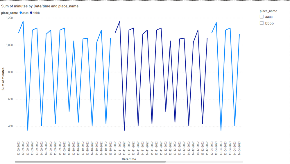
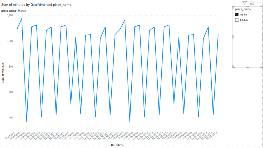
This is the maximum that I am able to create near your requirement.
Thank You.
- Mark as New
- Bookmark
- Subscribe
- Mute
- Subscribe to RSS Feed
- Permalink
- Report Inappropriate Content
Thank you for your wonderful answer.
However, "time" refers to the time (a.m. or p.m.), not elapsed time.
6:10:00 cannot be 370 minutes.
I would like to express it in the form of 6:10.
thank you.
- Mark as New
- Bookmark
- Subscribe
- Mute
- Subscribe to RSS Feed
- Permalink
- Report Inappropriate Content
@mmm_a012345 , That can not be done for y axis in any chart. The time can be expressed as minutes in the terms how many minutes have passed in that day. There can be card visual that represents time. Whenever a point on line graph is selected the corresponding time will be shown on card.
Sorry if I couldn't help at all and Thank you for taking time to read. I hope that this gives you some insight into powerBI
Helpful resources

Join us at the Microsoft Fabric Community Conference
March 31 - April 2, 2025, in Las Vegas, Nevada. Use code MSCUST for a $150 discount! Prices go up Feb. 11th.

Power BI Monthly Update - January 2025
Check out the January 2025 Power BI update to learn about new features in Reporting, Modeling, and Data Connectivity.

| User | Count |
|---|---|
| 144 | |
| 87 | |
| 65 | |
| 50 | |
| 45 |
| User | Count |
|---|---|
| 217 | |
| 88 | |
| 81 | |
| 65 | |
| 56 |

