FabCon is coming to Atlanta
Join us at FabCon Atlanta from March 16 - 20, 2026, for the ultimate Fabric, Power BI, AI and SQL community-led event. Save $200 with code FABCOMM.
Register now!- Power BI forums
- Get Help with Power BI
- Desktop
- Service
- Report Server
- Power Query
- Mobile Apps
- Developer
- DAX Commands and Tips
- Custom Visuals Development Discussion
- Health and Life Sciences
- Power BI Spanish forums
- Translated Spanish Desktop
- Training and Consulting
- Instructor Led Training
- Dashboard in a Day for Women, by Women
- Galleries
- Data Stories Gallery
- Themes Gallery
- Contests Gallery
- QuickViz Gallery
- Quick Measures Gallery
- Visual Calculations Gallery
- Notebook Gallery
- Translytical Task Flow Gallery
- TMDL Gallery
- R Script Showcase
- Webinars and Video Gallery
- Ideas
- Custom Visuals Ideas (read-only)
- Issues
- Issues
- Events
- Upcoming Events
Get Fabric Certified for FREE during Fabric Data Days. Don't miss your chance! Request now
- Power BI forums
- Forums
- Get Help with Power BI
- Desktop
- How to use Measure in X Axis in chart
- Subscribe to RSS Feed
- Mark Topic as New
- Mark Topic as Read
- Float this Topic for Current User
- Bookmark
- Subscribe
- Printer Friendly Page
- Mark as New
- Bookmark
- Subscribe
- Mute
- Subscribe to RSS Feed
- Permalink
- Report Inappropriate Content
How to use Measure in X Axis in chart
Hi,
I am new to Power BI and will appreciate any help with my question.
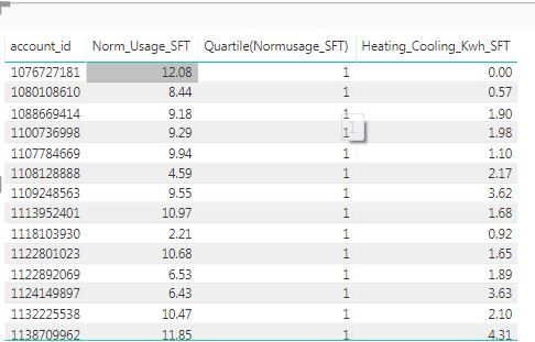
So, I have a list of 100 accounts with the following 3 columns:
(1) Normalized Electric Usage per Square footage occupied (Norm_Usage_SFT)
(2) Quartile (Norm/SFT) - this is a derived field where I binned my 100 accounts into 4 quartiles based on their usage in column1
(3) Heating/Cooling Load/Square Footage (Heating_Cooling_ KWH_SFT) for these 100 accounts. The sample dataset is below:
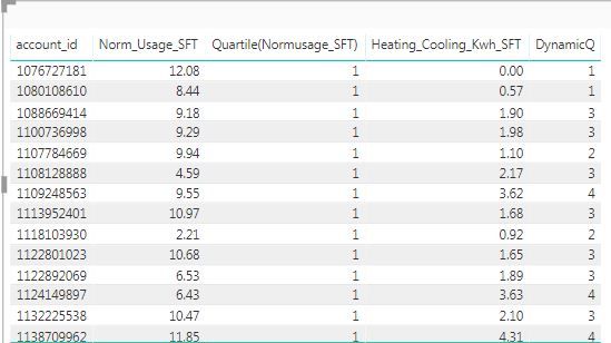
I have created a measure which is a quartile calculation: DynamicQ based on column 3 (Heating_Cooling_ KWH_SFT) which calculates and bins the values in column 3 into 4 buckets. The dataset after adding the measure looks like:
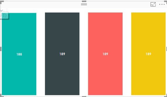
Now, I would like to use this measure (DynamicQ) in the X axis of a bar graph and count the number of accounts. This measure has 4 values: 1, 2, 3, 4 corresponding to the buckets created. I want the output to show something like this: The 4 bars correspond to the 4 values of the measure (1,2,3 and 4) and the counts should represent the number of accounts (count of account_ID).
How can I achieve that? I am unable to do the graph above since a measure is not getting added into the X Axis. I want to add count of account_ids into the Y axiz. Is there any workaround to do that? Any help is appreciated.
Thanks
- Mark as New
- Bookmark
- Subscribe
- Mute
- Subscribe to RSS Feed
- Permalink
- Report Inappropriate Content
HI Snaruma,
Have you managed to get measures in X Axis?
I created a measures for dates, and it is working as expected in Table view, But when I select cluster column chart, can not drag dates in to Shared Axis.
Any help>
- Mark as New
- Bookmark
- Subscribe
- Mute
- Subscribe to RSS Feed
- Permalink
- Report Inappropriate Content
Hi @snaruma,
Measure is not able to be added to X-axis of chart visual. Instead, you can create a calculated column to get the same results of DynamicQ which can also bins the values in column 3 into 4 buckets. The formula is similar to:
DynamicQ =
IF (
    Table[Heating_Cooling_ KWH_SFT] < 1,
    1,
    IF (
        Table[Heating_Cooling_ KWH_SFT] >= 1
            && Table[Heating_Cooling_ KWH_SFT] < 2,
        2,
        IF (
            Table[Heating_Cooling_ KWH_SFT] >= 2
                && Table[Heating_Cooling_ KWH_SFT] < 3,
            3,
            4
        )
    )
)
Regards,
Yuliana Gu
If this post helps, then please consider Accept it as the solution to help the other members find it more quickly.
- Mark as New
- Bookmark
- Subscribe
- Mute
- Subscribe to RSS Feed
- Permalink
- Report Inappropriate Content
Thanks for the response. But I have 2 questions:
(1) The calculation of the DynamicQ measure is as follows:
DynamicQ =
var FirstQ=PERCENTILEX.INC(allselected(dec_weather),dec_weather[Heating_Cooling_Kwh_SFT],0.25)
var SecondQ=PERCENTILEX.INC(allselected(dec_weather),dec_weather[Heating_Cooling_Kwh_SFT],0.5)
var ThirdQ=PERCENTILEX.INC(allselected(dec_weather),dec_weather[Heating_Cooling_Kwh_SFT],0.75)
VAR ThisVal =selectedvalue(dec_weather[Heating_Cooling_Kwh_SFT])
return
IF (
ThisVal < FirstQ,
1,
IF (
ThisVal >=FirstQ
&& ThisVal < SecondQ,
2,
IF ( ThisVal >= SecondQ && ThisVal < ThirdQ, 3, 4 )
)
)
It is different from what you have provided. I can recreate this as a calculated column but it is not dynamic obviously. If I use certain slicers, this column is not recalculating this formula whereas the measure (DynamicQ) is recalculating. And this is what I want , but now I cannot use measure as a slicer or in the bar graph as x-axis. Is there any other way that I can use this measure DynamicQ as a slicer atleast if not in a bar graph?
(1) Calculated columns are not dynamic, correct? If I want the column value to recalculate based on a set of filters, will I be able to do that?
Appreciate any responses.
Thanks!
- Mark as New
- Bookmark
- Subscribe
- Mute
- Subscribe to RSS Feed
- Permalink
- Report Inappropriate Content
Hi @snaruma ,
I am also facing a similar issue where I want the column value to recalculate based on a set of filters.
I was curious if you could find any solution to this problem. If yes, could you please share it with us?
Regards!!
- Mark as New
- Bookmark
- Subscribe
- Mute
- Subscribe to RSS Feed
- Permalink
- Report Inappropriate Content
Hi @snaruma,
Yes. As you know, measure is not available to be added to slicer nor X-axis of chart. Calculated column is static which won't dynamically changed based on slicer selection.
However, even you want the measure to be dynamical, the category values displayed on X-axis are always 1, 2, 3 and 4. So, there is no difference to use calculated column or measure. I was concerned about what value did you want to dynamically show.
Regards,
Yuliana Gu
If this post helps, then please consider Accept it as the solution to help the other members find it more quickly.
Helpful resources

Power BI Monthly Update - November 2025
Check out the November 2025 Power BI update to learn about new features.

Fabric Data Days
Advance your Data & AI career with 50 days of live learning, contests, hands-on challenges, study groups & certifications and more!


