- Power BI forums
- Updates
- News & Announcements
- Get Help with Power BI
- Desktop
- Service
- Report Server
- Power Query
- Mobile Apps
- Developer
- DAX Commands and Tips
- Custom Visuals Development Discussion
- Health and Life Sciences
- Power BI Spanish forums
- Translated Spanish Desktop
- Power Platform Integration - Better Together!
- Power Platform Integrations (Read-only)
- Power Platform and Dynamics 365 Integrations (Read-only)
- Training and Consulting
- Instructor Led Training
- Dashboard in a Day for Women, by Women
- Galleries
- Community Connections & How-To Videos
- COVID-19 Data Stories Gallery
- Themes Gallery
- Data Stories Gallery
- R Script Showcase
- Webinars and Video Gallery
- Quick Measures Gallery
- 2021 MSBizAppsSummit Gallery
- 2020 MSBizAppsSummit Gallery
- 2019 MSBizAppsSummit Gallery
- Events
- Ideas
- Custom Visuals Ideas
- Issues
- Issues
- Events
- Upcoming Events
- Community Blog
- Power BI Community Blog
- Custom Visuals Community Blog
- Community Support
- Community Accounts & Registration
- Using the Community
- Community Feedback
Register now to learn Fabric in free live sessions led by the best Microsoft experts. From Apr 16 to May 9, in English and Spanish.
- Power BI forums
- Forums
- Get Help with Power BI
- Desktop
- Re: How to show summary values in map region?
- Subscribe to RSS Feed
- Mark Topic as New
- Mark Topic as Read
- Float this Topic for Current User
- Bookmark
- Subscribe
- Printer Friendly Page
- Mark as New
- Bookmark
- Subscribe
- Mute
- Subscribe to RSS Feed
- Permalink
- Report Inappropriate Content
How to show summary values in map region?
Hi all,
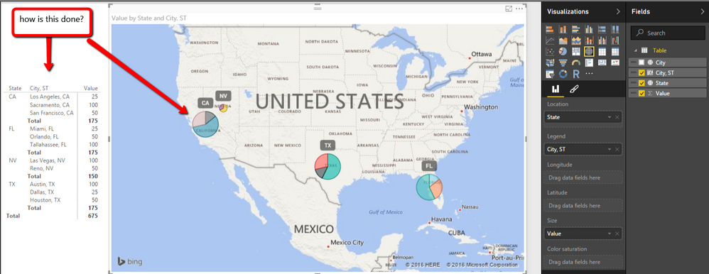
I am trying to put aggregate values into a map in pretty much the same way as shown in the attached image...
I'm going around in circles trying to figure it out and would appreciate input from you experienced folk!
Stuff that I have available as input
* Irish County name (also have lat/long available but reckon I don't need these as I am aggregating up to county level)
* Categories (Rugby, Football, Athletics)
* Category values
example:
County | Rugby | Football | Athletics | Total |
Dublin | 100 | 50 | 25 | 175 |
Cork | 50 | 80 | 10 | 140 |
Galway | 70 | 120 | 30 | 220 |
I have tried pivoting it like this:
County | Category | Value |
Dublin | Rugby | 50 |
Dublin | Football | 80 |
Dublin | Athletics | 120 |
Cork | Rugby | 50 |
Cork | Football | 80 |
Cork | Athletics | 10 |
Galway | Rugby | 70 |
Galway | Football | 120 |
Galway | Athletics | 30 |
That seemed to get me further, but not quite right ....
As per the attached image, I am trying to have a pie-chart appear in the county, that shows slices for each category value (or percentage)
Any assistance most gratefully received!
Allen.

Solved! Go to Solution.
- Mark as New
- Bookmark
- Subscribe
- Mute
- Subscribe to RSS Feed
- Permalink
- Report Inappropriate Content
You may drag measure below to Tooltips.
Measure =
CALCULATE ( SUM ( Table1[Value] ), ALLSELECTED ( Table1[Category] ) )
If this post helps, then please consider Accept it as the solution to help the other members find it more quickly.
Helpful resources

Microsoft Fabric Learn Together
Covering the world! 9:00-10:30 AM Sydney, 4:00-5:30 PM CET (Paris/Berlin), 7:00-8:30 PM Mexico City

Power BI Monthly Update - April 2024
Check out the April 2024 Power BI update to learn about new features.

| User | Count |
|---|---|
| 111 | |
| 100 | |
| 80 | |
| 64 | |
| 57 |
| User | Count |
|---|---|
| 145 | |
| 111 | |
| 92 | |
| 84 | |
| 66 |
