- Power BI forums
- Updates
- News & Announcements
- Get Help with Power BI
- Desktop
- Service
- Report Server
- Power Query
- Mobile Apps
- Developer
- DAX Commands and Tips
- Custom Visuals Development Discussion
- Health and Life Sciences
- Power BI Spanish forums
- Translated Spanish Desktop
- Power Platform Integration - Better Together!
- Power Platform Integrations (Read-only)
- Power Platform and Dynamics 365 Integrations (Read-only)
- Training and Consulting
- Instructor Led Training
- Dashboard in a Day for Women, by Women
- Galleries
- Community Connections & How-To Videos
- COVID-19 Data Stories Gallery
- Themes Gallery
- Data Stories Gallery
- R Script Showcase
- Webinars and Video Gallery
- Quick Measures Gallery
- 2021 MSBizAppsSummit Gallery
- 2020 MSBizAppsSummit Gallery
- 2019 MSBizAppsSummit Gallery
- Events
- Ideas
- Custom Visuals Ideas
- Issues
- Issues
- Events
- Upcoming Events
- Community Blog
- Power BI Community Blog
- Custom Visuals Community Blog
- Community Support
- Community Accounts & Registration
- Using the Community
- Community Feedback
Earn a 50% discount on the DP-600 certification exam by completing the Fabric 30 Days to Learn It challenge.
- Power BI forums
- Forums
- Get Help with Power BI
- Desktop
- How to set intuitive filtering by category hierarc...
- Subscribe to RSS Feed
- Mark Topic as New
- Mark Topic as Read
- Float this Topic for Current User
- Bookmark
- Subscribe
- Printer Friendly Page
- Mark as New
- Bookmark
- Subscribe
- Mute
- Subscribe to RSS Feed
- Permalink
- Report Inappropriate Content
How to set intuitive filtering by category hierarchy?
Dear Power BI Community,
I’m trying to build a user-friendly report with a hierarchy slicer that allows for filtering and aggregating values based on different levels of a ragged classification hierarchy.
I’ve created a fully reproducible example (ReprEx) including example data that you can find on my GitHub.
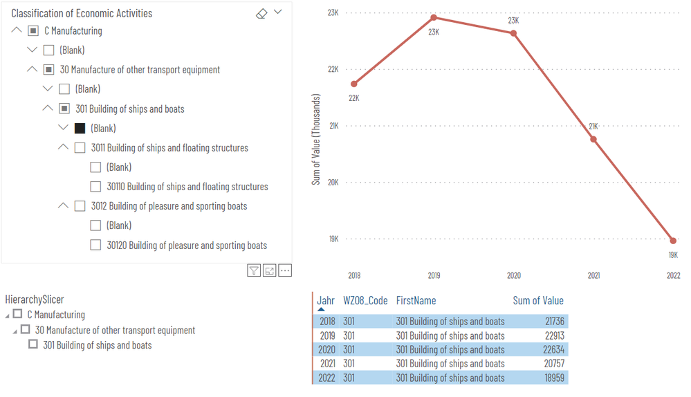
The final report should give something like the following results:
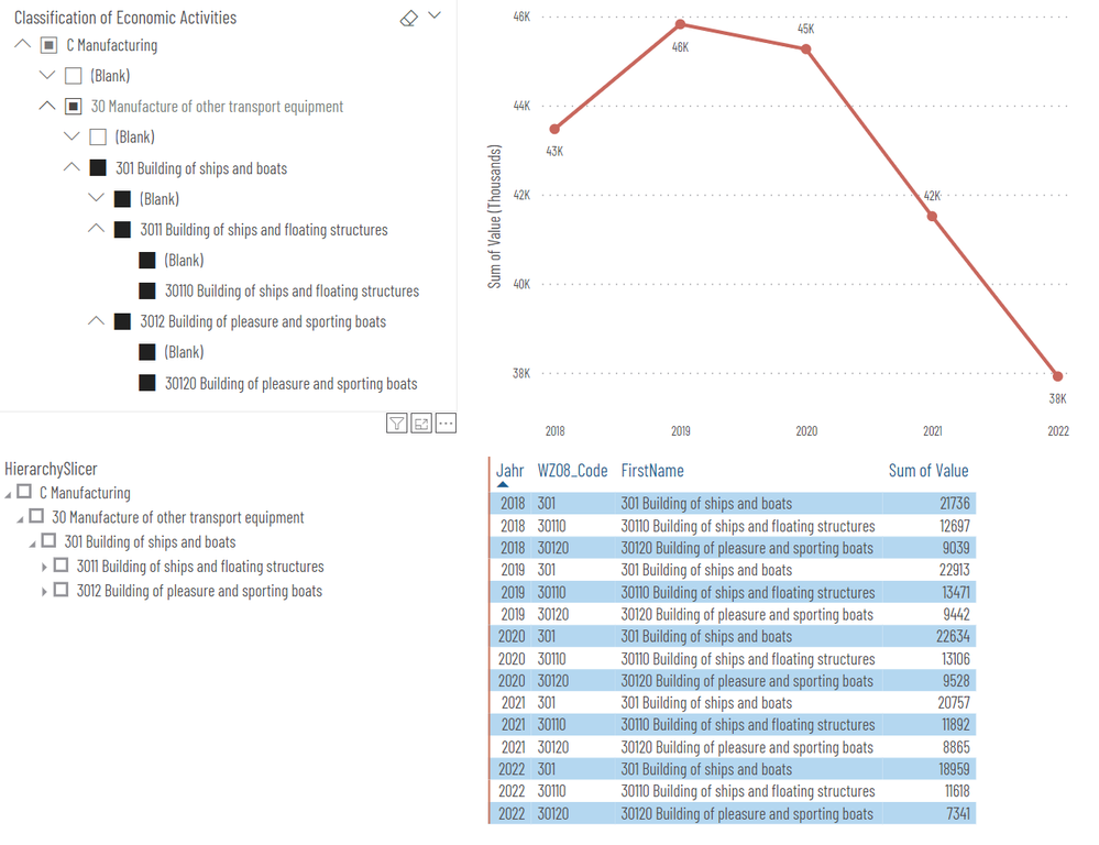
While the filtering using either the standard slicer or custom HierarchySlicer works in general, I find it not very intuitive for the user. However, I’m struggling to improve it. Specifically, when I select a category from the third level (e. g., 301 Building of ships and boats), then values for this category and all its subcategories are summed leading to double counting and wrong numbers in the line chart visual:
What I’d like to achieve is a slicer with blanks removed that shows the same filtering behaviour and results as in the first report screenshot when selecting the fourth level (Blank) but when selecting the third level category 301 Building of ships and boats.
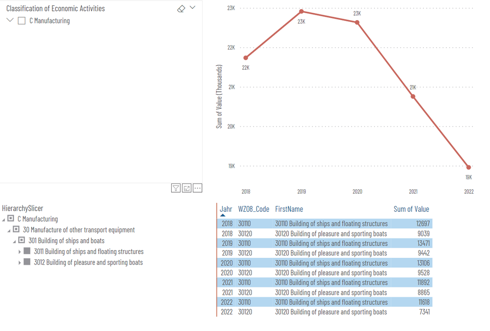
Currently I can only achieve this by multiple selection of the subcategories using CTRL + Select like so:
I appreciate any help and suggestions how to achieve this.
Many thanks in advance!
Solved! Go to Solution.
- Mark as New
- Bookmark
- Subscribe
- Mute
- Subscribe to RSS Feed
- Permalink
- Report Inappropriate Content
Dear Power BI Community,
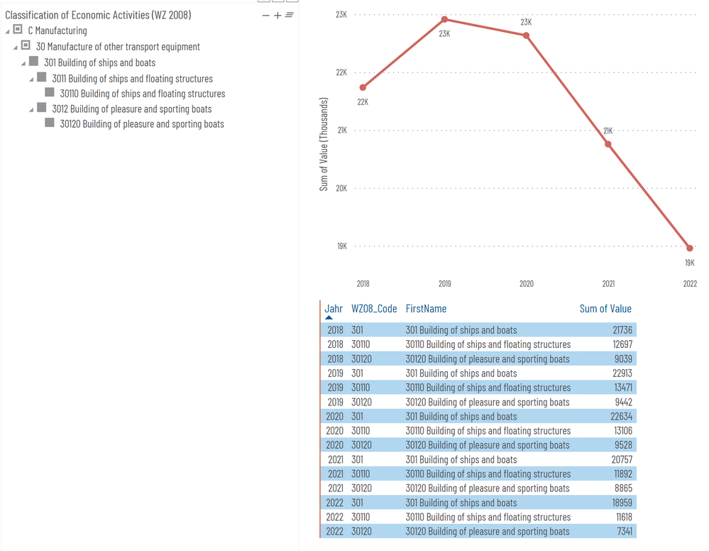
I managed to solve my problem after I realized that I need to simply filter for the lowest level of my hierarchy to achieve correct aggregation of my values using my hierarchy slicer.
I've updated the reproducible example (ReprEx) available on my GitHub, where create a table using DAX that I use for the line chart visual:
ReprEx_FactTable_Level5filtered =
    FILTER(
        ReprEx_FactTable,
        LEN([WZ08_Code]) = 5
    )
Helpful resources
| User | Count |
|---|---|
| 98 | |
| 90 | |
| 83 | |
| 70 | |
| 67 |
| User | Count |
|---|---|
| 113 | |
| 104 | |
| 101 | |
| 73 | |
| 65 |


