Party with Power BI’s own Guy in a Cube
Power BI is turning 10! Tune in for a special live episode on July 24 with behind-the-scenes stories, product evolution highlights, and a sneak peek at what’s in store for the future.
Save the date- Power BI forums
- Get Help with Power BI
- Desktop
- Service
- Report Server
- Power Query
- Mobile Apps
- Developer
- DAX Commands and Tips
- Custom Visuals Development Discussion
- Health and Life Sciences
- Power BI Spanish forums
- Translated Spanish Desktop
- Training and Consulting
- Instructor Led Training
- Dashboard in a Day for Women, by Women
- Galleries
- Webinars and Video Gallery
- Data Stories Gallery
- Themes Gallery
- Contests Gallery
- Quick Measures Gallery
- Notebook Gallery
- Translytical Task Flow Gallery
- R Script Showcase
- Ideas
- Custom Visuals Ideas (read-only)
- Issues
- Issues
- Events
- Upcoming Events
Enhance your career with this limited time 50% discount on Fabric and Power BI exams. Ends August 31st. Request your voucher.
- Power BI forums
- Forums
- Get Help with Power BI
- Desktop
- Re: How to prevent aggregation of data point in sc...
- Subscribe to RSS Feed
- Mark Topic as New
- Mark Topic as Read
- Float this Topic for Current User
- Bookmark
- Subscribe
- Printer Friendly Page
- Mark as New
- Bookmark
- Subscribe
- Mute
- Subscribe to RSS Feed
- Permalink
- Report Inappropriate Content
How to prevent aggregation of data point in scattered plot
Hi,
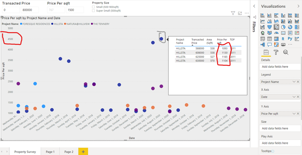
I am facing issue with my scattered plot. PowerBI aggregates my data point (see circled in grey) instead of giving my separate plot on the graph (see circled in red in the top tip and on the y axis). Anyone has a solution to this? I will enclose a dropbox link to the pbix file below if you want to test out your solution. Thank you.
https://www.dropbox.com/s/z3jg236jmu6vugv/Price%20Analyser%20-%20Request%20help.pbix?dl=0

- Mark as New
- Bookmark
- Subscribe
- Mute
- Subscribe to RSS Feed
- Permalink
- Report Inappropriate Content
Hi @fanhui3 ,
Sorry for that you can add date to the x-axis however it then sums the data points.
Normally, the visuals in power bi will show the aggregate value except for table visual.
Or you can create a calculate column and put it in legend.
Column = 'Past Property Transaction Price'[Project Name]&"-"&'Past Property Transaction Price'[Price Per sqft]
Perhaps you can refer this thread, hope it can inspire you.
https://community.powerbi.com/t5/Desktop/Scatter-with-date-on-X-and-time-on-Y/td-p/19030
Best regards,
Community Support Team _ zhenbw
If this post helps, then please consider Accept it as the solution to help the other members find it more quickly.
- Mark as New
- Bookmark
- Subscribe
- Mute
- Subscribe to RSS Feed
- Permalink
- Report Inappropriate Content
Hi @fanhui3 ,
Believe that the issue you have here is the aggregation you are using on the legend, since you are grouping by projects it gives you a sum of all prices per square meter.
What is the type of details you want? You want to present all prices but with colours by project?
Regards
Miguel Félix
Did I answer your question? Mark my post as a solution!
Proud to be a Super User!
Check out my blog: Power BI em Português- Mark as New
- Bookmark
- Subscribe
- Mute
- Subscribe to RSS Feed
- Permalink
- Report Inappropriate Content
Hi, yes!!!! I would like each price to be represented by a separate Dot and that they each coloured by project.
Helpful resources

Power BI Monthly Update - July 2025
Check out the July 2025 Power BI update to learn about new features.

Join our Fabric User Panel
This is your chance to engage directly with the engineering team behind Fabric and Power BI. Share your experiences and shape the future.

| User | Count |
|---|---|
| 68 | |
| 68 | |
| 40 | |
| 29 | |
| 26 |
| User | Count |
|---|---|
| 88 | |
| 49 | |
| 45 | |
| 38 | |
| 37 |

