Fabric Data Days starts November 4th!
Advance your Data & AI career with 50 days of live learning, dataviz contests, hands-on challenges, study groups & certifications and more!
Get registered- Power BI forums
- Get Help with Power BI
- Desktop
- Service
- Report Server
- Power Query
- Mobile Apps
- Developer
- DAX Commands and Tips
- Custom Visuals Development Discussion
- Health and Life Sciences
- Power BI Spanish forums
- Translated Spanish Desktop
- Training and Consulting
- Instructor Led Training
- Dashboard in a Day for Women, by Women
- Galleries
- Data Stories Gallery
- Themes Gallery
- Contests Gallery
- Quick Measures Gallery
- Visual Calculations Gallery
- Notebook Gallery
- Translytical Task Flow Gallery
- TMDL Gallery
- R Script Showcase
- Webinars and Video Gallery
- Ideas
- Custom Visuals Ideas (read-only)
- Issues
- Issues
- Events
- Upcoming Events
Get Fabric Certified for FREE during Fabric Data Days. Don't miss your chance! Learn more
- Power BI forums
- Forums
- Get Help with Power BI
- Desktop
- Re: How to merge two visuals in Power BI
- Subscribe to RSS Feed
- Mark Topic as New
- Mark Topic as Read
- Float this Topic for Current User
- Bookmark
- Subscribe
- Printer Friendly Page
- Mark as New
- Bookmark
- Subscribe
- Mute
- Subscribe to RSS Feed
- Permalink
- Report Inappropriate Content
How to merge two visuals in Power BI
HI Fellows,
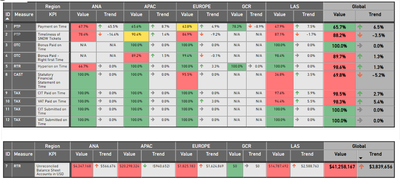
I wonder, how can I merge two same-looking power bi visuals (pivot tables).
The difference between them is that they are using different measures and background formatting rules.
If not possible, is there an option in Power BI not to use the headers? I will crop the visuals and make the illusion of a merger.
Solved! Go to Solution.
- Mark as New
- Bookmark
- Subscribe
- Mute
- Subscribe to RSS Feed
- Permalink
- Report Inappropriate Content
You could probably change your measures and formatting to calculate differently based on the KPI or whatever value required and then just use the one matrix but based on the question you asked.
There's no way that I'm aware of to turn off the headers but you can fake it by changing the formatting of the column headers. Set the text colour to the same colour as your report background. Make sure when you overlap the visuals that the correct one is on top by adjusting the order of the visuals in the selection pane.
This should allow you to achieve what you want.
| Have I solved your problem? Please click Accept as Solution so I don't keep coming back to this post, oh yeah, others may find it useful also ;). |
- Mark as New
- Bookmark
- Subscribe
- Mute
- Subscribe to RSS Feed
- Permalink
- Report Inappropriate Content
Thank you very much for this idea!
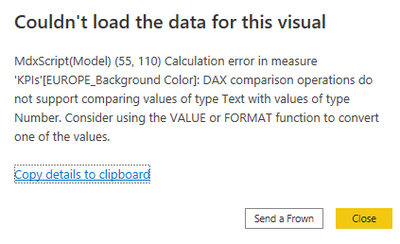
However, I am quite new in DAX. I tried to merge those metrics:

When I gave up on the Currency FORMAT, it works, but $ Values are displayed as a General number. How to fix this?
Thanks for all ideas 🙂
- Mark as New
- Bookmark
- Subscribe
- Mute
- Subscribe to RSS Feed
- Permalink
- Report Inappropriate Content
You could probably change your measures and formatting to calculate differently based on the KPI or whatever value required and then just use the one matrix but based on the question you asked.
There's no way that I'm aware of to turn off the headers but you can fake it by changing the formatting of the column headers. Set the text colour to the same colour as your report background. Make sure when you overlap the visuals that the correct one is on top by adjusting the order of the visuals in the selection pane.
This should allow you to achieve what you want.
| Have I solved your problem? Please click Accept as Solution so I don't keep coming back to this post, oh yeah, others may find it useful also ;). |
Helpful resources

Fabric Data Days
Advance your Data & AI career with 50 days of live learning, contests, hands-on challenges, study groups & certifications and more!

Power BI Monthly Update - October 2025
Check out the October 2025 Power BI update to learn about new features.


