- Power BI forums
- Updates
- News & Announcements
- Get Help with Power BI
- Desktop
- Service
- Report Server
- Power Query
- Mobile Apps
- Developer
- DAX Commands and Tips
- Custom Visuals Development Discussion
- Health and Life Sciences
- Power BI Spanish forums
- Translated Spanish Desktop
- Power Platform Integration - Better Together!
- Power Platform Integrations (Read-only)
- Power Platform and Dynamics 365 Integrations (Read-only)
- Training and Consulting
- Instructor Led Training
- Dashboard in a Day for Women, by Women
- Galleries
- Community Connections & How-To Videos
- COVID-19 Data Stories Gallery
- Themes Gallery
- Data Stories Gallery
- R Script Showcase
- Webinars and Video Gallery
- Quick Measures Gallery
- 2021 MSBizAppsSummit Gallery
- 2020 MSBizAppsSummit Gallery
- 2019 MSBizAppsSummit Gallery
- Events
- Ideas
- Custom Visuals Ideas
- Issues
- Issues
- Events
- Upcoming Events
- Community Blog
- Power BI Community Blog
- Custom Visuals Community Blog
- Community Support
- Community Accounts & Registration
- Using the Community
- Community Feedback
Register now to learn Fabric in free live sessions led by the best Microsoft experts. From Apr 16 to May 9, in English and Spanish.
- Power BI forums
- Forums
- Get Help with Power BI
- Desktop
- How to make a timeline-circle chart?
- Subscribe to RSS Feed
- Mark Topic as New
- Mark Topic as Read
- Float this Topic for Current User
- Bookmark
- Subscribe
- Printer Friendly Page
- Mark as New
- Bookmark
- Subscribe
- Mute
- Subscribe to RSS Feed
- Permalink
- Report Inappropriate Content
How to make a timeline-circle chart?
Hi there. I need to make a timeline-based chart with circles and didn't manage to find a solution.
There are 3 categories and each one has a score from 1 to 10 which should be displayed as a circle, and the bigger the score, the bigger the circle should be. Also there are days when they was measured. I need to show all these categories together at the time interval and didn't manage to find a solution. At first i though about using Scatter Plot, but it supports only 1 category and i need 3. Then i tried to use linear chart - it works fine, but there isn't an option to increase the size of a dot. Also searched for custom visuals but found nothing.
There is a video of what i need to implement in Tableau - it's exactly what i need, but don't know how to do it.
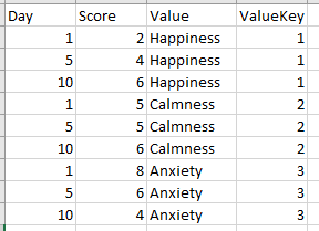
Test data:
How it shold be:
Will be glad if someone will help, good day anyway.
Solved! Go to Solution.
- Mark as New
- Bookmark
- Subscribe
- Mute
- Subscribe to RSS Feed
- Permalink
- Report Inappropriate Content
My decision was the next one: I changed my data table to the next format and then pasted it into the Scatter plot (Days to X, ValueKey to Y and Score to values). Although I need Value column in Y axis it doesn't work with categorical values, so instead I used created numerical ValueKey column, hid the humbers and passed the table visual with names left to it - not the prefect solution but it works.
- Mark as New
- Bookmark
- Subscribe
- Mute
- Subscribe to RSS Feed
- Permalink
- Report Inappropriate Content
Hello @Yonko ,
Check if the scatter chart would match your case,
refer to this link https://learn.microsoft.com/en-us/power-bi/visuals/power-bi-visualization-scatter?tabs=powerbi-deskt...
If I answered your question, please mark my post as solution, Appreciate your Kudos 👍
Proud to be a Super User! |  |
Helpful resources

Microsoft Fabric Learn Together
Covering the world! 9:00-10:30 AM Sydney, 4:00-5:30 PM CET (Paris/Berlin), 7:00-8:30 PM Mexico City

Power BI Monthly Update - April 2024
Check out the April 2024 Power BI update to learn about new features.

| User | Count |
|---|---|
| 114 | |
| 99 | |
| 83 | |
| 70 | |
| 61 |
| User | Count |
|---|---|
| 149 | |
| 114 | |
| 107 | |
| 89 | |
| 67 |


