Party with Power BI’s own Guy in a Cube
Power BI is turning 10! Tune in for a special live episode on July 24 with behind-the-scenes stories, product evolution highlights, and a sneak peek at what’s in store for the future.
Save the date- Power BI forums
- Get Help with Power BI
- Desktop
- Service
- Report Server
- Power Query
- Mobile Apps
- Developer
- DAX Commands and Tips
- Custom Visuals Development Discussion
- Health and Life Sciences
- Power BI Spanish forums
- Translated Spanish Desktop
- Training and Consulting
- Instructor Led Training
- Dashboard in a Day for Women, by Women
- Galleries
- Webinars and Video Gallery
- Data Stories Gallery
- Themes Gallery
- Contests Gallery
- Quick Measures Gallery
- Notebook Gallery
- Translytical Task Flow Gallery
- R Script Showcase
- Ideas
- Custom Visuals Ideas (read-only)
- Issues
- Issues
- Events
- Upcoming Events
Enhance your career with this limited time 50% discount on Fabric and Power BI exams. Ends August 31st. Request your voucher.
- Power BI forums
- Forums
- Get Help with Power BI
- Desktop
- How to get column in x axis of bar chart using mea...
- Subscribe to RSS Feed
- Mark Topic as New
- Mark Topic as Read
- Float this Topic for Current User
- Bookmark
- Subscribe
- Printer Friendly Page
- Mark as New
- Bookmark
- Subscribe
- Mute
- Subscribe to RSS Feed
- Permalink
- Report Inappropriate Content
How to get column in x axis of bar chart using measure
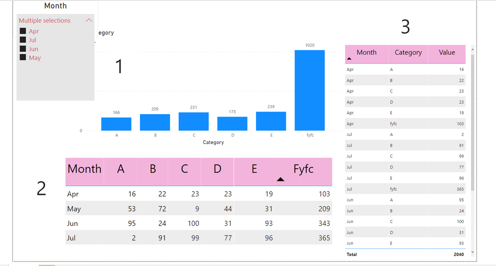
I want to create Graph 1 but my table structure is as Table 2, any measure to achieve this.
Also when table 2 is unpivoted (Table 3) then only its showing total otherwise Total is not appearing in Table 2.
Please help me resolve it, Thanking you in advance
Solved! Go to Solution.
- Mark as New
- Bookmark
- Subscribe
- Mute
- Subscribe to RSS Feed
- Permalink
- Report Inappropriate Content
Hi @Harsh333,
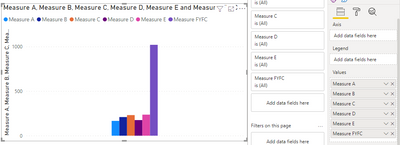
I'm not sure if I got your point accurately. You can create a separate measure for each category.
Measure A = CALCULATE(SUM(Test[A]),ALLEXCEPT(Test,Test[Month]))

Measure B= CALCULATE(SUM(Test[B]),ALLEXCEPT(Test,Test[Month]))

Measure C= CALCULATE(SUM(Test[C]),ALLEXCEPT(Test,Test[Month]))

Measure D= CALCULATE(SUM(Test[D]),ALLEXCEPT(Test,Test[Month]))

Measure E= CALCULATE(SUM(Test[E]),ALLEXCEPT(Test,Test[Month]))

Measure FYFC = CALCULATE(SUM(Test[FYFC]),ALLEXCEPT(Test,Test[Month]))
Then put your measure in the chart, you will get a result like this:
There is another, more convenient solution but it does not use measure.
Based on what you mentioned above, you can unpivot Table2. You can enter data after unpivot into Power BI Desktop as Table 3.
Then use Table 3 to create a matrix like this:
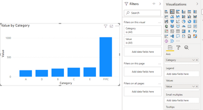
Then adjust the matrix chart to a column chart. Put category in Axis. You can see this:
A demo is attached for your reference.
Hope it helps.
Best Regards,
Caitlyn Yan
If this post helps then please consider Accept it as the solution to help the other members find it more quickly.
- Mark as New
- Bookmark
- Subscribe
- Mute
- Subscribe to RSS Feed
- Permalink
- Report Inappropriate Content
@Anonymous , refer if this custom visual can help
https://appsource.microsoft.com/en-us/product/power-bi-visuals/wa200000675?tab=overview
- Mark as New
- Bookmark
- Subscribe
- Mute
- Subscribe to RSS Feed
- Permalink
- Report Inappropriate Content
Sorry but I think you misunderstood my problem:
I want to created above bar graph (1) if my table was structured as (2).
not bar graph with table.
Helpful resources

Power BI Monthly Update - July 2025
Check out the July 2025 Power BI update to learn about new features.

Join our Fabric User Panel
This is your chance to engage directly with the engineering team behind Fabric and Power BI. Share your experiences and shape the future.

| User | Count |
|---|---|
| 70 | |
| 68 | |
| 43 | |
| 34 | |
| 26 |
| User | Count |
|---|---|
| 86 | |
| 49 | |
| 45 | |
| 38 | |
| 37 |


