- Subscribe to RSS Feed
- Mark Topic as New
- Mark Topic as Read
- Float this Topic for Current User
- Bookmark
- Subscribe
- Printer Friendly Page
- Mark as New
- Bookmark
- Subscribe
- Mute
- Subscribe to RSS Feed
- Permalink
- Report Inappropriate Content
How to create Dynamic reports in Power BI
Hi Experts,
I am working on a dynamic report.
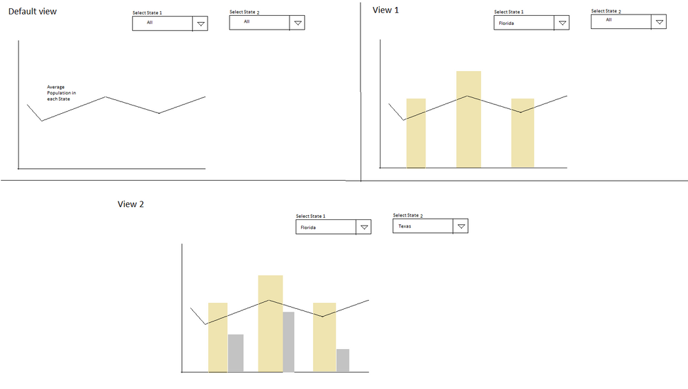
This report is a Line Graph which is the default view. This graph shows the Average Population in US states. It includes 2 filters called ' Select City 1' and 'Select City 2' as shown below. If user selects any value in Filters then the related bars should appear as shown below. Please help me, how can we achieve these functionality.
Many Thanks.
- Mark as New
- Bookmark
- Subscribe
- Mute
- Subscribe to RSS Feed
- Permalink
- Report Inappropriate Content
Hi @Anonymous,
This is possible. Please share sample data. Mask the sensitive parts first.
What's it in the x-axis? Why does a state have three columns?
The idea is using a measure to show blank when no selection is made.
Best Regards,
Dale
If this post helps, then please consider Accept it as the solution to help the other members find it more quickly.
- Mark as New
- Bookmark
- Subscribe
- Mute
- Subscribe to RSS Feed
- Permalink
- Report Inappropriate Content
Many thanks for your reply.
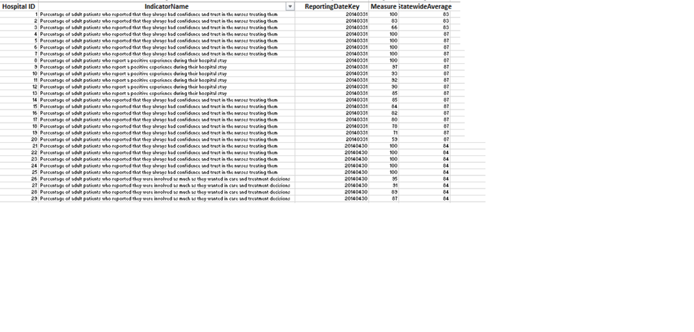
I am sharing the Power BI file which includes the sample data which includes Hospitals, Performance Indicators for each hospital, Measure (how indicator if performing), Statewide Average (for each indicator)
X axis - ReportingDate
Y Axis - Measure
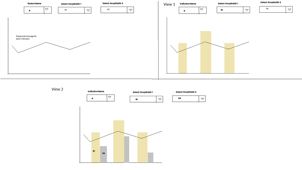
Basically we would have a filter for the IndicatorName selection and a line graph intially which will show each Indicator's statewide average for that reporting period
We need HospitalID filter twice as we want to compare the results for two hospitals.
I did not find the option to attach the file. So, i have captured screenshots of Smaple Data and Expected output.
Please advise, how can we get this visual created in Power BI. Really in need and would appreciate your help.
- Mark as New
- Bookmark
- Subscribe
- Mute
- Subscribe to RSS Feed
- Permalink
- Report Inappropriate Content
Hi @Anonymous,
It's easy to create visuals in Power BI. You just need to drag these columns to the fields of the visual. The key issue here is the two slicers of "HospitalID". The slicers work with "AND" operator. So the result of your image isn't 81 or 24 if they have the same field from the same column. It's nothing. The solution could like it in the snapshot below.
Please download the demo from the attachment.
Best Regards,
Dale
If this post helps, then please consider Accept it as the solution to help the other members find it more quickly.
- Mark as New
- Bookmark
- Subscribe
- Mute
- Subscribe to RSS Feed
- Permalink
- Report Inappropriate Content
Many thanks for your reply. I am going by your idea.
I have downloaded the pbix file as well.
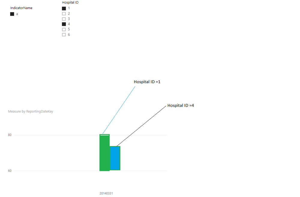
As per your screenshot, We can have just one slicer for selecting two different Hospital IDs. Once we select any two,Hospital IDs then we should have two bars for each Time period. Each bar is for each hospital as we are comparing values for each hospital as shown in the below screenshot.
Please guide me , how can we do this in Power BI.
- Mark as New
- Bookmark
- Subscribe
- Mute
- Subscribe to RSS Feed
- Permalink
- Report Inappropriate Content
Hi @Anonymous,
Please try to add the HospitalID in the legend. Please refer to the snapshot below. I have modified a little data to make the visual more vivid.
Best Regards,
Dale
If this post helps, then please consider Accept it as the solution to help the other members find it more quickly.
Helpful resources

Join us at the Microsoft Fabric Community Conference
March 31 - April 2, 2025, in Las Vegas, Nevada. Use code MSCUST for a $150 discount!

Power BI Monthly Update - February 2025
Check out the February 2025 Power BI update to learn about new features.

| Subject | Author | Posted | |
|---|---|---|---|
| 06-17-2024 09:57 AM | |||
| 02-22-2024 04:12 AM | |||
| 07-08-2024 09:17 AM | |||
| 06-06-2024 10:41 AM | |||
| 11-04-2020 01:51 AM |
| User | Count |
|---|---|
| 83 | |
| 81 | |
| 52 | |
| 37 | |
| 36 |
| User | Count |
|---|---|
| 104 | |
| 85 | |
| 47 | |
| 43 | |
| 42 |


