- Power BI forums
- Updates
- News & Announcements
- Get Help with Power BI
- Desktop
- Service
- Report Server
- Power Query
- Mobile Apps
- Developer
- DAX Commands and Tips
- Custom Visuals Development Discussion
- Health and Life Sciences
- Power BI Spanish forums
- Translated Spanish Desktop
- Power Platform Integration - Better Together!
- Power Platform Integrations (Read-only)
- Power Platform and Dynamics 365 Integrations (Read-only)
- Training and Consulting
- Instructor Led Training
- Dashboard in a Day for Women, by Women
- Galleries
- Community Connections & How-To Videos
- COVID-19 Data Stories Gallery
- Themes Gallery
- Data Stories Gallery
- R Script Showcase
- Webinars and Video Gallery
- Quick Measures Gallery
- 2021 MSBizAppsSummit Gallery
- 2020 MSBizAppsSummit Gallery
- 2019 MSBizAppsSummit Gallery
- Events
- Ideas
- Custom Visuals Ideas
- Issues
- Issues
- Events
- Upcoming Events
- Community Blog
- Power BI Community Blog
- Custom Visuals Community Blog
- Community Support
- Community Accounts & Registration
- Using the Community
- Community Feedback
Register now to learn Fabric in free live sessions led by the best Microsoft experts. From Apr 16 to May 9, in English and Spanish.
- Power BI forums
- Forums
- Get Help with Power BI
- Desktop
- How to calculate sales growth monthly and quarterl...
- Subscribe to RSS Feed
- Mark Topic as New
- Mark Topic as Read
- Float this Topic for Current User
- Bookmark
- Subscribe
- Printer Friendly Page
- Mark as New
- Bookmark
- Subscribe
- Mute
- Subscribe to RSS Feed
- Permalink
- Report Inappropriate Content
How to calculate sales growth monthly and quarterly and added the same in drill down?
Hi
I am creating a chart to visualize the comparison between the market and products with showing sales and sales growth for monthly and quarterly. I need to add these feature in the chart as a drill-down.
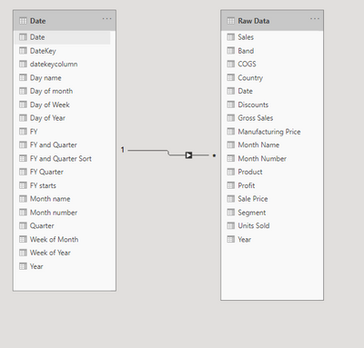
My data has two tables one is a date table and another one is raw data
I have created a clustered bar graph using the country column as a market and sales. Product in the legend for the comparison. Now I need to calculate sales growth for monthly and quarterly and show it as a line in the bar graph. The idea is to show both sales vs sales growth in each market against different products. This has to be in drill-down features for both monthly and quarterly.
Could you please advise how to calculate the sales growth and also am I using the right chart?
Solved! Go to Solution.
- Mark as New
- Bookmark
- Subscribe
- Mute
- Subscribe to RSS Feed
- Permalink
- Report Inappropriate Content
Hi @Jason2500 ,
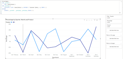
If caluculated the sales growth for each product, the line number must be the same the number of products.
Create a measure like this to calculate the percentage:
Percentage =
VAR _current =
    SUM ( Sales[Sales] )
VAR _previous =
    CALCULATE ( SUM ( Sales[Sales] ), DATEADD ( 'Calendar'[Date], -1, MONTH ) )
RETURN
    DIVIDE ( _current - _previous, _previous, BLANK () )
Attached a sample file in the below, hopes it could help.
Best Regards,
Community Support Team _ Yingjie Li
If this post helps, then please consider Accept it as the solution to help the other members find it more quickly.
- Mark as New
- Bookmark
- Subscribe
- Mute
- Subscribe to RSS Feed
- Permalink
- Report Inappropriate Content
@Jason2500 , Line in clustered column chart will not split by legend. (Product)
Check for any custom visual for that
https://appsource.microsoft.com/en-us/marketplace/apps?product=power-bi-visuals
You have to keep both line or use measure slicer to switch lines
measure slicer
https://www.youtube.com/watch?v=b9352Vxuj-M
https://community.powerbi.com/t5/Desktop/Slicer-MTD-QTD-YTD-to-filter-dates-using-the-slicer/td-p/50...
https://radacad.com/change-the-column-or-measure-value-in-a-power-bi-visual-by-selection-of-the-slic...
https://www.youtube.com/watch?v=vlnx7QUVYME
For QOQ and MOM
Power BI — Qtr on Qtr with or Without Time Intelligence
https://medium.com/@amitchandak.1978/power-bi-qtd-questions-time-intelligence-2-5-d842063da839
https://www.youtube.com/watch?v=8-TlVx7P0A0
Power BI — Month on Month with or Without Time Intelligence
https://medium.com/@amitchandak.1978/power-bi-mtd-questions-time-intelligence-3-5-64b0b4a4090e
https://www.youtube.com/watch?v=6LUBbvcxtKA
Microsoft Power BI Learning Resources, 2023 !!
Learn Power BI - Full Course with Dec-2022, with Window, Index, Offset, 100+ Topics !!
Did I answer your question? Mark my post as a solution! Appreciate your Kudos !! Proud to be a Super User! !!
Helpful resources

Microsoft Fabric Learn Together
Covering the world! 9:00-10:30 AM Sydney, 4:00-5:30 PM CET (Paris/Berlin), 7:00-8:30 PM Mexico City

Power BI Monthly Update - April 2024
Check out the April 2024 Power BI update to learn about new features.

| User | Count |
|---|---|
| 115 | |
| 100 | |
| 88 | |
| 69 | |
| 61 |
| User | Count |
|---|---|
| 152 | |
| 120 | |
| 102 | |
| 87 | |
| 68 |


