- Subscribe to RSS Feed
- Mark Topic as New
- Mark Topic as Read
- Float this Topic for Current User
- Bookmark
- Subscribe
- Printer Friendly Page
- Mark as New
- Bookmark
- Subscribe
- Mute
- Subscribe to RSS Feed
- Permalink
- Report Inappropriate Content

How to add a total column to Stacked Bar chart
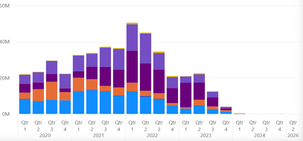
I have a chart like this. They want to see a bar with total amount for each year as well with quaters. How do i do that? Is that even possible? On x-axis there are two columns used first year then quarter.
Thanks in advance.
Solved! Go to Solution.
- Mark as New
- Bookmark
- Subscribe
- Mute
- Subscribe to RSS Feed
- Permalink
- Report Inappropriate Content

Hi @Karnik_
There is no option to add a total stacked column in a standard generic way.
There are some workarounds to do it like in the linked discussion, but then you should make some changes in your data table to achieve it (note that it includes sample file)
https://community.fabric.microsoft.com/t5/Desktop/Stacked-Column-Chart-add-Total-column/m-p/785693
Personally from the point of view of effective data visualization, I don't recommend using this kind of graphs at all because there are not really have some informational value. As an alternative, you can use a matrix with conditional formatting of bars. Please refer to the attached blog post:
"Home experiments" and stacked bar graphs (madeiradata.com)
If this post helps, then please consider Accepting it as the solution to help the other members find it more quickly
Rita Fainshtein | Microsoft MVP
https://www.linkedin.com/in/rita-fainshtein/
Blog : https://www.madeiradata.com/profile/ritaf/profile
- Mark as New
- Bookmark
- Subscribe
- Mute
- Subscribe to RSS Feed
- Permalink
- Report Inappropriate Content

Hi @Karnik_
There is no option to add a total stacked column in a standard generic way.
There are some workarounds to do it like in the linked discussion, but then you should make some changes in your data table to achieve it (note that it includes sample file)
https://community.fabric.microsoft.com/t5/Desktop/Stacked-Column-Chart-add-Total-column/m-p/785693
Personally from the point of view of effective data visualization, I don't recommend using this kind of graphs at all because there are not really have some informational value. As an alternative, you can use a matrix with conditional formatting of bars. Please refer to the attached blog post:
"Home experiments" and stacked bar graphs (madeiradata.com)
If this post helps, then please consider Accepting it as the solution to help the other members find it more quickly
Rita Fainshtein | Microsoft MVP
https://www.linkedin.com/in/rita-fainshtein/
Blog : https://www.madeiradata.com/profile/ritaf/profile


