- Power BI forums
- Updates
- News & Announcements
- Get Help with Power BI
- Desktop
- Service
- Report Server
- Power Query
- Mobile Apps
- Developer
- DAX Commands and Tips
- Custom Visuals Development Discussion
- Health and Life Sciences
- Power BI Spanish forums
- Translated Spanish Desktop
- Power Platform Integration - Better Together!
- Power Platform Integrations (Read-only)
- Power Platform and Dynamics 365 Integrations (Read-only)
- Training and Consulting
- Instructor Led Training
- Dashboard in a Day for Women, by Women
- Galleries
- Community Connections & How-To Videos
- COVID-19 Data Stories Gallery
- Themes Gallery
- Data Stories Gallery
- R Script Showcase
- Webinars and Video Gallery
- Quick Measures Gallery
- 2021 MSBizAppsSummit Gallery
- 2020 MSBizAppsSummit Gallery
- 2019 MSBizAppsSummit Gallery
- Events
- Ideas
- Custom Visuals Ideas
- Issues
- Issues
- Events
- Upcoming Events
- Community Blog
- Power BI Community Blog
- Custom Visuals Community Blog
- Community Support
- Community Accounts & Registration
- Using the Community
- Community Feedback
Register now to learn Fabric in free live sessions led by the best Microsoft experts. From Apr 16 to May 9, in English and Spanish.
- Power BI forums
- Forums
- Get Help with Power BI
- Desktop
- Help with my stock charts
- Subscribe to RSS Feed
- Mark Topic as New
- Mark Topic as Read
- Float this Topic for Current User
- Bookmark
- Subscribe
- Printer Friendly Page
- Mark as New
- Bookmark
- Subscribe
- Mute
- Subscribe to RSS Feed
- Permalink
- Report Inappropriate Content
Help with my stock charts
Hello.
I completed very basic BI training this week so wanted to give it a try.
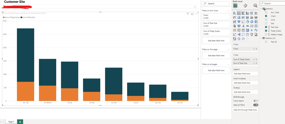
I'm trying to display chemical tank levels of products used by customers. I have a slicer set up so that the only products that show up are the ones exclusive to the customer.
As you can see below the orange displays the chemical stock level against the total quanity the chemical tank can take (blue).
The problem I have encountered is that there is sometimes more than one tank of product. For example the AC-150 should be split into two separate bars. I have Tank ID data available - each tank has a unique number. I'm struggling to work out how to split products by their Tank ID so that multiple bars of data show for one product (if required). So in the above image, I would like to see two bars for the AC-150.
Many thanks.
Solved! Go to Solution.
- Mark as New
- Bookmark
- Subscribe
- Mute
- Subscribe to RSS Feed
- Permalink
- Report Inappropriate Content
Unfortunately, I don't think it's possible with this chart by keeping the tank size on X-Axis.
You may use a measure like
% Tank Filled = SUM(YourTable[Today Guess]) / SUM(YourTable[Tank Size])
And show this in an other 100% diagram.
Have a nice day
- Mark as New
- Bookmark
- Subscribe
- Mute
- Subscribe to RSS Feed
- Permalink
- Report Inappropriate Content
- Mark as New
- Bookmark
- Subscribe
- Mute
- Subscribe to RSS Feed
- Permalink
- Report Inappropriate Content
Hey @OpsCord ,
It's look like your data is missing a lot, your 'Today Guess' and your 'Tank Size' are only associated with your 'Chem', you need them to be associated with 'Chem' and 'Chem 'Tank ID' at least.
As what you showed us, your table 'Statistics (2)' is useless.
If you are able to add your tank ID in Your 'Statistics' table just add it below Chem in X-axis.
Have a nice day
- Mark as New
- Bookmark
- Subscribe
- Mute
- Subscribe to RSS Feed
- Permalink
- Report Inappropriate Content
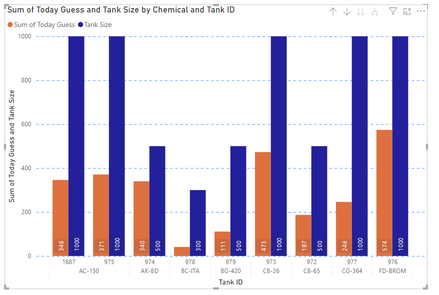
Thanks @Timuran
With your help I've got to this stage.
What I need to do now is have something that shows the actual level in the tank.
So for example, tank ID 1687 is total 1000L. Yet the level may be 500L. So it displays the actual level in bold and the tank size in a different colour. Hope this makes sense.
- Mark as New
- Bookmark
- Subscribe
- Mute
- Subscribe to RSS Feed
- Permalink
- Report Inappropriate Content
- Mark as New
- Bookmark
- Subscribe
- Mute
- Subscribe to RSS Feed
- Permalink
- Report Inappropriate Content
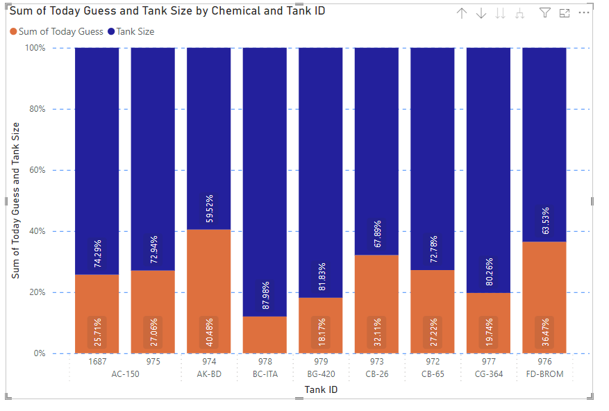
Thanks again @Timuran
This is where I'm at:
Ideally I would like to display it like a % stacked column chart however this isn't ideal as I want to display actual numbers and not %. Is there a way around this?
Appreciate the help. 🙂
- Mark as New
- Bookmark
- Subscribe
- Mute
- Subscribe to RSS Feed
- Permalink
- Report Inappropriate Content
Unfortunately, I don't think it's possible with this chart by keeping the tank size on X-Axis.
You may use a measure like
% Tank Filled = SUM(YourTable[Today Guess]) / SUM(YourTable[Tank Size])
And show this in an other 100% diagram.
Have a nice day
Helpful resources

Microsoft Fabric Learn Together
Covering the world! 9:00-10:30 AM Sydney, 4:00-5:30 PM CET (Paris/Berlin), 7:00-8:30 PM Mexico City

Power BI Monthly Update - April 2024
Check out the April 2024 Power BI update to learn about new features.

| User | Count |
|---|---|
| 111 | |
| 95 | |
| 77 | |
| 68 | |
| 54 |
| User | Count |
|---|---|
| 144 | |
| 105 | |
| 102 | |
| 89 | |
| 63 |


