FabCon is coming to Atlanta
Join us at FabCon Atlanta from March 16 - 20, 2026, for the ultimate Fabric, Power BI, AI and SQL community-led event. Save $200 with code FABCOMM.
Register now!- Power BI forums
- Get Help with Power BI
- Desktop
- Service
- Report Server
- Power Query
- Mobile Apps
- Developer
- DAX Commands and Tips
- Custom Visuals Development Discussion
- Health and Life Sciences
- Power BI Spanish forums
- Translated Spanish Desktop
- Training and Consulting
- Instructor Led Training
- Dashboard in a Day for Women, by Women
- Galleries
- Data Stories Gallery
- Themes Gallery
- Contests Gallery
- QuickViz Gallery
- Quick Measures Gallery
- Visual Calculations Gallery
- Notebook Gallery
- Translytical Task Flow Gallery
- TMDL Gallery
- R Script Showcase
- Webinars and Video Gallery
- Ideas
- Custom Visuals Ideas (read-only)
- Issues
- Issues
- Events
- Upcoming Events
The Power BI Data Visualization World Championships is back! It's time to submit your entry. Live now!
- Power BI forums
- Forums
- Get Help with Power BI
- Desktop
- Help with graph + tooltip
- Subscribe to RSS Feed
- Mark Topic as New
- Mark Topic as Read
- Float this Topic for Current User
- Bookmark
- Subscribe
- Printer Friendly Page
- Mark as New
- Bookmark
- Subscribe
- Mute
- Subscribe to RSS Feed
- Permalink
- Report Inappropriate Content
Help with graph + tooltip
Hello
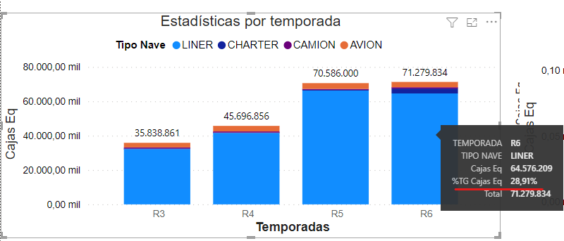
Currently I am looking for a way to be able to show in a graph certain information in the tooltip, Currently the graph shows the number of "eq boxes" that each "SEASON" contains category by "SHIP TYPE".
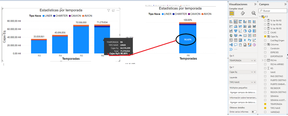
The problem that arises is when you want to add "Eq Boxes" to the tooltip section of the created graph, once added "%TG Eq Boxes" does not yield the correct percentage of "Eq Boxes" referring to the "SHIP TYPE" (SHIP TYPE is the legend of the graph) by "SEASON".
Currently the graph only interacts with segmenters "TYPE SHIP" and "DESTINATION COUNTRY"
I leave in images what I want to show in the graph if possible.
This shows the graph currently:
what I need to show:
of course, I thank you for your help!
Solved! Go to Solution.
- Mark as New
- Bookmark
- Subscribe
- Mute
- Subscribe to RSS Feed
- Permalink
- Report Inappropriate Content
@Syndicate_Admin , based on what I got.
You need a measure like
divide([measure], calculate([measure], removefilters(Table[Tipo Nave]) ) )
- Mark as New
- Bookmark
- Subscribe
- Mute
- Subscribe to RSS Feed
- Permalink
- Report Inappropriate Content
@Syndicate_Admin , based on what I got.
You need a measure like
divide([measure], calculate([measure], removefilters(Table[Tipo Nave]) ) )
- Mark as New
- Bookmark
- Subscribe
- Mute
- Subscribe to RSS Feed
- Permalink
- Report Inappropriate Content
Thank you very much, it was the solution to my problem.
boxes eq2 = SUMX('B D', 'B D'[KG.]/5)
help = DIVIDE([eq2 boxes], CALCULATE([eq2 boxes], REMOVEFILTERS('B D'[SHIP TYPE])))
Helpful resources
| User | Count |
|---|---|
| 49 | |
| 37 | |
| 31 | |
| 22 | |
| 19 |
| User | Count |
|---|---|
| 132 | |
| 100 | |
| 56 | |
| 37 | |
| 37 |


