This time we’re going bigger than ever. Fabric, Power BI, SQL, AI and more. We're covering it all. You won't want to miss it.
Learn moreLevel up your Power BI skills this month - build one visual each week and tell better stories with data! Get started
Hello All,
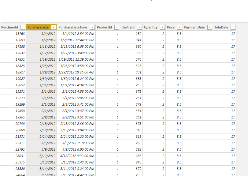
i have tables like this
Now, iam asked to visualize Products having growth rate lesser than CAGR (Based on average sales). Iam able to get formulas for Cagr in website, but unable to match with my scenario(like which columns to use). I have period of 4 years in my table. Can anyone tell me how to calculate Growthrate and Cagr and what will be best visual to show this using columns in my tables
@Anonymous
You may research quick measure Year-over-year change and take a look at this post, then try using Line and clustered column chart.
Thanks for the reply. How does the year over year change works here.
Check out the April 2026 Power BI update to learn about new features.
Sign up to receive a private message when registration opens and key events begin.
If you have recently started exploring Fabric, we'd love to hear how it's going. Your feedback can help with product improvements.
| User | Count |
|---|---|
| 35 | |
| 33 | |
| 26 | |
| 22 | |
| 18 |
| User | Count |
|---|---|
| 66 | |
| 36 | |
| 32 | |
| 26 | |
| 23 |