- Power BI forums
- Updates
- News & Announcements
- Get Help with Power BI
- Desktop
- Service
- Report Server
- Power Query
- Mobile Apps
- Developer
- DAX Commands and Tips
- Custom Visuals Development Discussion
- Health and Life Sciences
- Power BI Spanish forums
- Translated Spanish Desktop
- Power Platform Integration - Better Together!
- Power Platform Integrations (Read-only)
- Power Platform and Dynamics 365 Integrations (Read-only)
- Training and Consulting
- Instructor Led Training
- Dashboard in a Day for Women, by Women
- Galleries
- Community Connections & How-To Videos
- COVID-19 Data Stories Gallery
- Themes Gallery
- Data Stories Gallery
- R Script Showcase
- Webinars and Video Gallery
- Quick Measures Gallery
- 2021 MSBizAppsSummit Gallery
- 2020 MSBizAppsSummit Gallery
- 2019 MSBizAppsSummit Gallery
- Events
- Ideas
- Custom Visuals Ideas
- Issues
- Issues
- Events
- Upcoming Events
- Community Blog
- Power BI Community Blog
- Custom Visuals Community Blog
- Community Support
- Community Accounts & Registration
- Using the Community
- Community Feedback
Register now to learn Fabric in free live sessions led by the best Microsoft experts. From Apr 16 to May 9, in English and Spanish.
- Power BI forums
- Forums
- Get Help with Power BI
- Desktop
- Get percentage of each status by customer and rank...
- Subscribe to RSS Feed
- Mark Topic as New
- Mark Topic as Read
- Float this Topic for Current User
- Bookmark
- Subscribe
- Printer Friendly Page
- Mark as New
- Bookmark
- Subscribe
- Mute
- Subscribe to RSS Feed
- Permalink
- Report Inappropriate Content
Get percentage of each status by customer and rank them in a visual
Hi,
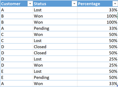
I have a single table with a list of customers, and status for each of their leads. What I what to do is to calculate the percentage per customer of each of these statuses like 50% Won and 50% Lost (see example in the picture below). Once I get this percentage for each of the customers, I would like to visually show a ranking of the customers like this:
1. Visual showing top 3 customers by won leads
2. Visual showing top 3 customers by lost leads
For example, in the table below, we can see that A won 33% of his total leads, 33% are still in pending status and 33% are lost.
On the other hand, B won 100% of his leads, while C, who got two leads, won one of them which corresponds to 50%. In the "Top 3 wining %" I would like to see: 1.B - 100%, 2.C - 50%, 3.A - 33%
Thanks for your help. Have a good day!
Solved! Go to Solution.
- Mark as New
- Bookmark
- Subscribe
- Mute
- Subscribe to RSS Feed
- Permalink
- Report Inappropriate Content
Hi, @BBrg
According to your description and the sample picture, I can clearly understand your requirement, you can try my steps:
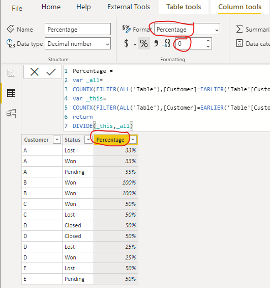
- Create a calculated column in the data table like this:
Percentage =

var _all=

COUNTX(FILTER(ALL('Table'),[Customer]=EARLIER('Table'[Customer])),[Customer])

var _this=

COUNTX(FILTER(ALL('Table'),[Customer]=EARLIER('Table'[Customer])&&[Status]=EARLIER('Table'[Status])),[Customer])

return

DIVIDE(_this,_all)
Then change the column format like this:
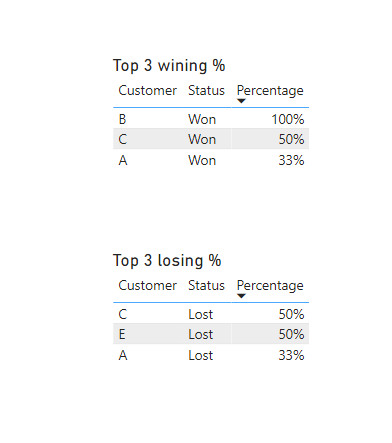
- Create a table visual and place fields and apply filters like this:
- Then do the same thing for another “Losing table” and give them a title, and you can get what you want, like this:
You can download my test pbix file here
Best Regards,
Community Support Team _Robert Qin
If this post helps, then please consider Accept it as the solution to help the other members find it more quickly.
- Mark as New
- Bookmark
- Subscribe
- Mute
- Subscribe to RSS Feed
- Permalink
- Report Inappropriate Content
Hi @v-robertq-msft ,
Thanks so much for your detailed answer.
Following your formula, I managed to create the "percentage" column and it works fine.
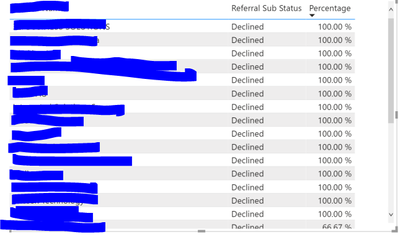
However, When trying to create the visual, and filter for Top 3, I get more than 3 entries, as can be seen below. The first column has customer's names. Any idea why that might happen?
In your pbix file, I can see that it works as expected, instead.
- Mark as New
- Bookmark
- Subscribe
- Mute
- Subscribe to RSS Feed
- Permalink
- Report Inappropriate Content
Ah, I think that I know why.
The table shows top 3 percentages (100, 66,67, 50) in the "percentage" column. Not the top 3 customers. hmmm
Helpful resources

Microsoft Fabric Learn Together
Covering the world! 9:00-10:30 AM Sydney, 4:00-5:30 PM CET (Paris/Berlin), 7:00-8:30 PM Mexico City

Power BI Monthly Update - April 2024
Check out the April 2024 Power BI update to learn about new features.

| User | Count |
|---|---|
| 110 | |
| 95 | |
| 76 | |
| 65 | |
| 51 |
| User | Count |
|---|---|
| 146 | |
| 109 | |
| 106 | |
| 88 | |
| 61 |


