- Power BI forums
- Updates
- News & Announcements
- Get Help with Power BI
- Desktop
- Service
- Report Server
- Power Query
- Mobile Apps
- Developer
- DAX Commands and Tips
- Custom Visuals Development Discussion
- Health and Life Sciences
- Power BI Spanish forums
- Translated Spanish Desktop
- Training and Consulting
- Instructor Led Training
- Dashboard in a Day for Women, by Women
- Galleries
- Community Connections & How-To Videos
- COVID-19 Data Stories Gallery
- Themes Gallery
- Data Stories Gallery
- R Script Showcase
- Webinars and Video Gallery
- Quick Measures Gallery
- 2021 MSBizAppsSummit Gallery
- 2020 MSBizAppsSummit Gallery
- 2019 MSBizAppsSummit Gallery
- Events
- Ideas
- Custom Visuals Ideas
- Issues
- Issues
- Events
- Upcoming Events
- Community Blog
- Power BI Community Blog
- Power BI 中文博客
- Community Support
- Community Accounts & Registration
- Using the Community
- Community Feedback
October 28 & 29: Experts share their secrets on how to pass the Fabric Analytics Engineer certification exam—live. Learn more
- Power BI forums
- Forums
- Get Help with Power BI
- Desktop
- Gauge radial
- Subscribe to RSS Feed
- Mark Topic as New
- Mark Topic as Read
- Float this Topic for Current User
- Bookmark
- Subscribe
- Printer Friendly Page
- Mark as New
- Bookmark
- Subscribe
- Mute
- Subscribe to RSS Feed
- Permalink
- Report Inappropriate Content
Gauge radial
Hello, I want to make a Radial gauge with two targets (for exemple 10 % and 20%) and have 3 colors : green (<10 %), orange (between 10 and 20 %) and red (> 20 %). I read it's not possible but some posts (https://community.powerbi.com/t5/Desktop/KPI-with-Gauge-visual/m-p/64028#M26440) talk about some chart I have not on my PowerBI Desktop as Bullet chart or diel gage visual. Is ther a solution for me with some of this Visualizations and how obtain it please ?
- Mark as New
- Bookmark
- Subscribe
- Mute
- Subscribe to RSS Feed
- Permalink
- Report Inappropriate Content
Hi @Anonymous,
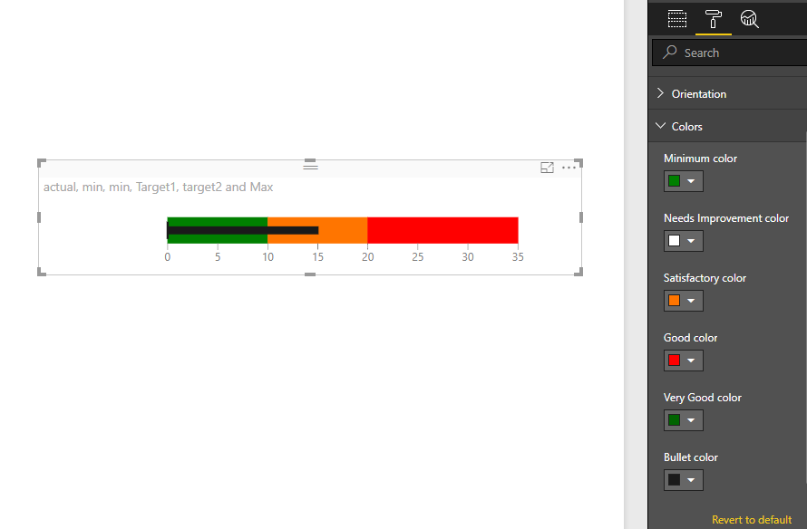
With a Bullet chart, you may need five indicators to represent target values and actual values. Please see below examples which are all measures.
min=0
max=35
target1=10
target2=20
actual=15
Best regards,
Yuliana Gu
If this post helps, then please consider Accept it as the solution to help the other members find it more quickly.
- Mark as New
- Bookmark
- Subscribe
- Mute
- Subscribe to RSS Feed
- Permalink
- Report Inappropriate Content
Thank's Yuliana,
Humm... I have not 'Bullet chart' in the list of tools, is it a tool to dowload please ? or is this tool in recent versions of PWBI Desktop ?
Anyway, are the five items min, max, target1, target2 and actual fixed by the user or in the BDD ?
- Mark as New
- Bookmark
- Subscribe
- Mute
- Subscribe to RSS Feed
- Permalink
- Report Inappropriate Content
Hi @Anonymous,
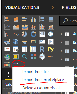
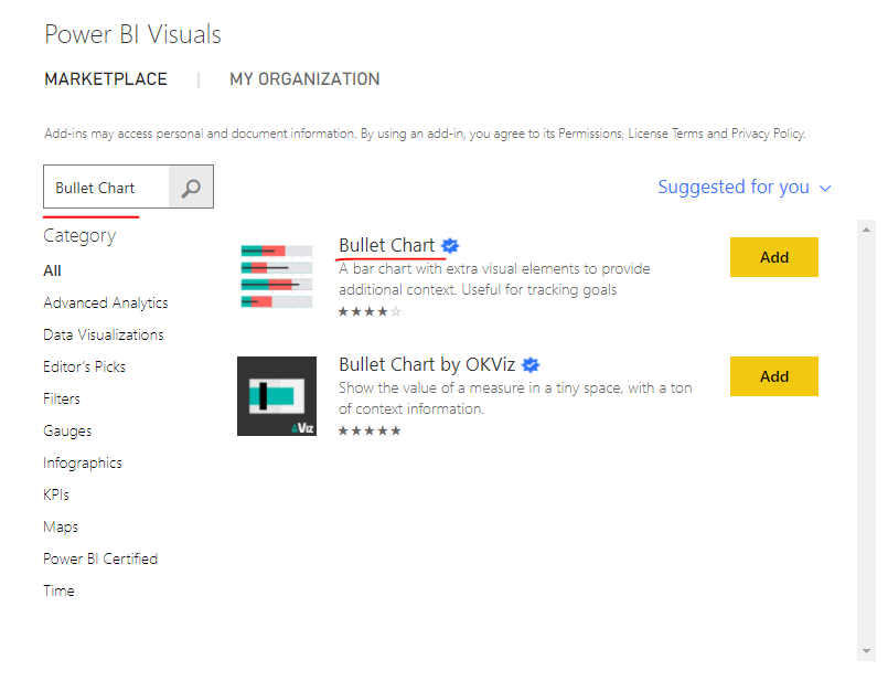
Bullet Chart is a custom visual that need to be downloaded from Office Store.
Best regards,
Yuliana Gu
If this post helps, then please consider Accept it as the solution to help the other members find it more quickly.
Helpful resources
| User | Count |
|---|---|
| 105 | |
| 99 | |
| 98 | |
| 86 | |
| 49 |
| User | Count |
|---|---|
| 162 | |
| 142 | |
| 132 | |
| 102 | |
| 63 |


