- Power BI forums
- Updates
- News & Announcements
- Get Help with Power BI
- Desktop
- Service
- Report Server
- Power Query
- Mobile Apps
- Developer
- DAX Commands and Tips
- Custom Visuals Development Discussion
- Health and Life Sciences
- Power BI Spanish forums
- Translated Spanish Desktop
- Power Platform Integration - Better Together!
- Power Platform Integrations (Read-only)
- Power Platform and Dynamics 365 Integrations (Read-only)
- Training and Consulting
- Instructor Led Training
- Dashboard in a Day for Women, by Women
- Galleries
- Community Connections & How-To Videos
- COVID-19 Data Stories Gallery
- Themes Gallery
- Data Stories Gallery
- R Script Showcase
- Webinars and Video Gallery
- Quick Measures Gallery
- 2021 MSBizAppsSummit Gallery
- 2020 MSBizAppsSummit Gallery
- 2019 MSBizAppsSummit Gallery
- Events
- Ideas
- Custom Visuals Ideas
- Issues
- Issues
- Events
- Upcoming Events
- Community Blog
- Power BI Community Blog
- Custom Visuals Community Blog
- Community Support
- Community Accounts & Registration
- Using the Community
- Community Feedback
Register now to learn Fabric in free live sessions led by the best Microsoft experts. From Apr 16 to May 9, in English and Spanish.
- Power BI forums
- Forums
- Get Help with Power BI
- Desktop
- Finding an overall median of a measure by week in ...
- Subscribe to RSS Feed
- Mark Topic as New
- Mark Topic as Read
- Float this Topic for Current User
- Bookmark
- Subscribe
- Printer Friendly Page
- Mark as New
- Bookmark
- Subscribe
- Mute
- Subscribe to RSS Feed
- Permalink
- Report Inappropriate Content
Finding an overall median of a measure by week in table and chart visual
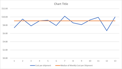
I have the following visual that shows the week by week shipping cost for a department. The [Cost per shipment] is a measure and I would like to take the median of this measure and bring it into the visual as well as a line chart. Is there a way to do this?
Week_Num is from a Calendar_Table
Table visual
| WEEK_NUM | Cost per shipment | Median of Weekly Cost per Shipment |
| 1 | $7.41 | $9.05 |
| 2 | $9.47 | $9.05 |
| 3 | $7.83 | $9.05 |
| 4 | $9.05 | $9.05 |
| 5 | $9.21 | $9.05 |
| 6 | $7.91 | $9.05 |
| 7 | $10.19 | $9.05 |
| 8 | $8.57 | $9.05 |
| 9 | $8.13 | $9.05 |
| 10 | $9.27 | $9.05 |
| 11 | $9.90 | $9.05 |
| 12 | $6.67 | $9.05 |
| 13 | $9.99 | $9.05 |
Line Chart
Solved! Go to Solution.
- Mark as New
- Bookmark
- Subscribe
- Mute
- Subscribe to RSS Feed
- Permalink
- Report Inappropriate Content
Hi,
Median of Weekly Cost per Shipment = MEDIANX(VALUES(Calendar_Table[Week_Num]),[Cost per shipment])
Hope this helps.
Regards,
Ashish Mathur
http://www.ashishmathur.com
https://www.linkedin.com/in/excelenthusiasts/
- Mark as New
- Bookmark
- Subscribe
- Mute
- Subscribe to RSS Feed
- Permalink
- Report Inappropriate Content
You cannot measure a measure., Implement your entire business logic in the new measure, Use virtual table variables for the intermediate steps.
Please provide sample data that covers your issue or question completely, in a usable format (not as a screenshot).
https://community.fabric.microsoft.com/t5/Community-Blog/How-to-provide-sample-data-in-the-Power-BI-...
Please show the expected outcome based on the sample data you provided.
https://community.fabric.microsoft.com/t5/Desktop/How-to-Get-Your-Question-Answered-Quickly/m-p/1447...
- Mark as New
- Bookmark
- Subscribe
- Mute
- Subscribe to RSS Feed
- Permalink
- Report Inappropriate Content
Appreciate the response. So my issue here is that I have multiple measures that I have created using a bunch of tables. A lot of these measures are using sources from different tables, for instance cost per shipment uses overall cost from a finance database for actuals and shipments count of product from another table for outbound data.
The ask from execs is that for some of these measures, that are being tracked week over week, they'd like to see a target line in the charts that is based on the median of that measure, for the current period in the chart, usually 6 week rolling. Easy to do in excel but no idea how to go about it in power bi. I thought a simple table (the table above is not a screenshot, the chart is) could get my problem across.
- Mark as New
- Bookmark
- Subscribe
- Mute
- Subscribe to RSS Feed
- Permalink
- Report Inappropriate Content
You sample presents a static table. Measures behave differently, they are recalculated every time. That means your sample data in its current form is not covering your scenario.
Helpful resources

Microsoft Fabric Learn Together
Covering the world! 9:00-10:30 AM Sydney, 4:00-5:30 PM CET (Paris/Berlin), 7:00-8:30 PM Mexico City

Power BI Monthly Update - April 2024
Check out the April 2024 Power BI update to learn about new features.

| User | Count |
|---|---|
| 107 | |
| 97 | |
| 75 | |
| 65 | |
| 53 |
| User | Count |
|---|---|
| 144 | |
| 103 | |
| 98 | |
| 85 | |
| 64 |

