- Power BI forums
- Updates
- News & Announcements
- Get Help with Power BI
- Desktop
- Service
- Report Server
- Power Query
- Mobile Apps
- Developer
- DAX Commands and Tips
- Custom Visuals Development Discussion
- Health and Life Sciences
- Power BI Spanish forums
- Translated Spanish Desktop
- Power Platform Integration - Better Together!
- Power Platform Integrations (Read-only)
- Power Platform and Dynamics 365 Integrations (Read-only)
- Training and Consulting
- Instructor Led Training
- Dashboard in a Day for Women, by Women
- Galleries
- Community Connections & How-To Videos
- COVID-19 Data Stories Gallery
- Themes Gallery
- Data Stories Gallery
- R Script Showcase
- Webinars and Video Gallery
- Quick Measures Gallery
- 2021 MSBizAppsSummit Gallery
- 2020 MSBizAppsSummit Gallery
- 2019 MSBizAppsSummit Gallery
- Events
- Ideas
- Custom Visuals Ideas
- Issues
- Issues
- Events
- Upcoming Events
- Community Blog
- Power BI Community Blog
- Custom Visuals Community Blog
- Community Support
- Community Accounts & Registration
- Using the Community
- Community Feedback
Register now to learn Fabric in free live sessions led by the best Microsoft experts. From Apr 16 to May 9, in English and Spanish.
- Power BI forums
- Forums
- Get Help with Power BI
- Desktop
- Filling in gaps of no data
- Subscribe to RSS Feed
- Mark Topic as New
- Mark Topic as Read
- Float this Topic for Current User
- Bookmark
- Subscribe
- Printer Friendly Page
- Mark as New
- Bookmark
- Subscribe
- Mute
- Subscribe to RSS Feed
- Permalink
- Report Inappropriate Content
Filling in gaps of no data
Hi there,
Apologies if this is a basic question but quite a beginner and did not quite find/understand what I am looking for in other posts.
I currently have a user entering data into a Sharepoint list on a semi-regular basis, the list is formatted such that the columns are
Date Incident Level Incident Location
The days that data is entered vary, so some days may have no data at all, or in some cases there might be multiple entries per day.
For example,
May 19 0 Workshop
May 18 1 Shop floor
May 18 2 Plant
May 15 1 Lab
....
What I'd like to do is create a stacked bar chart in PowerBI that shows this data with total number of incidents per day, with a breakdown of the number of type of incidents for that day, but also showing days with zero incidents. Using the above sample, May 19 should show a total of one incident of type 0, May 18 should show total of two incidents (one of type 1, one of type 2), May 17 should show zero incidents, etc. To this chart, I'd also like to apply a filter so its only showing the last 30 days of data.
I've been able to get a combination of a couple of these but not all at the same time unfortunately; I've tried:
- checking the 'show items with no data' on the dates but then it seems like my filter doesn't work and it just ends up showing all the dates in my date hierarchy.
- I've tried creating a separate date table and then joining this to the table above with data to create days with 'null' incidents, but then can't get the breakdown of type of incidents (I've read I might need to create a relationship between the final table and the original one with the incident types?)
Please let me know if I can provide more information.
Hope anyone could please offer some assistance 🙂
Thank you!
Solved! Go to Solution.
- Mark as New
- Bookmark
- Subscribe
- Mute
- Subscribe to RSS Feed
- Permalink
- Report Inappropriate Content
Yes the measure uses the calendar date and i might know whats the issue with your scenario.
Please use the date from calendar table in y axis of visual with hierarchy.
Also for the final part of the question, Drag and drop the date from calendar table again on visual and use relative date filter.
- Mark as New
- Bookmark
- Subscribe
- Mute
- Subscribe to RSS Feed
- Permalink
- Report Inappropriate Content
HI @NaveenGandhi ,
Quick question on "to avoid this create the below measure", is there anything for the formula of the measure before creating the filter on the visual?
- Mark as New
- Bookmark
- Subscribe
- Mute
- Subscribe to RSS Feed
- Permalink
- Report Inappropriate Content
Use this measure.
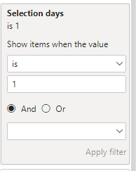
Selection days = if(month(selectedvalue('date'[date])),1,0)
- Mark as New
- Bookmark
- Subscribe
- Mute
- Subscribe to RSS Feed
- Permalink
- Report Inappropriate Content
HI @NaveenGandhi,
I think it is closer but I might be missing something as its not working for me fully; for the measure, is the 'date' referring to the calendar table?
I follow right up to where I select 'show items with no data' on my main visual (this shows all data in the date hierarchy in the data table with the incident levels like you were saying).
Once I create the measure and apply it to the visual and set it as 'is 1' the visual becomes blank and changing the slicer does not do anything (visual stays blank).
To confirm, after selecting the 'show items with no data' in the date hierarchy of the main data table:
- create measure using Selection days = if(month(selectedvalue('Calendar'[date])),1,0)
- apply this filter on my visual with the incident data and set it to 'is 1'
- Slicer range should then adjust what is shown in the visual? (My slicer is using the date range from the 'Calendar' table); ex. if I set the range to 35 days, it should show 35 days?
Also, just to confirm, I'd like to always show the last 30 days (as of today) (not just the current month if possible to not have to use the slicer).
Thanks for all your help so far!
- Mark as New
- Bookmark
- Subscribe
- Mute
- Subscribe to RSS Feed
- Permalink
- Report Inappropriate Content
Yes the measure uses the calendar date and i might know whats the issue with your scenario.
Please use the date from calendar table in y axis of visual with hierarchy.
Also for the final part of the question, Drag and drop the date from calendar table again on visual and use relative date filter.
- Mark as New
- Bookmark
- Subscribe
- Mute
- Subscribe to RSS Feed
- Permalink
- Report Inappropriate Content
- Mark as New
- Bookmark
- Subscribe
- Mute
- Subscribe to RSS Feed
- Permalink
- Report Inappropriate Content
Hello @astropil00
First create a calendar table for as much period you would require. I have created for first 6 months of 2023.
Below is the sample data i have used for this, With a 1 to many relationship with calendar table.

Create a stacked bar chart with below inputs.
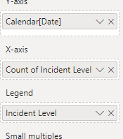
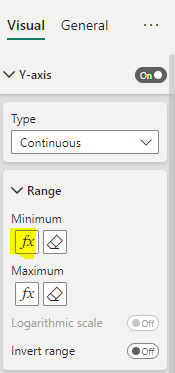
go to the visual properties of the visual to access the y axis range menu and choose fx option for minimum.
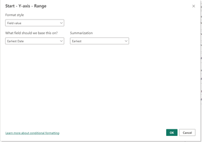
Do the same for Maximum range, but make the summarization latest.
Now you can slice the date for 1 month and you will be able to see the data for whole month with blanks as well.
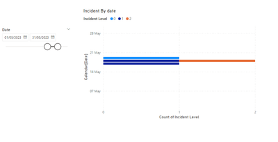
Hope this helps! Let me know if you need further assistance.
If this post helps, then please consider Accept it as the solution to help the others find it more quickly.
- Mark as New
- Bookmark
- Subscribe
- Mute
- Subscribe to RSS Feed
- Permalink
- Report Inappropriate Content
Hi @NaveenGandhi ,
This is excellent, thank you!
Just a quick follow up question - is it possible to show a granular break-down of the days?
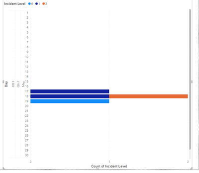
For example with the data being between May 14 and 21, is it possible to show the days beside and then month (or Month for all the days in the month and then show the bar beside the day it has data for?). I am going to be showing these on a big tv so it helps a bit with the readability from further away.
- Mark as New
- Bookmark
- Subscribe
- Mute
- Subscribe to RSS Feed
- Permalink
- Report Inappropriate Content
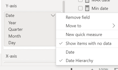
If you want to show all days in a month(Drop the earlier solution except creating calendar table), Then create date hierarchy for the y axis and click on "show items with no data" and drill to the day level hierarchy.
Now you will see all dates from the calendar, to avoid this create the below measure and add it as a visual level filter then make it "is 1". This would show only the dates that are choosen in the slicer.
Hope this helps!
If this post helps, then please consider Accept it as the solution to help the others find it more quickly.
Helpful resources

Microsoft Fabric Learn Together
Covering the world! 9:00-10:30 AM Sydney, 4:00-5:30 PM CET (Paris/Berlin), 7:00-8:30 PM Mexico City

Power BI Monthly Update - April 2024
Check out the April 2024 Power BI update to learn about new features.

| User | Count |
|---|---|
| 107 | |
| 97 | |
| 75 | |
| 65 | |
| 53 |
| User | Count |
|---|---|
| 144 | |
| 103 | |
| 98 | |
| 85 | |
| 64 |

