Forum Discussion

Event Duration Analysis
Hi all! My previous post somehow got lost in the abyss of the interwebs, so I'm making it again.
I have a table which records device usage in my business. It records the device name, the time in, and time out.
| time out | time in | device name |
| 31/3/17 13:28 | 31/3/17 13:39 | 0001 |
| 31/3/17 13:31 | 31/3/17 14:38 | 0002 |
| 31/3/17 13:49 | 31/3/17 14:25 | 0001 |
The long and short of our goal is this: to be able to calculate how many hours each day the devices are being used (not each individual device, I don't think, but all devices together), and to be able to isolate which times of day in particular they are being under-used.
A device has a 12 hour period each day where it can be used, and there are 6 devices, so in total we're comparing time the devices checked out to 72 hours (maybe with some kind of pie chart or something showing what percent of 72 hours the sum of use-time is).
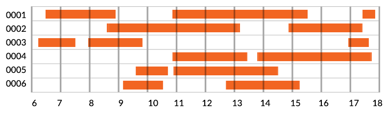
I was also envisioning some sort of graph that looks like this, to illustrate device checkout times:
Anything powerBI can do to make these tasks easy for me?
3 Replies
 ytc-reportsHelper I
Hi all!
I have a table which records device usage in my business. It records the device name, the time in, and time out.
time out time in device name 31/3/17 13:28 31/3/17 13:39 0001 31/3/17 13:31 31/3/17 14:38 0002 31/3/17 13:49 31/3/17 14:25 0001 The long and short of our goal is this: to be able to calculate how many hours each day the devices are being used (not each individual device, I don't think, but all devices together), and to be able to isolate which times of day in particular they are being under-used.
A device has a 12 hour period each day where it can be used, and there are 6 devices, so in total we're comparing time the devices checked out to 72 hours (maybe with some kind of pie chart or something showing what percent of 72 hours the sum of use-time is).
I was also envisioning some sort of graph that looks like this, to illustrate device checkout times:
Anything powerBI can do to make these tasks easy for me?
- dkay84_PowerBIMicrosoft EmployeeThere is a custom visual for this:
https://app.powerbi.com/visuals/show/Gantt1448688115699
Also, you can easily extract a duration and/or hour of the day to get a summary of usage by hour. Not sure exactly what your requirements are but this should get you started.  Eric_ZhangMicrosoft Employee
I think you can create a calculated column to get the during seconds of each record. And then aggregate the duration by day to calculate the utilization percentage.
duration = DATEDIFF('Table'[time out],'Table'[time in],SECOND)As to the gantt chart, AFAIK, there's no offical visuals that support time level. The gantt visual in dkay84_PowerBI link is for date level. If you still prefer that kind of visual, you can submit your idea at Power BI Ideas and vote it up.
