Join us at the 2025 Microsoft Fabric Community Conference
March 31 - April 2, 2025, in Las Vegas, Nevada. Use code MSCUST for a $150 discount! Early bird discount ends December 31.
Register Now- Power BI forums
- Get Help with Power BI
- Desktop
- Service
- Report Server
- Power Query
- Mobile Apps
- Developer
- DAX Commands and Tips
- Custom Visuals Development Discussion
- Health and Life Sciences
- Power BI Spanish forums
- Translated Spanish Desktop
- Training and Consulting
- Instructor Led Training
- Dashboard in a Day for Women, by Women
- Galleries
- Community Connections & How-To Videos
- COVID-19 Data Stories Gallery
- Themes Gallery
- Data Stories Gallery
- R Script Showcase
- Webinars and Video Gallery
- Quick Measures Gallery
- 2021 MSBizAppsSummit Gallery
- 2020 MSBizAppsSummit Gallery
- 2019 MSBizAppsSummit Gallery
- Events
- Ideas
- Custom Visuals Ideas
- Issues
- Issues
- Events
- Upcoming Events
Be one of the first to start using Fabric Databases. View on-demand sessions with database experts and the Microsoft product team to learn just how easy it is to get started. Watch now
- Power BI forums
- Forums
- Get Help with Power BI
- Desktop
- Enhanced scatter 2.0.0 x and y start/end
- Subscribe to RSS Feed
- Mark Topic as New
- Mark Topic as Read
- Float this Topic for Current User
- Bookmark
- Subscribe
- Printer Friendly Page
- Mark as New
- Bookmark
- Subscribe
- Mute
- Subscribe to RSS Feed
- Permalink
- Report Inappropriate Content
Enhanced scatter 2.0.0 x and y start/end
I am trying to use the enhanced scatter 2.0.0 (https://appsource.microsoft.com/en-us/product/power-bi-visuals/WA104380762?tab=Overview) to display some values, but for the sake of visual appeal i need to custom set the start and end of x/y axis. I can't find an option for that under format pane and the closest I've gotten is the data fields X Start, X End ... . However i have tried all the different types of data i could think of in there and nothing seems to have an effect. I have tried searching for documentation and tutortials but have thus far been unsuccessful.
Solved! Go to Solution.
- Mark as New
- Bookmark
- Subscribe
- Mute
- Subscribe to RSS Feed
- Permalink
- Report Inappropriate Content
Hey @raulallas ,
as it seems it's only possible to set the start and end of the axis by filtering the values.
For this example I'm using the wide world sample dataset (https://github.com/microsoft/sql-server-samples/tree/master/samples/databases/wide-world-importers).
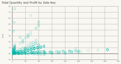
Caution: It's necessary to align the measure that filters the values and the column used in the "Details" band of the visual. The next screenshot shows unfiltered values (numeric column "quantity used" on the x-axis:
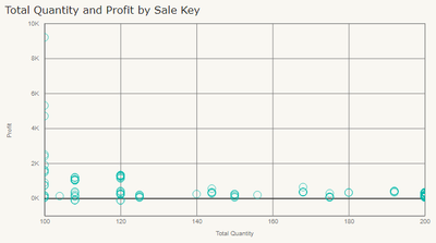
where the values on the x-axis in the next screenshot are filtered using this measure:
Total Quantity =
var xmin = 100
var xmax = 200
return
SUMX(
    'Fact Sale'
    , var __quantity = SUM('Fact Sale'[Quantity])
    return
    IF(AND(__quantity >= xmin , __quantity <= xmax) , __quantity , BLANK())
)
and the screenshot:
Hopefully, this provides some ideas to tackle your challenge.
Regards,
Tom
Did I answer your question? Mark my post as a solution, this will help others!
Proud to be a Super User!
I accept Kudos 😉
Hamburg, Germany
- Mark as New
- Bookmark
- Subscribe
- Mute
- Subscribe to RSS Feed
- Permalink
- Report Inappropriate Content
I was frustrated by this and found a fairly easy work-around that worked for me.
- Go to the original Scatter visualization (not the enhanced)
- Go to the Format pane
- Select X Axis
- Set your Start and End values
- Select Y Axis
- Set your Start and End values
- With your graph selected, apply the Enhanced Scatter visualization
When I did this, it retained the start and end values in the enhanced scatter viz.
I hope that helps.
- Mark as New
- Bookmark
- Subscribe
- Mute
- Subscribe to RSS Feed
- Permalink
- Report Inappropriate Content
Amazing!!
Made my day. Incredible that there is no documentation... really hard to learn PowerBI compared to Tableau imo.
Anyways, thanks for the hint. Worked for me as well.
- Mark as New
- Bookmark
- Subscribe
- Mute
- Subscribe to RSS Feed
- Permalink
- Report Inappropriate Content
Hey @raulallas ,
as it seems it's only possible to set the start and end of the axis by filtering the values.
For this example I'm using the wide world sample dataset (https://github.com/microsoft/sql-server-samples/tree/master/samples/databases/wide-world-importers).
Caution: It's necessary to align the measure that filters the values and the column used in the "Details" band of the visual. The next screenshot shows unfiltered values (numeric column "quantity used" on the x-axis:
where the values on the x-axis in the next screenshot are filtered using this measure:
Total Quantity =
var xmin = 100
var xmax = 200
return
SUMX(
    'Fact Sale'
    , var __quantity = SUM('Fact Sale'[Quantity])
    return
    IF(AND(__quantity >= xmin , __quantity <= xmax) , __quantity , BLANK())
)
and the screenshot:
Hopefully, this provides some ideas to tackle your challenge.
Regards,
Tom
Did I answer your question? Mark my post as a solution, this will help others!
Proud to be a Super User!
I accept Kudos 😉
Hamburg, Germany
- Mark as New
- Bookmark
- Subscribe
- Mute
- Subscribe to RSS Feed
- Permalink
- Report Inappropriate Content
Hey, thanks for the tip, I tried using it, but ended up going with blank values at opposite corners of the visual for a cleaner look. However this does answer the question for anyone trying to do it so I will accept it as solution.
Helpful resources

Join us at the Microsoft Fabric Community Conference
March 31 - April 2, 2025, in Las Vegas, Nevada. Use code MSCUST for a $150 discount!

Microsoft Fabric Community Conference 2025
Arun Ulag shares exciting details about the Microsoft Fabric Conference 2025, which will be held in Las Vegas, NV.

| User | Count |
|---|---|
| 123 | |
| 79 | |
| 59 | |
| 58 | |
| 44 |
| User | Count |
|---|---|
| 179 | |
| 120 | |
| 82 | |
| 70 | |
| 53 |


