Jumpstart your career with the Fabric Career Hub
Find everything you need to get certified on Fabric—skills challenges, live sessions, exam prep, role guidance, and a 50 percent discount on exams.
Get started- Power BI forums
- Updates
- News & Announcements
- Get Help with Power BI
- Desktop
- Service
- Report Server
- Power Query
- Mobile Apps
- Developer
- DAX Commands and Tips
- Custom Visuals Development Discussion
- Health and Life Sciences
- Power BI Spanish forums
- Translated Spanish Desktop
- Power Platform Integration - Better Together!
- Power Platform Integrations (Read-only)
- Power Platform and Dynamics 365 Integrations (Read-only)
- Training and Consulting
- Instructor Led Training
- Dashboard in a Day for Women, by Women
- Galleries
- Community Connections & How-To Videos
- COVID-19 Data Stories Gallery
- Themes Gallery
- Data Stories Gallery
- R Script Showcase
- Webinars and Video Gallery
- Quick Measures Gallery
- 2021 MSBizAppsSummit Gallery
- 2020 MSBizAppsSummit Gallery
- 2019 MSBizAppsSummit Gallery
- Events
- Ideas
- Custom Visuals Ideas
- Issues
- Issues
- Events
- Upcoming Events
- Community Blog
- Power BI Community Blog
- Custom Visuals Community Blog
- Community Support
- Community Accounts & Registration
- Using the Community
- Community Feedback
Earn a 50% discount on the DP-600 certification exam by completing the Fabric 30 Days to Learn It challenge.
- Power BI forums
- Forums
- Get Help with Power BI
- Desktop
- Dynamic Grouping on Scatter Chart based on slicer ...
- Subscribe to RSS Feed
- Mark Topic as New
- Mark Topic as Read
- Float this Topic for Current User
- Bookmark
- Subscribe
- Printer Friendly Page
- Mark as New
- Bookmark
- Subscribe
- Mute
- Subscribe to RSS Feed
- Permalink
- Report Inappropriate Content
Dynamic Grouping on Scatter Chart based on slicer selection
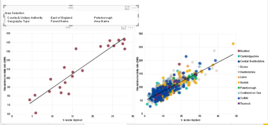
I am the process of creating a report in power bi. I have 2 scatter charts on the page. (see screenshot below)
1) Scatter chart on left, showing just points in final area selection
2) Scatter chart on right, showing all points within parent selection
However, i want to have only 2 groups for the scatter graph on the right, so i have just 2 colours
1) Area Selection Name
2) Rest of areas within parent name
I have tried to create a new table, that ultimately has all area names plus 'Other', thinking i could then write a DAX measure with 3 variables (Selected Area, Unselected Area, All Areas), and then return the values accordingly, but this doesn't seem to work. Has anyone done something similar or have any suggestions?
- Mark as New
- Bookmark
- Subscribe
- Mute
- Subscribe to RSS Feed
- Permalink
- Report Inappropriate Content
Hi @StephShadwell,
I 'm not clear about your data structure, so I cannot reproduce your scenario.
If it is convenient, could you share a dummy pbix file which can reproduce the scenario, so that we can help further investigate on it? You can upload it to OneDrive or Dropbox and post the link here. Do mask sensitive data before uploading.)
Best Regards,
Cherry
If this post helps, then please consider Accept it as the solution to help the other members find it more quickly.
- Mark as New
- Bookmark
- Subscribe
- Mute
- Subscribe to RSS Feed
- Permalink
- Report Inappropriate Content
Apologies for the delay, please see link to file (https://1drv.ms/u/s!AsoxVmjjxqm_iBO3sIVbZTD605jc )
It is a fairly straight forward data model, with the area boundaries ultimately driving the mapping, with the main data being taken from the health inequalties sheet, with the STP data ultimately being appended to the bottom of the health inequalities to make one data table.
The 2 scatter charts are on the premature mortality tab, with the one on the left showing purely the area selected, and the one on the right showing the selection and all other data from the parent. What i am looking to achieve is the area selected to show in 1 colour and the other areas to be grouped, bearing in mind the selection could always potentially be different, so would need to be dynamically working out the groupings based on the selections.
Thanks


