FabCon is coming to Atlanta
Join us at FabCon Atlanta from March 16 - 20, 2026, for the ultimate Fabric, Power BI, AI and SQL community-led event. Save $200 with code FABCOMM.
Register now!- Power BI forums
- Get Help with Power BI
- Desktop
- Service
- Report Server
- Power Query
- Mobile Apps
- Developer
- DAX Commands and Tips
- Custom Visuals Development Discussion
- Health and Life Sciences
- Power BI Spanish forums
- Translated Spanish Desktop
- Training and Consulting
- Instructor Led Training
- Dashboard in a Day for Women, by Women
- Galleries
- Data Stories Gallery
- Themes Gallery
- Contests Gallery
- Quick Measures Gallery
- Notebook Gallery
- Translytical Task Flow Gallery
- TMDL Gallery
- R Script Showcase
- Webinars and Video Gallery
- Ideas
- Custom Visuals Ideas (read-only)
- Issues
- Issues
- Events
- Upcoming Events
To celebrate FabCon Vienna, we are offering 50% off select exams. Ends October 3rd. Request your discount now.
- Power BI forums
- Forums
- Get Help with Power BI
- Desktop
- Re: Display difference in clustered column chart
- Subscribe to RSS Feed
- Mark Topic as New
- Mark Topic as Read
- Float this Topic for Current User
- Bookmark
- Subscribe
- Printer Friendly Page


- Mark as New
- Bookmark
- Subscribe
- Mute
- Subscribe to RSS Feed
- Permalink
- Report Inappropriate Content
Display difference in clustered column chart
Hi all,
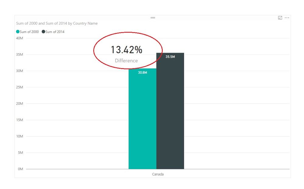
I'm finding a way to display difference between two values in my clustered column chat. I have a measure to calculate the difference but don't know how to integrate it to the chart.
Solved! Go to Solution.
- Mark as New
- Bookmark
- Subscribe
- Mute
- Subscribe to RSS Feed
- Permalink
- Report Inappropriate Content
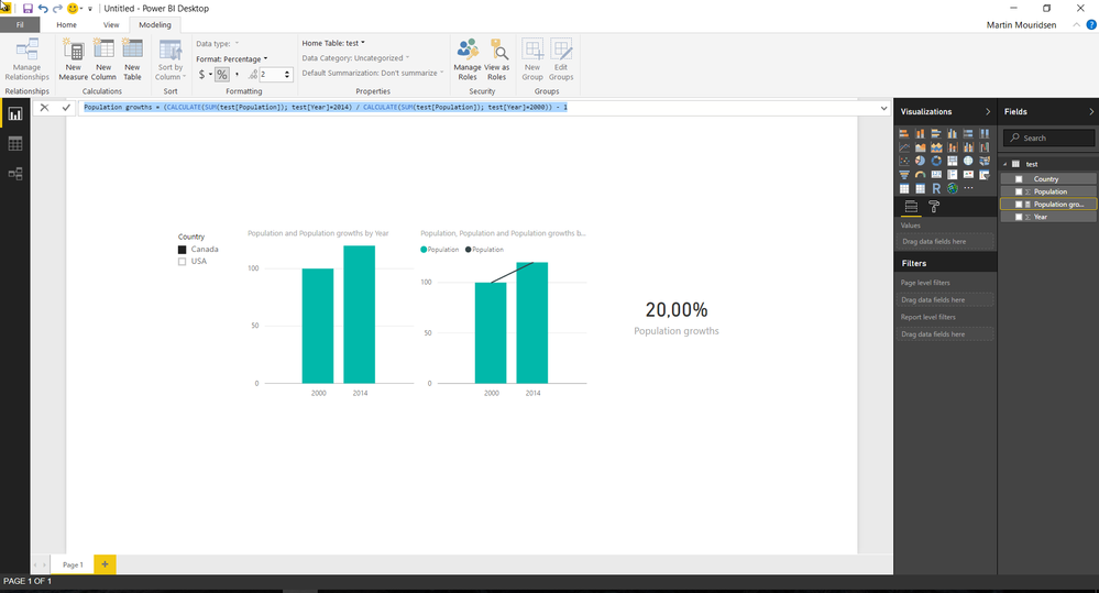
You need year on the axis to achieve what you want, which is why I proposed a new data structure.
My measure looks like this:
Population growth =
(CALCULATE(SUM(test[Population]); test[Year]=2014) / CALCULATE(SUM(test[Population]); test[Year]=2000)) - 1
See picture below. There is 2 types of visualizations. One with clustered bar and another one with clustered chart and trend line. If you hover over the columns, you'll see the population growth.


- Mark as New
- Bookmark
- Subscribe
- Mute
- Subscribe to RSS Feed
- Permalink
- Report Inappropriate Content
@s15 wrote:
Hi all,
I'm finding a way to display difference between two values in my clustered column chat. I have a measure to calculate the difference but don't know how to integrate it to the chart.
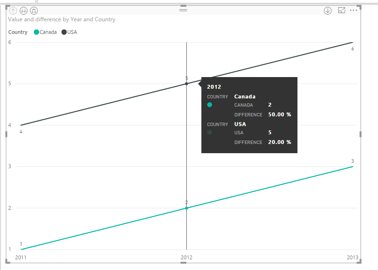
What is your difference measure like? You could probably put the measure to the tooltip field.
By the way, for me, I'd use a line chart. See more details in the attached pbix file.
difference =
CALCULATE (
    DIVIDE (
        SUM ( yourTable[Value] )
            - CALCULATE ( SUM ( yourTable[Value] ), SAMEPERIODLASTYEAR ( 'calendar'[Date] ) ),
        SUM ( yourTable[Value] )
    )
)
- Mark as New
- Bookmark
- Subscribe
- Mute
- Subscribe to RSS Feed
- Permalink
- Report Inappropriate Content
I just need to display the difference of growth between year 2000 and year 2014. My dataset contains population of Canada in different years. From my example, the growth rate is 13,42% by the measure below
Difference = 1 - (SUM(Population[2000])/SUM(Population[2014]))
Displaying the difference is helpful to explain my data.
I drag and drop my measure into Tooltip but nothing changes.

- Mark as New
- Bookmark
- Subscribe
- Mute
- Subscribe to RSS Feed
- Permalink
- Report Inappropriate Content
- Mark as New
- Bookmark
- Subscribe
- Mute
- Subscribe to RSS Feed
- Permalink
- Report Inappropriate Content
@Anonymous
This is very simple like this

- Mark as New
- Bookmark
- Subscribe
- Mute
- Subscribe to RSS Feed
- Permalink
- Report Inappropriate Content
- Mark as New
- Bookmark
- Subscribe
- Mute
- Subscribe to RSS Feed
- Permalink
- Report Inappropriate Content
Just typo. You don't have to worry about the year. It is my typo. I just want to display the growth rate in clustered chart.
- Mark as New
- Bookmark
- Subscribe
- Mute
- Subscribe to RSS Feed
- Permalink
- Report Inappropriate Content
If you have this data structure:
Year Population Country
2000 10000000 Canada
2014 20000000 Canada
You can use this visual: Line & Clustered column chart. Then just plot the according values.
- Mark as New
- Bookmark
- Subscribe
- Mute
- Subscribe to RSS Feed
- Permalink
- Report Inappropriate Content
With this data set, how is your measure look like? I want to divide population in 2000 by 2014 @Anonymous
- Mark as New
- Bookmark
- Subscribe
- Mute
- Subscribe to RSS Feed
- Permalink
- Report Inappropriate Content
You need year on the axis to achieve what you want, which is why I proposed a new data structure.
My measure looks like this:
Population growth =
(CALCULATE(SUM(test[Population]); test[Year]=2014) / CALCULATE(SUM(test[Population]); test[Year]=2000)) - 1
See picture below. There is 2 types of visualizations. One with clustered bar and another one with clustered chart and trend line. If you hover over the columns, you'll see the population growth.
- Mark as New
- Bookmark
- Subscribe
- Mute
- Subscribe to RSS Feed
- Permalink
- Report Inappropriate Content
Can I have the "20%" display somewhere on the chart?
- Mark as New
- Bookmark
- Subscribe
- Mute
- Subscribe to RSS Feed
- Permalink
- Report Inappropriate Content
You can drag the card visual on top of the clustered bar chart and then push it to front. But, to my knowledfe, there isn't the type of integration, which you are asking for.
- Mark as New
- Bookmark
- Subscribe
- Mute
- Subscribe to RSS Feed
- Permalink
- Report Inappropriate Content
- Mark as New
- Bookmark
- Subscribe
- Mute
- Subscribe to RSS Feed
- Permalink
- Report Inappropriate Content
No it is not. Could you please show your screenshot? The chart that @Eric_Zhang is very hard to understand.
Thank you.

Helpful resources

Power BI Monthly Update - September 2025
Check out the September 2025 Power BI update to learn about new features.

Fabric Community Update - August 2025
Find out what's new and trending in the Fabric community.


