- Power BI forums
- Updates
- News & Announcements
- Get Help with Power BI
- Desktop
- Service
- Report Server
- Power Query
- Mobile Apps
- Developer
- DAX Commands and Tips
- Custom Visuals Development Discussion
- Health and Life Sciences
- Power BI Spanish forums
- Translated Spanish Desktop
- Power Platform Integration - Better Together!
- Power Platform Integrations (Read-only)
- Power Platform and Dynamics 365 Integrations (Read-only)
- Training and Consulting
- Instructor Led Training
- Dashboard in a Day for Women, by Women
- Galleries
- Community Connections & How-To Videos
- COVID-19 Data Stories Gallery
- Themes Gallery
- Data Stories Gallery
- R Script Showcase
- Webinars and Video Gallery
- Quick Measures Gallery
- 2021 MSBizAppsSummit Gallery
- 2020 MSBizAppsSummit Gallery
- 2019 MSBizAppsSummit Gallery
- Events
- Ideas
- Custom Visuals Ideas
- Issues
- Issues
- Events
- Upcoming Events
- Community Blog
- Power BI Community Blog
- Custom Visuals Community Blog
- Community Support
- Community Accounts & Registration
- Using the Community
- Community Feedback
Register now to learn Fabric in free live sessions led by the best Microsoft experts. From Apr 16 to May 9, in English and Spanish.
- Power BI forums
- Forums
- Get Help with Power BI
- Desktop
- Deneb / Vega-lite questions
- Subscribe to RSS Feed
- Mark Topic as New
- Mark Topic as Read
- Float this Topic for Current User
- Bookmark
- Subscribe
- Printer Friendly Page
- Mark as New
- Bookmark
- Subscribe
- Mute
- Subscribe to RSS Feed
- Permalink
- Report Inappropriate Content
Deneb / Vega-lite questions
Hi,
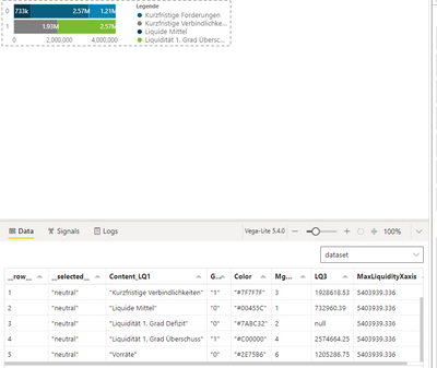
I am trying to use a Deneb Visual.
{
  "data": {"name": "dataset"},
  "encoding": {
    "y": {
      "field": "Group",
      "type": "nominal",
      "title": null
    },
    "x": {
      "field": "LQ3",
      "type": "quantitative",
      "title": null,
      "stack": "zero"
    },
    "order": {
      "field": "Mgmt_Dashboard_LQ1"
    }
  },
  "layer": [
    {
      "mark": "bar",
      "encoding": {
        "color": {
          "field": "Content_LQ1",
          "title": "Legende",
          "type": "nominal",
          "scale": {
            "domain": [
              "Kurzfristige Forderungen",
              "Kurzfristige Verbindlichkeiten",
              "Liquide Mittel",
              "Liquidität 1. Grad Überschuss",
              "Vorräte",
              "Liquidität 1. Grad Defizit"
            ],
            "range": [
              "#085F82",
              "#7F7F7F",
              "#053C52",
              "#7ABC32",
              "#0A83B2",
              "#C00000"
            ]
          }
        }
      }
    },
    {
      "mark": {
        "type": "text",
        "align": "left",
        "x": -1,
        "color": "white",
        "xOffset": -30
      },
      "encoding": {
        "text": {
          "field": "LQ3",
          "type": "quantitative",
          "format": ".3s"
        }
      }
    }
  ]
}
I am struggling with 3 things:
1. How to align the bar-label (eg. 733k) right in the center of the bar?
2. How can I set the length of the x-axis dynamically to the measure "MaxLiquidityXaxis"
3. How to set the color for each bar based on the color-code given in the dataset itself
Thanks in advance!!
- Mark as New
- Bookmark
- Subscribe
- Mute
- Subscribe to RSS Feed
- Permalink
- Report Inappropriate Content
Hi @giammariam ,
first of all thanks!
The color selection works!
The position of the bar label however is not perfect as I think it takes the middle of the x-value as a starting point so the label is rather right-aligned. It seems that the middle point of the "x-value-bar" and the middel point of the "text field" have to be aligned so that the label fits
- Mark as New
- Bookmark
- Subscribe
- Mute
- Subscribe to RSS Feed
- Permalink
- Report Inappropriate Content
Sorry, I did not see the "align": "center" change. So that works perfectly fine 😉
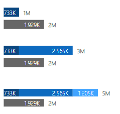
How would you solve the last point with vega? I have to show 3 diagramms above each other and need the range of the x axis to be set by the maximum - measure. Or would that also be solved if i "facet" those 3 diagrams into one visual and extend just the dataset with groups (1 for each diagram)
- Mark as New
- Bookmark
- Subscribe
- Mute
- Subscribe to RSS Feed
- Permalink
- Report Inappropriate Content
@pbiXlsx Vega would allow me to create a signal that would essentially act as a variable for the max domain value of the x-axis. Also, yes, I would use faceting for the layout composition that you are after. Do you have a .pbix that you can share that either has your data (or if you can't share your data, a .pbix with mock data)?
Madison Giammaria
Proud to be a Super User 😄
Do you frequently use Deneb to provide insights to your stakeholders? Have you considered sponsoring this free and open source custom visual? More info here!
- Mark as New
- Bookmark
- Subscribe
- Mute
- Subscribe to RSS Feed
- Permalink
- Report Inappropriate Content
Hello @pbiXlsx. I got your first and third items implemented. The second one is giving me trouble. Apparently because of the way vega-lite handles params (no access to setting signals), I'm not sure if this is possible in Vega-Lite. If you wanted to switch to Vega, we should be able to get that implemented.
Here is a comment on stackoverflow discussing this
Happy to help more if you want to try going with Vega.
Updated Spec:
{
  "data": {"name": "dataset"},
  "encoding": {
    "y": {"field": "Group", "type": "nominal", "title": null},
    "x": {
      "field": "LQ3",
      "type": "quantitative",
      "title": null,
      "stack": "zero"
    },
    "order": {"field": "Mgmt_Dashboard_LQ1"}
  },
  "layer": [
    {
      "mark": "bar",
      "encoding": {
        "color": {
          "field": "Content_LQ1",
          "title": "Legende",
          "type": "nominal",
          "scale": {
            "domain": [
              "Kurzfristige Forderungen",
              "Kurzfristige Verbindlichkeiten",
              "Liquide Mittel",
              "Liquidität 1. Grad Überschuss",
              "Vorräte",
              "Liquidität 1. Grad Defizit"
            ],
            "range": {"field": "Color"}
          }
        }
      }
    },
    {
      "mark": {"type": "text", "align": "center", "x": -1, "color": "white"},
      "encoding": {
        "text": {"field": "LQ3", "type": "quantitative", "format": ".3s"},
        "x": {"field": "LQ3", "bandPosition": 0.5}
      }
    }
  ]
}
Madison Giammaria
Proud to be a Super User 😄
Do you frequently use Deneb to provide insights to your stakeholders? Have you considered sponsoring this free and open source custom visual? More info here!
Helpful resources

Microsoft Fabric Learn Together
Covering the world! 9:00-10:30 AM Sydney, 4:00-5:30 PM CET (Paris/Berlin), 7:00-8:30 PM Mexico City

Power BI Monthly Update - April 2024
Check out the April 2024 Power BI update to learn about new features.

| User | Count |
|---|---|
| 108 | |
| 105 | |
| 88 | |
| 74 | |
| 66 |
| User | Count |
|---|---|
| 124 | |
| 112 | |
| 98 | |
| 81 | |
| 72 |


