New Offer! Become a Certified Fabric Data Engineer
Check your eligibility for this 50% exam voucher offer and join us for free live learning sessions to get prepared for Exam DP-700.
Get Started- Power BI forums
- Get Help with Power BI
- Desktop
- Service
- Report Server
- Power Query
- Mobile Apps
- Developer
- DAX Commands and Tips
- Custom Visuals Development Discussion
- Health and Life Sciences
- Power BI Spanish forums
- Translated Spanish Desktop
- Training and Consulting
- Instructor Led Training
- Dashboard in a Day for Women, by Women
- Galleries
- Community Connections & How-To Videos
- COVID-19 Data Stories Gallery
- Themes Gallery
- Data Stories Gallery
- R Script Showcase
- Webinars and Video Gallery
- Quick Measures Gallery
- 2021 MSBizAppsSummit Gallery
- 2020 MSBizAppsSummit Gallery
- 2019 MSBizAppsSummit Gallery
- Events
- Ideas
- Custom Visuals Ideas
- Issues
- Issues
- Events
- Upcoming Events
Don't miss out! 2025 Microsoft Fabric Community Conference, March 31 - April 2, Las Vegas, Nevada. Use code MSCUST for a $150 discount. Prices go up February 11th. Register now.
- Power BI forums
- Forums
- Get Help with Power BI
- Desktop
- Data Model for radar/polar/donut chart
- Subscribe to RSS Feed
- Mark Topic as New
- Mark Topic as Read
- Float this Topic for Current User
- Bookmark
- Subscribe
- Printer Friendly Page
- Mark as New
- Bookmark
- Subscribe
- Mute
- Subscribe to RSS Feed
- Permalink
- Report Inappropriate Content
Data Model for radar/polar/donut chart
File: https://easyupload.io/wg28x6
Hello everyone,
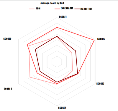
I'd like some help with this case. There is one test for each employee for this company, and each oh them belongs to one unit. This client have requested for a radar chart to compare employees or/and units by each atribute of this test. So, I have to create a visual where the client will be able to compare anything he wants. It must have a data segmentation by Employee and Unit.
Examples:
1) Avarage Score by Unit.
2) Compare Employee's Score with Company's Avarage.
I've tryied several community visuals but nothing really works like excel. Any tips how to solve it?
Thanks in advance. 😁
- Mark as New
- Bookmark
- Subscribe
- Mute
- Subscribe to RSS Feed
- Permalink
- Report Inappropriate Content
Have you tried one of the Radar charts in AppSource (click ellipsis under visuals and choose Get More Visuals)?
Pat
Did I answer your question? Mark my post as a solution! Kudos are also appreciated!
To learn more about Power BI, follow me on Twitter or subscribe on YouTube.
@mahoneypa HoosierBI on YouTube
- Mark as New
- Bookmark
- Subscribe
- Mute
- Subscribe to RSS Feed
- Permalink
- Report Inappropriate Content
Hi @mahoneypat
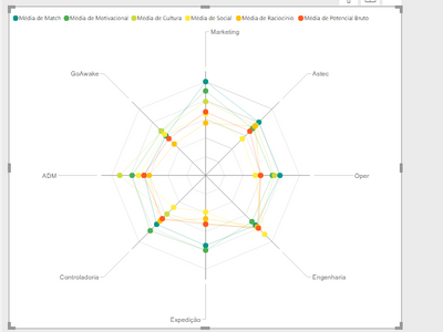
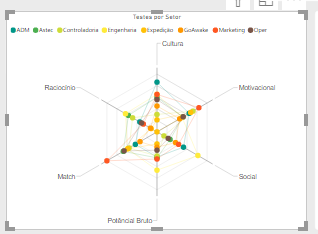
Yes, I've tried. The problemwith those charts is that PowerBi works with column values, so for example the units goes to the radar, not the atributes/scores from the test.
Also, I've tried toconvert the table lines into columns, but there is no way to filter them after this.
Problem 1) Units into the radar poles.
Problem 2) No way to filter, units for example.
Helpful resources
| User | Count |
|---|---|
| 117 | |
| 75 | |
| 62 | |
| 50 | |
| 44 |
| User | Count |
|---|---|
| 174 | |
| 125 | |
| 60 | |
| 60 | |
| 57 |


