- Power BI forums
- Updates
- News & Announcements
- Get Help with Power BI
- Desktop
- Service
- Report Server
- Power Query
- Mobile Apps
- Developer
- DAX Commands and Tips
- Custom Visuals Development Discussion
- Health and Life Sciences
- Power BI Spanish forums
- Translated Spanish Desktop
- Power Platform Integration - Better Together!
- Power Platform Integrations (Read-only)
- Power Platform and Dynamics 365 Integrations (Read-only)
- Training and Consulting
- Instructor Led Training
- Dashboard in a Day for Women, by Women
- Galleries
- Community Connections & How-To Videos
- COVID-19 Data Stories Gallery
- Themes Gallery
- Data Stories Gallery
- R Script Showcase
- Webinars and Video Gallery
- Quick Measures Gallery
- 2021 MSBizAppsSummit Gallery
- 2020 MSBizAppsSummit Gallery
- 2019 MSBizAppsSummit Gallery
- Events
- Ideas
- Custom Visuals Ideas
- Issues
- Issues
- Events
- Upcoming Events
- Community Blog
- Power BI Community Blog
- Custom Visuals Community Blog
- Community Support
- Community Accounts & Registration
- Using the Community
- Community Feedback
Register now to learn Fabric in free live sessions led by the best Microsoft experts. From Apr 16 to May 9, in English and Spanish.
- Power BI forums
- Forums
- Get Help with Power BI
- Desktop
- Re: Cumulative monthly totals
- Subscribe to RSS Feed
- Mark Topic as New
- Mark Topic as Read
- Float this Topic for Current User
- Bookmark
- Subscribe
- Printer Friendly Page
- Mark as New
- Bookmark
- Subscribe
- Mute
- Subscribe to RSS Feed
- Permalink
- Report Inappropriate Content
Cumulative monthly totals
Hi,
I have a Date table and fact table related by field called Year
I want to achieve a table like this:
| Year | MonthNo | sales | Monthly Cumulative |
| 2022 | 01 | 20 | 20 |
| 2022 | 02 | 30 | 50 |
| 2022 | 03 | 40 | 90 |
| 2022 | 04 | 50 | 140 |
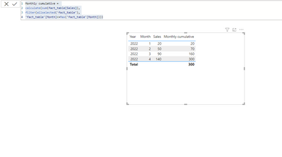
I have used this dax to obtain this measure Monthly cumulative:
Monthly cumulative=
calculate(sum(sales),
filter(allselected('Date'),
'Date'[Dates]<=Max('Date'[Dates])))
But the result is
140
140
140
140
I want to this in a bar graph too.
How do i do this?
Solved! Go to Solution.
- Mark as New
- Bookmark
- Subscribe
- Mute
- Subscribe to RSS Feed
- Permalink
- Report Inappropriate Content
Hi,
I am not sure how your datamodel looks like, but please try something like below whether it suits your requirement.
Monthly cumulative =
CALCULATE (
    SUM ( sales[revenue] ),
    FILTER ( ALLSELECTED ( 'Date'[Dates] ), 'Date'[Dates] <= MAX ( 'Date'[Dates] ) )
)
If this post helps, then please consider accepting it as the solution to help other members find it faster, and give a big thumbs up.
- Mark as New
- Bookmark
- Subscribe
- Mute
- Subscribe to RSS Feed
- Permalink
- Report Inappropriate Content
please check your relationship of date and sale table and also filter direction of table.
- Mark as New
- Bookmark
- Subscribe
- Mute
- Subscribe to RSS Feed
- Permalink
- Report Inappropriate Content
Thanks guys. I got the answer when I was just posting this question. However, the reply button deactivated, when I want to say.. I got the answer.
Thanks again for looking into it.
- Mark as New
- Bookmark
- Subscribe
- Mute
- Subscribe to RSS Feed
- Permalink
- Report Inappropriate Content
please check your relationship of date and sale table and also filter direction of table.
- Mark as New
- Bookmark
- Subscribe
- Mute
- Subscribe to RSS Feed
- Permalink
- Report Inappropriate Content
Hi,
I am not sure how your datamodel looks like, but please try something like below whether it suits your requirement.
Monthly cumulative =
CALCULATE (
    SUM ( sales[revenue] ),
    FILTER ( ALLSELECTED ( 'Date'[Dates] ), 'Date'[Dates] <= MAX ( 'Date'[Dates] ) )
)
If this post helps, then please consider accepting it as the solution to help other members find it faster, and give a big thumbs up.
Helpful resources

Microsoft Fabric Learn Together
Covering the world! 9:00-10:30 AM Sydney, 4:00-5:30 PM CET (Paris/Berlin), 7:00-8:30 PM Mexico City

Power BI Monthly Update - April 2024
Check out the April 2024 Power BI update to learn about new features.

| User | Count |
|---|---|
| 109 | |
| 98 | |
| 77 | |
| 66 | |
| 54 |
| User | Count |
|---|---|
| 144 | |
| 104 | |
| 100 | |
| 86 | |
| 64 |

