FabCon is coming to Atlanta
Join us at FabCon Atlanta from March 16 - 20, 2026, for the ultimate Fabric, Power BI, AI and SQL community-led event. Save $200 with code FABCOMM.
Register now!- Power BI forums
- Get Help with Power BI
- Desktop
- Service
- Report Server
- Power Query
- Mobile Apps
- Developer
- DAX Commands and Tips
- Custom Visuals Development Discussion
- Health and Life Sciences
- Power BI Spanish forums
- Translated Spanish Desktop
- Training and Consulting
- Instructor Led Training
- Dashboard in a Day for Women, by Women
- Galleries
- Data Stories Gallery
- Themes Gallery
- Contests Gallery
- QuickViz Gallery
- Quick Measures Gallery
- Visual Calculations Gallery
- Notebook Gallery
- Translytical Task Flow Gallery
- TMDL Gallery
- R Script Showcase
- Webinars and Video Gallery
- Ideas
- Custom Visuals Ideas (read-only)
- Issues
- Issues
- Events
- Upcoming Events
Get Fabric Certified for FREE during Fabric Data Days. Don't miss your chance! Request now
- Power BI forums
- Forums
- Get Help with Power BI
- Desktop
- Creating Top N chart for columns in a table based ...
- Subscribe to RSS Feed
- Mark Topic as New
- Mark Topic as Read
- Float this Topic for Current User
- Bookmark
- Subscribe
- Printer Friendly Page
- Mark as New
- Bookmark
- Subscribe
- Mute
- Subscribe to RSS Feed
- Permalink
- Report Inappropriate Content
Creating Top N chart for columns in a table based on a measure calculated from 2 other measures
I have a measure1 calculated in a table from 3 columns and then another measure2 calculated from same columns (ExcludingTechnician column) but on national level. A Technician can work on different worktypes and select different SOR Codes any number of times for a particular type of Task. Finally i have measure3 which is difference of the 2 measures.
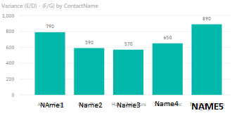
Now i'm creating a chart which shows TOP N for a column within the table depending on measure3.
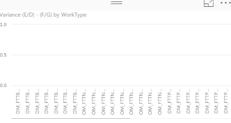
For the TOP 5 technicians it comes out correctly as shown in 2nd screenshot. However, For TOP N WorkType or SOR, all the entries get listed on the X-axis with 0 values.
Any help would be greatly appreciated.
- Mark as New
- Bookmark
- Subscribe
- Mute
- Subscribe to RSS Feed
- Permalink
- Report Inappropriate Content
Hi @usman2338,
Are these fields circled in bule original columns or calculated columns/measures?
Please share necessary source data in data view and formulas you used so that I can test on my side.
Regards,
Yuliana Gu
If this post helps, then please consider Accept it as the solution to help the other members find it more quickly.
- Mark as New
- Bookmark
- Subscribe
- Mute
- Subscribe to RSS Feed
- Permalink
- Report Inappropriate Content
Hi Yuliana,
Yes the blue circled are also measures which i have created. I'm pasting the link for the sample PBIX file containing the data and measures/formulas used. I have changed the column names.
I need to create charts for the TOP N ContactName,WorkType,Subcode based on variance and in the current table context/filters.
https://www.dropbox.com/s/65ioi94ewzwv9oo/Sample%20PBIX.pbix?dl=0
Please advise if you need more detials. thanks
Helpful resources

Power BI Monthly Update - November 2025
Check out the November 2025 Power BI update to learn about new features.

Fabric Data Days
Advance your Data & AI career with 50 days of live learning, contests, hands-on challenges, study groups & certifications and more!


