- Power BI forums
- Updates
- News & Announcements
- Get Help with Power BI
- Desktop
- Service
- Report Server
- Power Query
- Mobile Apps
- Developer
- DAX Commands and Tips
- Custom Visuals Development Discussion
- Health and Life Sciences
- Power BI Spanish forums
- Translated Spanish Desktop
- Power Platform Integration - Better Together!
- Power Platform Integrations (Read-only)
- Power Platform and Dynamics 365 Integrations (Read-only)
- Training and Consulting
- Instructor Led Training
- Dashboard in a Day for Women, by Women
- Galleries
- Community Connections & How-To Videos
- COVID-19 Data Stories Gallery
- Themes Gallery
- Data Stories Gallery
- R Script Showcase
- Webinars and Video Gallery
- Quick Measures Gallery
- 2021 MSBizAppsSummit Gallery
- 2020 MSBizAppsSummit Gallery
- 2019 MSBizAppsSummit Gallery
- Events
- Ideas
- Custom Visuals Ideas
- Issues
- Issues
- Events
- Upcoming Events
- Community Blog
- Power BI Community Blog
- Custom Visuals Community Blog
- Community Support
- Community Accounts & Registration
- Using the Community
- Community Feedback
Register now to learn Fabric in free live sessions led by the best Microsoft experts. From Apr 16 to May 9, in English and Spanish.
- Power BI forums
- Forums
- Get Help with Power BI
- Desktop
- Create "Dimension" Tables Based on Column Value an...
- Subscribe to RSS Feed
- Mark Topic as New
- Mark Topic as Read
- Float this Topic for Current User
- Bookmark
- Subscribe
- Printer Friendly Page
- Mark as New
- Bookmark
- Subscribe
- Mute
- Subscribe to RSS Feed
- Permalink
- Report Inappropriate Content
Create "Dimension" Tables Based on Column Value and not Column Header - Need Help
Hi all,
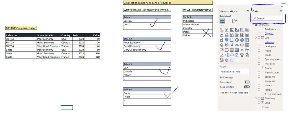
I am new with Power BI and have been trying to solve this for hours but cannot find any answer to my question. I have the below database see screenshot and when I load it into Power Bi, I get the below table in the "data pane" of Power Bi. Instead of having the column header as item to tick/untick when creating a chart, I would like to get the actual column value.
In other terms, Instead of having Indicators to tick and then I need to filter for EBITDA into my chart, I would like to be able to directly tick/untick "EBITDA" so that it gets included into my chart. By doing so, I would also be able to create e.g. a running total measure based uniquely on EBITDA and not based on "Indicators" which would also in this case include "Costs".
Is there a way to get tables such as the screenshot below? --> Instead of having Indicators, Scenario Label, ... etc I would get a table (1) with each specific indicators underneath it (table 1, EBITDA, Costs, ...) see screenshot.
This is an example but my database is in reality very big with >50 Indicators and >200k rows
Thanks a LOT if you can help with this
PS: in my title, I called these table "Dimensions Tables" but I am not 100% this is how it is actually called, sorry for that I am new in the business 😉
- Mark as New
- Bookmark
- Subscribe
- Mute
- Subscribe to RSS Feed
- Permalink
- Report Inappropriate Content
Hi and thanks a lot for the quick answer :)!
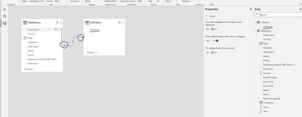
I used the first methodology you suggested --> referenced, remove duplicate and loaded the query. It created the table "Indicators". Up to there, all good. BUT I get the following problems now:
1) the relationship created when I drag and drop the "Indicators" item from my Dimension table to my Fact table is identified as many to many (see screenshot) which I am not so sure is ok
2) I still do not have my "dropdown" indicators in the right pane "data" - also see screenshot. Only "Indicators" appears in the newly reference table created instead of "EBITDA", "Costs", "...".
Any idea on how to showcase each indicator in the right pane? So to be clear, Instead of having "Indicators", I would like to have "EBITDA", "Costs", "..." in the newly created table created using Reference function
Thanks a lot again for this, I really appreciate your help 🙂
- Mark as New
- Bookmark
- Subscribe
- Mute
- Subscribe to RSS Feed
- Permalink
- Report Inappropriate Content
Many-to-many is definitely not right. Create a measure like
Num rows = COUNTROWS( 'TableQuery' )and then create a couple of table visuals including the measure, one with the column from the new indicators table and one with the column from the fact table. See if that can give you any insights into why the relationship would be many-to-many.
On your second point, the values from the column won't show up in the right hand pane, but if you create a slicer from the indicators column then they will show up in there.
- Mark as New
- Bookmark
- Subscribe
- Mute
- Subscribe to RSS Feed
- Permalink
- Report Inappropriate Content
Hi again,
Thanks a lot - indeed I get different number of rows when applying the code you provided aboe which I do not really understand why but I will investigate. Maybe one last question, still using the same database, how would you create a measure to compute the running (or cumulative sum) total of "EBITDA" for the years shown in my table
e.g. looking at the first screenshot I sent, how to create a measure to calculate the cumulative sum of the selected Indicator "EBITDA" for the selected Scenario Label "Poor Economy" see screenshot below. This means, if I change EBITDA for Costs and Poor Economy for Good Economy in my table/chart, the cumulative sum of the newly selected items will be calculated
Thanks a lot for all again 🙂
- Mark as New
- Bookmark
- Subscribe
- Mute
- Subscribe to RSS Feed
- Permalink
- Report Inappropriate Content
Create a measure like
Running Total =
VAR ReferenceDate =
    MAX ( 'TableQuery'[Year] )
RETURN
    CALCULATE ( SUM ( 'TableQuery'[Value] ), 'TableQuery'[Year] <= ReferenceDate )
and then use that in a table or matrix visual with columns from your new dimension tables.
- Mark as New
- Bookmark
- Subscribe
- Mute
- Subscribe to RSS Feed
- Permalink
- Report Inappropriate Content
You are correct, they are called dimension tables 😀.
There are a couple of ways of doing it, either in Power Query or in DAX.
In Power Query you can create multiple copies of your fact table by right-clicking on the query and choosing Reference. You'll want one copy for each dimension table you want to create. Select a column in the copy and then choose Remove Other Columns and then Remove Duplicate Rows. Load the data into Power BI and then create one-to-many relationships from each dimension table to the fact table.
In DAX you could create new tables as DISTINCT('Table'[Column]), again one table per dimension. Link the tables to the fact table as above.
Its probably worth trying both methods, publishing to the service and comparing refresh times. That should let you choose which method works best in your circumstances.
Helpful resources

Microsoft Fabric Learn Together
Covering the world! 9:00-10:30 AM Sydney, 4:00-5:30 PM CET (Paris/Berlin), 7:00-8:30 PM Mexico City

Power BI Monthly Update - April 2024
Check out the April 2024 Power BI update to learn about new features.

| User | Count |
|---|---|
| 111 | |
| 95 | |
| 80 | |
| 68 | |
| 59 |
| User | Count |
|---|---|
| 150 | |
| 119 | |
| 104 | |
| 87 | |
| 67 |


