- Power BI forums
- Updates
- News & Announcements
- Get Help with Power BI
- Desktop
- Service
- Report Server
- Power Query
- Mobile Apps
- Developer
- DAX Commands and Tips
- Custom Visuals Development Discussion
- Health and Life Sciences
- Power BI Spanish forums
- Translated Spanish Desktop
- Power Platform Integration - Better Together!
- Power Platform Integrations (Read-only)
- Power Platform and Dynamics 365 Integrations (Read-only)
- Training and Consulting
- Instructor Led Training
- Dashboard in a Day for Women, by Women
- Galleries
- Community Connections & How-To Videos
- COVID-19 Data Stories Gallery
- Themes Gallery
- Data Stories Gallery
- R Script Showcase
- Webinars and Video Gallery
- Quick Measures Gallery
- 2021 MSBizAppsSummit Gallery
- 2020 MSBizAppsSummit Gallery
- 2019 MSBizAppsSummit Gallery
- Events
- Ideas
- Custom Visuals Ideas
- Issues
- Issues
- Events
- Upcoming Events
- Community Blog
- Power BI Community Blog
- Custom Visuals Community Blog
- Community Support
- Community Accounts & Registration
- Using the Community
- Community Feedback
Register now to learn Fabric in free live sessions led by the best Microsoft experts. From Apr 16 to May 9, in English and Spanish.
- Power BI forums
- Forums
- Get Help with Power BI
- Desktop
- Create a graph from 3 table visuals which use the ...
- Subscribe to RSS Feed
- Mark Topic as New
- Mark Topic as Read
- Float this Topic for Current User
- Bookmark
- Subscribe
- Printer Friendly Page
- Mark as New
- Bookmark
- Subscribe
- Mute
- Subscribe to RSS Feed
- Permalink
- Report Inappropriate Content
Create a graph from 3 table visuals which use the same data (but are filtered differently)
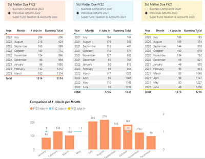
Hi all, hope I can explain this well enough. I have created 3 tables as per below.
The tables use the same data, but each one uses a different filter.
Table 1 shows jobs for FY23 (filtered on "Std Matter" slicer).
Table 2 shows jobs for FY22 (filtered on "Std Matter" slicer).
Table 3 shows jobs for FY21 (filtered on "Std Matter" slicer).
I wish to show a comparison "# Jobs In" per month for FY23, FY22 and FY21.
I thought maybe a stacked line graph showing FY23 data as the stack and then FY22 and FY21 as lines.
But I am not sure how to achieve this.
I think I need 3 measures for the data in each table as follows:
1) # Jobs In FY23
2) # Jobs In FY22
3) # Jobs In FY21
but am not sure how to write the code for each one to include the relevant filter.
Or if there is an easier or better way to show the compariosn, open to suggestions.
Any assistance appreciated.
- Mark as New
- Bookmark
- Subscribe
- Mute
- Subscribe to RSS Feed
- Permalink
- Report Inappropriate Content
Hi Christine,
You'll need to sort the month column used in your graph by another column for financial period.
You can add a financial period column like this:
FP =
If(MONTH('your date table'[Date])>6,
MONTH('your date table'[Date])-6,
MONTH('your date table'[Date])+6)
Then select the month column you're using in your graph and set it to Sort By the new FP column. See https://learn.microsoft.com/en-us/power-bi/create-reports/desktop-sort-by-column?tabs=powerbi-deskto... for an explanation of Sort By.
This article explains managing interactions between visuals: https://learn.microsoft.com/en-us/power-bi/create-reports/service-reports-visual-interactions?tabs=p...
I'd suggest checking out a few YouTube videos on PowerBI Interactions to get the gist of how they work as it's going to be easier to see it demonstrated.
- Mark as New
- Bookmark
- Subscribe
- Mute
- Subscribe to RSS Feed
- Permalink
- Report Inappropriate Content
Hi Christine, you're on the right track.
create a measure for each FY like this:
Running Total FY23 =
CALCULATE(count('your fact table'[Job ID],
'your date table'[FY]=2023,
'your date table'[Date] <= max('your date table'[Date])
This assumes you have a date dimension table, but if not just replace both 'your fact table' and 'your date table' with the name of the table where your date/month/year fields are stored.
I've also assumed you already have a column for FY. If not you'll probably want to add one. E.g if your end of financial year is 30 June, add a calculated column in the same table as your date field:
FY =
If(MONTH('your date table'[Date])>6,
YEAR('your date table'[Date])+1,
YEAR('your date table'[Date]))
- Mark as New
- Bookmark
- Subscribe
- Mute
- Subscribe to RSS Feed
- Permalink
- Report Inappropriate Content
Thank you so much. I am close now. I added the FY column and 3 measures:
I added graph and have 2 issues with it:
1) I want it to start by FY with July to June instead of Jan to Dec; and
2) I am not sure on how I do the "Edit" interactions for figures to work. I currently have graph interacting with orange std matter selection and that part of the graph (orange columns) is correct. But other 2 lines are not. If I interact graph with all 3 std matter selections, nothing displays in graph.
Any further assistace would be much appreaciated.
Helpful resources

Microsoft Fabric Learn Together
Covering the world! 9:00-10:30 AM Sydney, 4:00-5:30 PM CET (Paris/Berlin), 7:00-8:30 PM Mexico City

Power BI Monthly Update - April 2024
Check out the April 2024 Power BI update to learn about new features.

| User | Count |
|---|---|
| 109 | |
| 95 | |
| 77 | |
| 65 | |
| 53 |
| User | Count |
|---|---|
| 144 | |
| 105 | |
| 102 | |
| 89 | |
| 63 |


