Forum Discussion

Conditionally Format World Map based on % changes in Stock Market Indices
I have created a query to pull data from a website (investing.com) and I am trying to find the optimal way to present the data on a map on Power BI. The data includes absolute and percentage daily change per market (country) and I want when this is plotted on the map to be conditionally formatted so that all stock indices are colored based on the % change in a similar manner i could apply this on a table where the most negative would be for example dark red and the most positve dark green. I am trying this with the available PBI map visuals but it does not seem to be such an option on a map.
any suggestions how to fix this?
2 Replies
 v-caliao-msftMicrosoft Employee
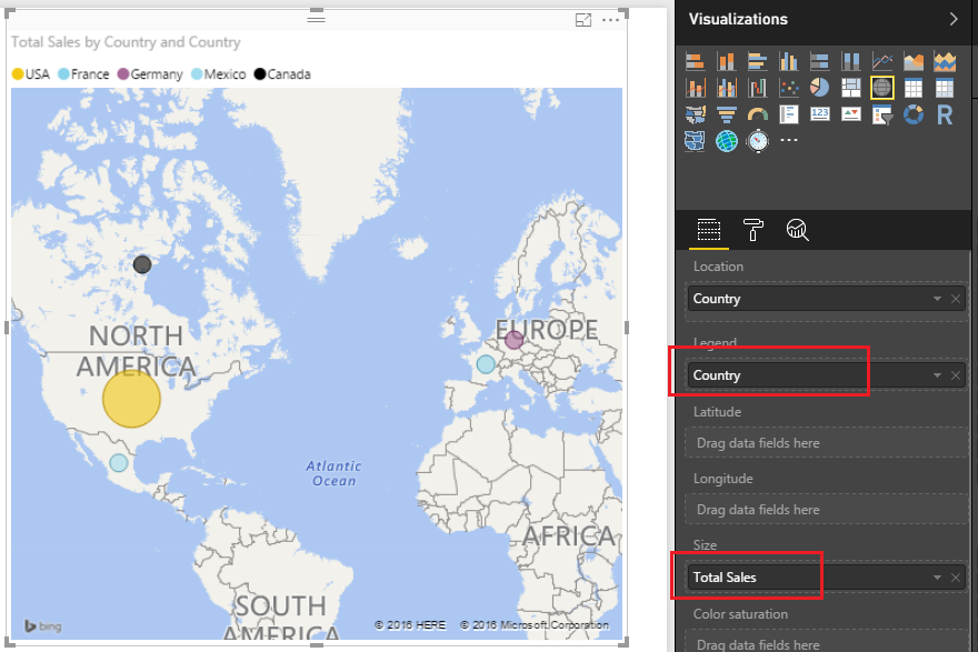
You can create a level column based on the % change, and then add this level column to Lenged. Then different levle will show different color on your map.
Regards,
Charlie Liao
 lemontreeHelper I
v-caliao-msft thank you for the suggestion but I'd appreciate some clarifications. what do you mean to create a level column? to add a new calculated colum?
also, will this only work on Map visual or on the filled map as well. in both cases, i do not get the expected result as when i add the existing %chg field at the legend every country has its own color but this is not what i want. What I am looking for is simpler. the country indices that are deep negative territory in terms of %chg to have dark red and then as we move towards zero and positive area to move from red to green. (pls check screenshot here: https://1drv.ms/i/s!Ag5Vx0E8pi14izQfB7DSSCB5_du1)
thank you in advance for your time.