- Power BI forums
- Updates
- News & Announcements
- Get Help with Power BI
- Desktop
- Service
- Report Server
- Power Query
- Mobile Apps
- Developer
- DAX Commands and Tips
- Custom Visuals Development Discussion
- Health and Life Sciences
- Power BI Spanish forums
- Translated Spanish Desktop
- Power Platform Integration - Better Together!
- Power Platform Integrations (Read-only)
- Power Platform and Dynamics 365 Integrations (Read-only)
- Training and Consulting
- Instructor Led Training
- Dashboard in a Day for Women, by Women
- Galleries
- Community Connections & How-To Videos
- COVID-19 Data Stories Gallery
- Themes Gallery
- Data Stories Gallery
- R Script Showcase
- Webinars and Video Gallery
- Quick Measures Gallery
- 2021 MSBizAppsSummit Gallery
- 2020 MSBizAppsSummit Gallery
- 2019 MSBizAppsSummit Gallery
- Events
- Ideas
- Custom Visuals Ideas
- Issues
- Issues
- Events
- Upcoming Events
- Community Blog
- Power BI Community Blog
- Custom Visuals Community Blog
- Community Support
- Community Accounts & Registration
- Using the Community
- Community Feedback
Register now to learn Fabric in free live sessions led by the best Microsoft experts. From Apr 16 to May 9, in English and Spanish.
- Power BI forums
- Forums
- Get Help with Power BI
- Desktop
- Re: Combined matrix and horizontal bar chart
- Subscribe to RSS Feed
- Mark Topic as New
- Mark Topic as Read
- Float this Topic for Current User
- Bookmark
- Subscribe
- Printer Friendly Page
- Mark as New
- Bookmark
- Subscribe
- Mute
- Subscribe to RSS Feed
- Permalink
- Report Inappropriate Content
Combined matrix and horizontal bar chart
Hi all,
My requirement is to build a combined horizontal bar chart + matrix.
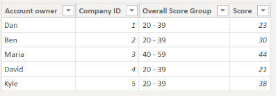
Source data is as follows
My understanding is that the most viable solution would be using SVG, however, I am yet to understand if it is possible to color bars based on the category.
- Mark as New
- Bookmark
- Subscribe
- Mute
- Subscribe to RSS Feed
- Permalink
- Report Inappropriate Content
did you find any solution for this?
- Mark as New
- Bookmark
- Subscribe
- Mute
- Subscribe to RSS Feed
- Permalink
- Report Inappropriate Content
Hi @Anonymous
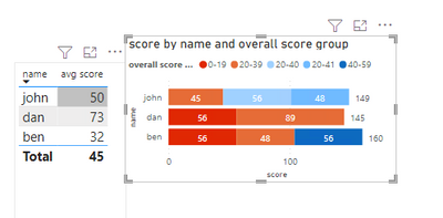
I think you can use table and stacked bar chart to achieve your requirement in power bi desktop
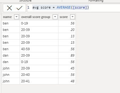
Here is my test table
The avg score is a measure
avg score = AVERAGE([score])
Format the label on the stack bar
Change the color of the bar
Open the total labels
Best Regards,
Community Support Team _Isabella
If this post helps, then please consider Accept it as the solution to help the other members find it more quickly.
- Mark as New
- Bookmark
- Subscribe
- Mute
- Subscribe to RSS Feed
- Permalink
- Report Inappropriate Content
Hi @Anonymous ,
I used your small data example and created a table:
Then I wrote an average measure to iterate the whole table, to scan each row of the column:
After that:
Example 1 - I choose a table chart and dragged these two fields:

To give color to the cells, you need to do this:

Example 2 - If you want to make a bar chart, to segment each column but the category of "Overall score group", you need to do the following: Click on Stacked bar chart, place these fields as shown below with Overall score group on the Legend field.
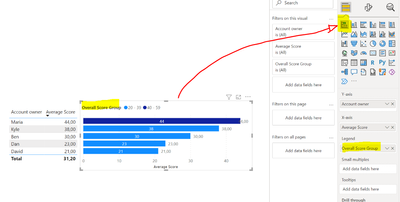

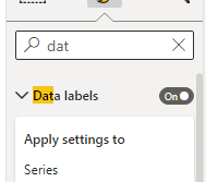
Finally, to activate data labels and total labels, write on search "Labels" and choose the following:

Here you will fill the example if you need to explore and test 🙂 https://we.tl/t-VyK84gWXPa
Hope I was of assistance!
Cheers
Joao Marcelino
Ps- Did I answer your question? Mark my post as a solution! Kudos are also appreciated 🙂
Helpful resources

Microsoft Fabric Learn Together
Covering the world! 9:00-10:30 AM Sydney, 4:00-5:30 PM CET (Paris/Berlin), 7:00-8:30 PM Mexico City

Power BI Monthly Update - April 2024
Check out the April 2024 Power BI update to learn about new features.

| User | Count |
|---|---|
| 116 | |
| 102 | |
| 78 | |
| 76 | |
| 49 |
| User | Count |
|---|---|
| 145 | |
| 108 | |
| 107 | |
| 89 | |
| 61 |


