Forum Discussion
Anonymous
7 years agoNot applicable
Clustered Column Bar Graph - Analytics Tab - Calculating Avg. on Avg.
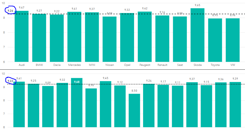
Hello everybody :) I was requested to create a new dashboard in Power BI to show the average Customer Satisfaction Index (CSI - 1 to 10) per Brand and Salesperson. The idea is to have one graph for ...
- 7 years ago
Hi Anonymous ,
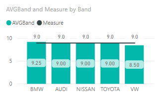
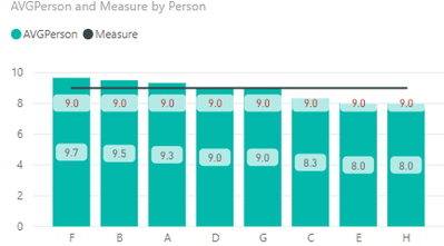
You can create a new column to calculate average. The aim of it is to make the average sources consistent.
AVG = CALCULATE ( AVERAGE ( 'Table'[CSI] ), ALLEXCEPT ( 'Table', 'Table'[Band], 'Table'[Person] ) )Then you need to use line and clustered column chart, put the “AVG” to the “line value”.
Best Regards,
Eads
If this post helps, then please consider Accept it as the solution to help the other members find it more quickly.
mussaenda
Community Champion
7 years agohi Anonymous ,
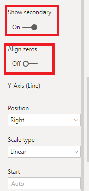
Just go to y axis format pane and turn on secondary and then turn on align zeros.
Anonymous
7 years agoNot applicable
Thank you so much mussaenda :D it's perfect now!