New Offer! Become a Certified Fabric Data Engineer
Check your eligibility for this 50% exam voucher offer and join us for free live learning sessions to get prepared for Exam DP-700.
Get Started- Power BI forums
- Get Help with Power BI
- Desktop
- Service
- Report Server
- Power Query
- Mobile Apps
- Developer
- DAX Commands and Tips
- Custom Visuals Development Discussion
- Health and Life Sciences
- Power BI Spanish forums
- Translated Spanish Desktop
- Training and Consulting
- Instructor Led Training
- Dashboard in a Day for Women, by Women
- Galleries
- Community Connections & How-To Videos
- COVID-19 Data Stories Gallery
- Themes Gallery
- Data Stories Gallery
- R Script Showcase
- Webinars and Video Gallery
- Quick Measures Gallery
- 2021 MSBizAppsSummit Gallery
- 2020 MSBizAppsSummit Gallery
- 2019 MSBizAppsSummit Gallery
- Events
- Ideas
- Custom Visuals Ideas
- Issues
- Issues
- Events
- Upcoming Events
Don't miss out! 2025 Microsoft Fabric Community Conference, March 31 - April 2, Las Vegas, Nevada. Use code MSCUST for a $150 discount. Prices go up February 11th. Register now.
- Power BI forums
- Forums
- Get Help with Power BI
- Desktop
- Choosing the right visual
- Subscribe to RSS Feed
- Mark Topic as New
- Mark Topic as Read
- Float this Topic for Current User
- Bookmark
- Subscribe
- Printer Friendly Page
- Mark as New
- Bookmark
- Subscribe
- Mute
- Subscribe to RSS Feed
- Permalink
- Report Inappropriate Content
Choosing the right visual
Guys, I have 2 tables containing, for one, events and for the other, the updates.
Events (IdEvent*, StartDate,EndDate,Description,Amount)
Updates(IdUpdate*,IdEvent,UpdateDate,Remark)
| IdEvent | Site | StartDate | EndDate | Description | Amount |
| 1 | A | 26/09/2017 | 31/05/2018 | Description1 | 2490 |
| 2 | B | 01/03/2016 | 24/06/2016 | Description2 | 300 |
| 3 | C | 14/09/2017 | 31/01/2018 | Description3 | 0 |
| IdUpdate | IdEvent | DateUpdate | Remark | |
| 17 | 3 | 16/06/2017 | - | |
| 41 | 1 | 24/11/2016 | - | |
| 48 | 1 | 09/12/2016 | - | |
| 50 | 1 | 21/12/2016 | - | |
| 61 | 2 | 01/03/2016 | - | |
| 98 | 1 | 26/12/2016 | - | |
| 141 | 1 | 31/03/2017 | - |
These two tables are, of course, interconnected, and linked to a calendar table.
I would like to show all the data, in one visuals and I am looking for the best way to represent it.
I tried the KPI Grid by MAQ Software but it is not fully adapted to my situation since I have dates.
Help would be much appreciated.
Solved! Go to Solution.
- Mark as New
- Bookmark
- Subscribe
- Mute
- Subscribe to RSS Feed
- Permalink
- Report Inappropriate Content
Hello @Fahd24,
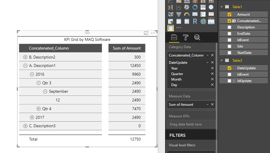
You can use KPI Grid by MAQ Software in the following way:
You can concatenate categorical columns from Table 1 using DAX, to have all this information in a single column (like Site and Description in the above image).
You can drag the various date column from Table 2 (which has multiple values) to form the hierarchy. And the measure columns in the Measure Data bag.
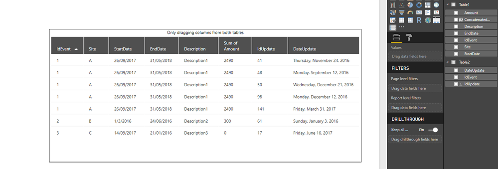
Alternatively, you can also use Grid by MAQ Software as follows (or the default Table visual in a similar way):
If you wish to display only the latest update from Table 2, for every IdEvent, use the following approach in Grid by MAQ Software:
Thanks
- Mark as New
- Bookmark
- Subscribe
- Mute
- Subscribe to RSS Feed
- Permalink
- Report Inappropriate Content
Thanks you @Greg_Deckler, even though i did not use your solution for my situation, it will be very usefull to keep aside.
Thank you @MAQSupport, very detailled answer! I've tried you solution and it works perfectly.
- Mark as New
- Bookmark
- Subscribe
- Mute
- Subscribe to RSS Feed
- Permalink
- Report Inappropriate Content
Not exactly certain of what you are trying to display but with start and end dates, you may need something like GENERATE. See my quick measure here:
https://community.powerbi.com/t5/Quick-Measures-Gallery/Open-Tickets/m-p/409364
Follow on LinkedIn
@ me in replies or I'll lose your thread!!!
Instead of a Kudo, please vote for this idea
Become an expert!: Enterprise DNA
External Tools: MSHGQM
YouTube Channel!: Microsoft Hates Greg
Latest book!: Power BI Cookbook Third Edition (Color)
DAX is easy, CALCULATE makes DAX hard...
- Mark as New
- Bookmark
- Subscribe
- Mute
- Subscribe to RSS Feed
- Permalink
- Report Inappropriate Content
Guys, I have 2 tables containing, for one, events and for the other, the updates.
Events (IdEvent*, StartDate,EndDate,Description,Amount)
Updates(IdUpdate*,IdEvent,UpdateDate,Remark)
| IdEvent | Site | StartDate | EndDate | Description | Amount |
| 1 | A | 26/09/2017 | 31/05/2018 | Description1 | 2490 |
| 2 | B | 01/03/2016 | 24/06/2016 | Description2 | 300 |
| 3 | C | 14/09/2017 | 31/01/2018 | Description3 | 0 |
| IdProblemPropertyUpdate | IdEvent | DateUpdate | Remark | |
| 17 | 3 | 16/06/2017 | - | |
| 41 | 1 | 24/11/2016 | - | |
| 48 | 1 | 09/12/2016 | - | |
| 50 | 1 | 21/12/2016 | - | |
| 61 | 2 | 01/03/2016 | - | |
| 98 | 1 | 26/12/2016 | - | |
| 141 | 1 | 31/03/2017 | - |
These two tables are, of course, interconnected, and linked to a calendar table.
I would like to show all the data, in one visuals and I am looking for the best way to represent it.
I tried the KPI Grid by MAQ Software but it is not fully adapted to my situation since I have dates.
Help would be much appreciated.
Helpful resources

Join us at the Microsoft Fabric Community Conference
March 31 - April 2, 2025, in Las Vegas, Nevada. Use code MSCUST for a $150 discount!

Power BI Monthly Update - January 2025
Check out the January 2025 Power BI update to learn about new features in Reporting, Modeling, and Data Connectivity.

| User | Count |
|---|---|
| 124 | |
| 79 | |
| 50 | |
| 38 | |
| 38 |
| User | Count |
|---|---|
| 196 | |
| 80 | |
| 70 | |
| 51 | |
| 42 |


