- Power BI forums
- Updates
- News & Announcements
- Get Help with Power BI
- Desktop
- Service
- Report Server
- Power Query
- Mobile Apps
- Developer
- DAX Commands and Tips
- Custom Visuals Development Discussion
- Health and Life Sciences
- Power BI Spanish forums
- Translated Spanish Desktop
- Power Platform Integration - Better Together!
- Power Platform Integrations (Read-only)
- Power Platform and Dynamics 365 Integrations (Read-only)
- Training and Consulting
- Instructor Led Training
- Dashboard in a Day for Women, by Women
- Galleries
- Community Connections & How-To Videos
- COVID-19 Data Stories Gallery
- Themes Gallery
- Data Stories Gallery
- R Script Showcase
- Webinars and Video Gallery
- Quick Measures Gallery
- 2021 MSBizAppsSummit Gallery
- 2020 MSBizAppsSummit Gallery
- 2019 MSBizAppsSummit Gallery
- Events
- Ideas
- Custom Visuals Ideas
- Issues
- Issues
- Events
- Upcoming Events
- Community Blog
- Power BI Community Blog
- Custom Visuals Community Blog
- Community Support
- Community Accounts & Registration
- Using the Community
- Community Feedback
Register now to learn Fabric in free live sessions led by the best Microsoft experts. From Apr 16 to May 9, in English and Spanish.
- Power BI forums
- Forums
- Get Help with Power BI
- Desktop
- Re: Change Data Label Value format
- Subscribe to RSS Feed
- Mark Topic as New
- Mark Topic as Read
- Float this Topic for Current User
- Bookmark
- Subscribe
- Printer Friendly Page
- Mark as New
- Bookmark
- Subscribe
- Mute
- Subscribe to RSS Feed
- Permalink
- Report Inappropriate Content
Change Data Label Value format
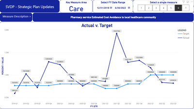
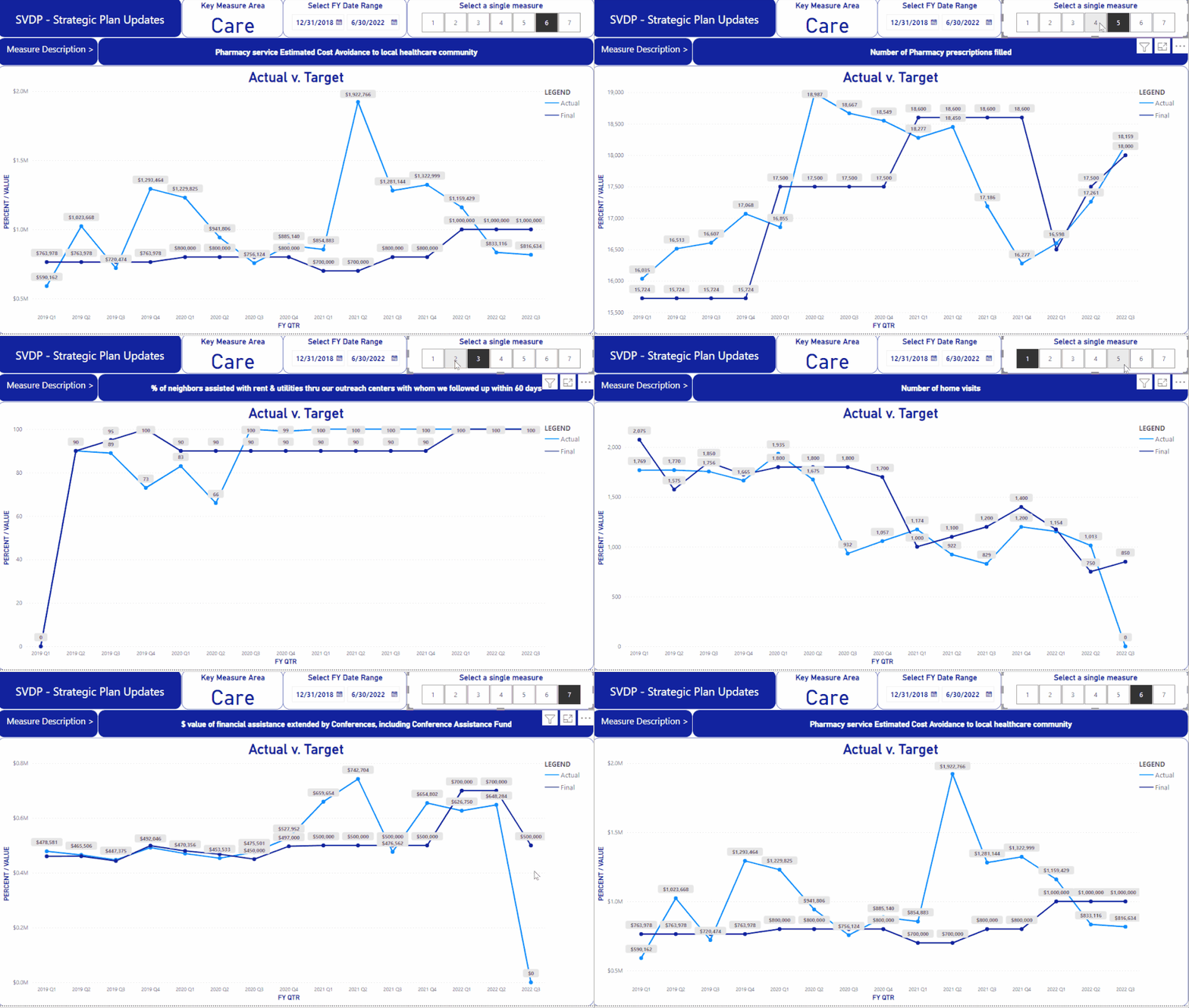
I have a report which shows "Key Measure Areas" for our non-profit. Within each of those areas, there are specific "measures" or KPIs if you will. "Measure" here is NOT referring to PowerBI measures. Each of these individual KPIs has a target and an actual value. In my report, I have a slicer which allows selection of a single KPI (1-7). The actual and target values for each KPI can be whole numbers representing totals, percent values, or $ values. These are all in a single column for Target and single column for Actual. So, if I select KPI #1 in my slicer I want the data label on the line chart to just show the whole number. If I select KPI # 6 or #7, I want the data labels to show up as currency ($) values. How can I accomplish this. I am attaching a link to the .pbix file and the particular report in this pbix file where I am referring to the KPIs (measure #s) is the "CARE" tab. Again, I want #6 and #7 data labels to show as $ values. Any assistance is greatly appreciated.
Link to PBIX file
https://drive.google.com/file/d/1wOitJdp1YXOw5LrK4ePtquLPBQnIwfS4/view?usp=sharing
Example, measure #6 is one where I want the data labels to show as $ currency values.
Solved! Go to Solution.
- Mark as New
- Bookmark
- Subscribe
- Mute
- Subscribe to RSS Feed
- Permalink
- Report Inappropriate Content
Hi @jwessel
Here I would suggest you use calcuation groups which give you dynamic format strings.
https://docs.microsoft.com/en-us/analysis-services/tabular-models/calculation-groups
This way, you can specify which format string is appropriate to your selection.
To do this in your file, you would also need to utilize a measure instead of calculated columns in your chart. (Calculation groups only override measures, not columns).
Here are the steps,
1. Install the external tool tabular editor for free External tools in Power BI Desktop - Power BI | Microsoft Docs
2. After installation, re-open Power BI Desktop and you will see the External Tools ribbon and click on tabular editor.
3. In tabular eidtor, click on Model > New Calculation Group
4. You can rename the Calculation Group to any name you like, it shows up like a table in your field list.
5. Expand the Calculation Group and you see a colum called "Name" which you can also rename as you like. This shows up as a column in this table in your field list, and is what is added to the visual later.
6. In the expanded Calculation Group, there is a folder called Calculation Items, right-click here and choose New Calculation Item. Do this twice so you have two Calculation Items.
7. The first one rename to "Actual" and I used this DAX expression:
VAR CareCatItem = SELECTEDVALUE ( Care[Category Item] )
RETURN
IF ( CareCatItem = 3, SUM ( Care[Actual] ) * 100,
IF ( CareCatItem = 4, SUM ( Care[Actual] ) * 100, SUM ( Care[Actual] ) ) )
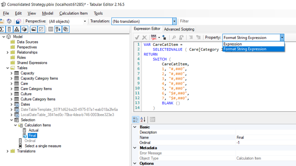
8. In the Property drop down (at the top-right of the DAX editor) where it says "Expression", change this to "Format String Expression" and here you can define the format string based on logic in your model, like this:
VAR CareCatItem =
SELECTEDVALUE ( Care[Category Item] )
RETURN
 SWITCH ( CareCatItem,
1, "#,##0",
2, "#,##0",
3, "#,##0",
4, "#,##0",
5, "#,##0",
6, "$#,##0",
7, "$#,##0",
BLANK () )
9. Now similarily for the second calculation item, rename that to "Target" and use this "Expression":
VAR CareCatItem =
SELECTEDVALUE ( Care[Category Item] )
RETURN
IF ( CareCatItem = 3, SUM ( Care[Target] ) * 100,
IF ( CareCatItem = 4, SUM ( Care[Target] ) * 100, SUM ( Care[Target] ) ) )
10. And for this one's "Format String Expression", use the same as used for "Actual".
11. Wonderful, now click save icon and close tabular editor.
12. Back in Power BI Desktop it should show a banner to update or refresh to show the calc group. Click that and you should see your Calculation group in the field list.
13. Now we right-click on your Care table and create a New Measure:
PERCENT \ VALUE = blank()
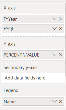
14. From your chart Y-axis go ahead and remove "Target" and "Value" and replace with the measure created above. And now bring in the Calculation Group "Name" (or whatever you named it) into the Legend section of the chart.
15. And you should see what you expect and can futher change it as you need.
Hope this helps!
Respectfully,
Zoe Douglas (DataZoe)
Follow me on LinkedIn at https://www.linkedin.com/in/zoedouglas-data
See my reports and blog at https://www.datazoepowerbi.com/
- Mark as New
- Bookmark
- Subscribe
- Mute
- Subscribe to RSS Feed
- Permalink
- Report Inappropriate Content
Hi DataZoe. This is absolutely fantastic!! Now I need to do a little research to figure out how to change the calc group actual and target to put the % signs behind some of the other figures. Thank you so much !!
Helpful resources

Microsoft Fabric Learn Together
Covering the world! 9:00-10:30 AM Sydney, 4:00-5:30 PM CET (Paris/Berlin), 7:00-8:30 PM Mexico City

Power BI Monthly Update - April 2024
Check out the April 2024 Power BI update to learn about new features.

| User | Count |
|---|---|
| 109 | |
| 98 | |
| 77 | |
| 66 | |
| 54 |
| User | Count |
|---|---|
| 144 | |
| 104 | |
| 100 | |
| 86 | |
| 64 |


