FabCon is coming to Atlanta
Join us at FabCon Atlanta from March 16 - 20, 2026, for the ultimate Fabric, Power BI, AI and SQL community-led event. Save $200 with code FABCOMM.
Register now!- Power BI forums
- Get Help with Power BI
- Desktop
- Service
- Report Server
- Power Query
- Mobile Apps
- Developer
- DAX Commands and Tips
- Custom Visuals Development Discussion
- Health and Life Sciences
- Power BI Spanish forums
- Translated Spanish Desktop
- Training and Consulting
- Instructor Led Training
- Dashboard in a Day for Women, by Women
- Galleries
- Data Stories Gallery
- Themes Gallery
- Contests Gallery
- QuickViz Gallery
- Quick Measures Gallery
- Visual Calculations Gallery
- Notebook Gallery
- Translytical Task Flow Gallery
- TMDL Gallery
- R Script Showcase
- Webinars and Video Gallery
- Ideas
- Custom Visuals Ideas (read-only)
- Issues
- Issues
- Events
- Upcoming Events
View all the Fabric Data Days sessions on demand. View schedule
- Power BI forums
- Forums
- Get Help with Power BI
- Desktop
- Re: Can't set conditional formating for colors in ...
- Subscribe to RSS Feed
- Mark Topic as New
- Mark Topic as Read
- Float this Topic for Current User
- Bookmark
- Subscribe
- Printer Friendly Page
- Mark as New
- Bookmark
- Subscribe
- Mute
- Subscribe to RSS Feed
- Permalink
- Report Inappropriate Content
Can't set conditional formating for colors in clustered column chart
If I have only one series of data I can chose a formula for the bar colors under "data colors". As soon as I add another data series to the chart this option is gone and I only can select a fixed color.
Is there no way to set the colors of multiple series by the value of fields?
Thanks!
- Mark as New
- Bookmark
- Subscribe
- Mute
- Subscribe to RSS Feed
- Permalink
- Report Inappropriate Content
Hi @Anonymous ,
Try to create a R visual.
library(ggplot2)
data<-dataset
data<-with(data,data[order(Category,ActualBudget),])
ggplot(data=data, aes(x=ActualBudget, y=Value,fill = ActualBudget))
       + geom_bar(stat="identity")
       +facet_grid(~Month)
       +scale_fill_manual(values=c("red","blue"))  -------- set the color you want
Best regards
Icey
If this post helps,then consider Accepting it as the solution to help other members find it faster.
- Mark as New
- Bookmark
- Subscribe
- Mute
- Subscribe to RSS Feed
- Permalink
- Report Inappropriate Content
Hi Icey
thanks, this is a good idea.
Still I can't build the chart I need.
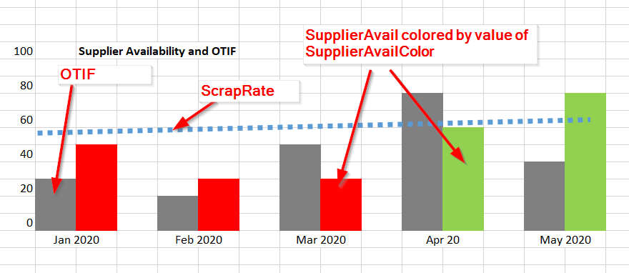
Here the visual as it should look like:
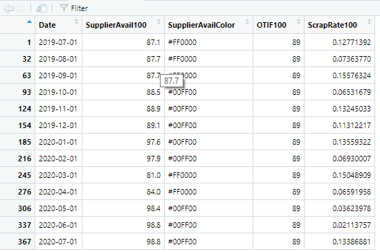
Here the data handed over to the visual:
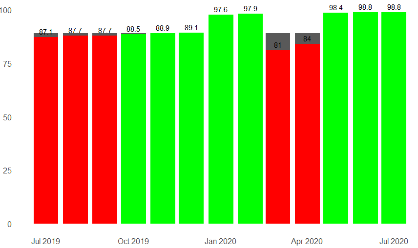
And what I'm able to create:
Here my code:
library(ggplot2)
theme_set(theme_classic())

dataCleaned <- subset(dataset, !is.na(SupplierAvail100))
dataCleaned$Date <- as.Date(dataCleaned$Date)
dataCleaned$SupplierAvail100 <- round(dataCleaned$SupplierAvail100, digits = 1)

labl = paste0(month.abb[strtoi(substr(dataCleaned$Date,6,7),10)], " ", substr(dataCleaned$Date,1,4))
brks = dataCleaned$Date

ggplot(data=dataCleaned, aes(x=Date))+
  geom_col(aes(y=OTIF100), show.legend = FALSE, position = "dodge") +
  geom_col(aes(y=SupplierAvail100), show.legend = FALSE, fill = dataCleaned$SupplierAvailColor, position = "dodge") +
  geom_text(aes(x = Date, y = SupplierAvail100, label = SupplierAvail100, vjust = -0.5)) +
  theme(axis.text.x = element_text(size = 12), axis.text.y = element_text(size = 12))+
  scale_x_continuous(labels = labl, breaks = brks, guide = guide_axis(check.overlap = TRUE))+
  theme(line = element_blank(), axis.title.x = element_blank(), axis.title.y = element_blank())
I don't know if a such complex visual is doable.
I'm very interested in your opinion.
Thanks
Rolf
- Mark as New
- Bookmark
- Subscribe
- Mute
- Subscribe to RSS Feed
- Permalink
- Report Inappropriate Content
Hi @Anonymous ,
Could you share some smaple data with the same structure of your real data for test? And please remove sensitive information.
Best regards
Icey
- Mark as New
- Bookmark
- Subscribe
- Mute
- Subscribe to RSS Feed
- Permalink
- Report Inappropriate Content
Hi Icey
find attached a small demo of the problem. Everything works except that can have the colored bars (ColA) side-by-side with the other bar (ColC).
Do you have me a hint?
Thanks!
- Mark as New
- Bookmark
- Subscribe
- Mute
- Subscribe to RSS Feed
- Permalink
- Report Inappropriate Content
@Anonymous , You can not use conditional formatting with more than one measure or legend as of now.
You can vote for an idea or log a new one -https://ideas.powerbi.com/ideas/
- Mark as New
- Bookmark
- Subscribe
- Mute
- Subscribe to RSS Feed
- Permalink
- Report Inappropriate Content
Thanks for the fast answer.
Is is then at least possible to have one serie with a measure and all others with static colors?
Helpful resources

Power BI Monthly Update - November 2025
Check out the November 2025 Power BI update to learn about new features.

Fabric Data Days
Advance your Data & AI career with 50 days of live learning, contests, hands-on challenges, study groups & certifications and more!


