- Power BI forums
- Updates
- News & Announcements
- Get Help with Power BI
- Desktop
- Service
- Report Server
- Power Query
- Mobile Apps
- Developer
- DAX Commands and Tips
- Custom Visuals Development Discussion
- Health and Life Sciences
- Power BI Spanish forums
- Translated Spanish Desktop
- Power Platform Integration - Better Together!
- Power Platform Integrations (Read-only)
- Power Platform and Dynamics 365 Integrations (Read-only)
- Training and Consulting
- Instructor Led Training
- Dashboard in a Day for Women, by Women
- Galleries
- Community Connections & How-To Videos
- COVID-19 Data Stories Gallery
- Themes Gallery
- Data Stories Gallery
- R Script Showcase
- Webinars and Video Gallery
- Quick Measures Gallery
- 2021 MSBizAppsSummit Gallery
- 2020 MSBizAppsSummit Gallery
- 2019 MSBizAppsSummit Gallery
- Events
- Ideas
- Custom Visuals Ideas
- Issues
- Issues
- Events
- Upcoming Events
- Community Blog
- Power BI Community Blog
- Custom Visuals Community Blog
- Community Support
- Community Accounts & Registration
- Using the Community
- Community Feedback
Register now to learn Fabric in free live sessions led by the best Microsoft experts. From Apr 16 to May 9, in English and Spanish.
- Power BI forums
- Forums
- Get Help with Power BI
- Desktop
- Re: Can't get report screen to work
- Subscribe to RSS Feed
- Mark Topic as New
- Mark Topic as Read
- Float this Topic for Current User
- Bookmark
- Subscribe
- Printer Friendly Page
- Mark as New
- Bookmark
- Subscribe
- Mute
- Subscribe to RSS Feed
- Permalink
- Report Inappropriate Content
Can't get report screen to work
I am brand new to Power BI. I have been through the tutorials but my screens are not the same.
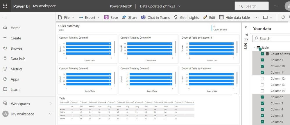
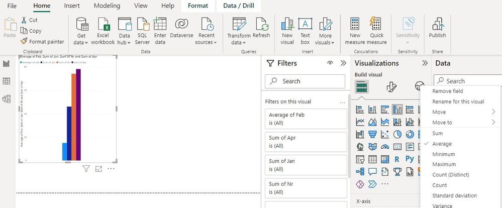
I have loaded some data which you can see in the graphic but it is graphing a "Count" of my data rather than the actual data. I have tried every button to change this to no avail.
Any help would be appreciated.
Mike
Solved! Go to Solution.
- Mark as New
- Bookmark
- Subscribe
- Mute
- Subscribe to RSS Feed
- Permalink
- Report Inappropriate Content
I am attaching screen shots showing the excel source file and what is plotting.
I don't want Sums, I want the details. I am unable to get a plot of the details.
Mike
- Mark as New
- Bookmark
- Subscribe
- Mute
- Subscribe to RSS Feed
- Permalink
- Report Inappropriate Content
Hi,
If you want to visualize the actual data instead of a count of your data in Power BI, you'll need to make sure that you have chosen the correct field as the "Values" field in your visual.
To do this:
Select the visual you want to modify.
Go to the "Visualizations" pane.
In the "Values" section, choose the field you want to use as the actual data. If you have multiple columns, you may need to select the option to aggregate the data (e.g., sum, average, etc.).
You may also need to adjust the formatting options in the "Format" section of the "Visualizations" pane to get the look you want.
- Mark as New
- Bookmark
- Subscribe
- Mute
- Subscribe to RSS Feed
- Permalink
- Report Inappropriate Content
I have changed over to the standard Power BI (not desktop) and find this produces reports that are much more useful. I really believe that tabular reports are much more useful than graphical reports for 99% of business requirements.
Thankyou for all your help. I will mark this as the Solution.
- Mark as New
- Bookmark
- Subscribe
- Mute
- Subscribe to RSS Feed
- Permalink
- Report Inappropriate Content
- Mark as New
- Bookmark
- Subscribe
- Mute
- Subscribe to RSS Feed
- Permalink
- Report Inappropriate Content
I am attaching screen shots showing the excel source file and what is plotting.
I don't want Sums, I want the details. I am unable to get a plot of the details.
Mike
- Mark as New
- Bookmark
- Subscribe
- Mute
- Subscribe to RSS Feed
- Permalink
- Report Inappropriate Content
Hi,
In the Report view you can disable the sum or count by clicking the Down arrow next to "y-axis" in your case and selecting the appropriate calculation. In the Data view, you can remove the automatic sum by selecting the column and selecting Do no summarize in the Properties tab / Summarization of the Column Tools.
- Mark as New
- Bookmark
- Subscribe
- Mute
- Subscribe to RSS Feed
- Permalink
- Report Inappropriate Content
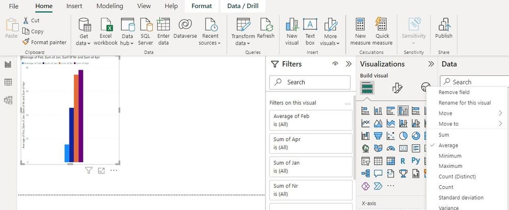
If I click the down arrow under the y-Axis I get the screen below. There is no option for "actual values" its for options like "average" or "median"
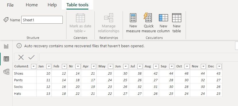
The second screen shows what happens if I click on a column in Data View. There is no property tab and no option for "remove sum".
The 3rd screen shows the Excel data table I am trying to depict.
- Mark as New
- Bookmark
- Subscribe
- Mute
- Subscribe to RSS Feed
- Permalink
- Report Inappropriate Content
Hi,
So what exactly are you trying to do?
You cannot visualise all data using the selected graph without selecting average, sum, minimum, etc or using a measure.
You can remove the automatic Sum in the Data view as explained earlier.
- Mark as New
- Bookmark
- Subscribe
- Mute
- Subscribe to RSS Feed
- Permalink
- Report Inappropriate Content
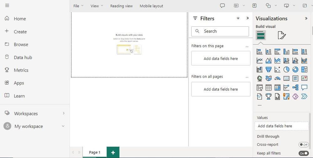
I have tried the following,
- I selected my table.
- I clicked "Make a Report" with the option "Build from scratch."
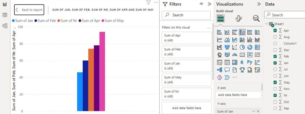
- it took mw the the screen shown in the attached capture.
There is a place for "Add Values" in the lower right but it does not work.
What am I doing wrong?
Mike
- Mark as New
- Bookmark
- Subscribe
- Mute
- Subscribe to RSS Feed
- Permalink
- Report Inappropriate Content
Hi,
Do you have an option to develop the model in Power BI Desktop? I think that will give you all options with familiar screens.
- Mark as New
- Bookmark
- Subscribe
- Mute
- Subscribe to RSS Feed
- Permalink
- Report Inappropriate Content
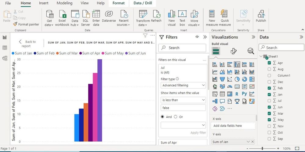
I have downloaded the Desktop Version and loaded it with one product with sales over 12 months.
It insists on doing Sums. Yiou mentioned about clicking on "Properties" in the Data section. I have opened up my Data Section and I cannot find the word "Properties". See attached screen shot.
Helpful resources

Microsoft Fabric Learn Together
Covering the world! 9:00-10:30 AM Sydney, 4:00-5:30 PM CET (Paris/Berlin), 7:00-8:30 PM Mexico City

Power BI Monthly Update - April 2024
Check out the April 2024 Power BI update to learn about new features.

| User | Count |
|---|---|
| 110 | |
| 95 | |
| 76 | |
| 65 | |
| 51 |
| User | Count |
|---|---|
| 146 | |
| 109 | |
| 106 | |
| 88 | |
| 61 |
