- Power BI forums
- Updates
- News & Announcements
- Get Help with Power BI
- Desktop
- Service
- Report Server
- Power Query
- Mobile Apps
- Developer
- DAX Commands and Tips
- Custom Visuals Development Discussion
- Health and Life Sciences
- Power BI Spanish forums
- Translated Spanish Desktop
- Power Platform Integration - Better Together!
- Power Platform Integrations (Read-only)
- Power Platform and Dynamics 365 Integrations (Read-only)
- Training and Consulting
- Instructor Led Training
- Dashboard in a Day for Women, by Women
- Galleries
- Community Connections & How-To Videos
- COVID-19 Data Stories Gallery
- Themes Gallery
- Data Stories Gallery
- R Script Showcase
- Webinars and Video Gallery
- Quick Measures Gallery
- 2021 MSBizAppsSummit Gallery
- 2020 MSBizAppsSummit Gallery
- 2019 MSBizAppsSummit Gallery
- Events
- Ideas
- Custom Visuals Ideas
- Issues
- Issues
- Events
- Upcoming Events
- Community Blog
- Power BI Community Blog
- Custom Visuals Community Blog
- Community Support
- Community Accounts & Registration
- Using the Community
- Community Feedback
Register now to learn Fabric in free live sessions led by the best Microsoft experts. From Apr 16 to May 9, in English and Spanish.
- Power BI forums
- Forums
- Get Help with Power BI
- Desktop
- Caluculate percentage of a column based on a slide...
- Subscribe to RSS Feed
- Mark Topic as New
- Mark Topic as Read
- Float this Topic for Current User
- Bookmark
- Subscribe
- Printer Friendly Page
- Mark as New
- Bookmark
- Subscribe
- Mute
- Subscribe to RSS Feed
- Permalink
- Report Inappropriate Content
Caluculate percentage of a column based on a slider
Hi everyone,
New to Power BI, just finding my way. I have a column in my data that has times in seconds - it's for how long it takes to respond to an alarm. We have KPIs around this - for us it is currently 600 seconds. What I'm trying to do is:
Using a slicer / slider, allow users to see what percentage of calls were below the value set by the slider, using only the filtered data. This is to allow users to see what dropping the KPI down would look like. For bonus points, a graph showing the data points below the filter in 15 second increments would also illustrate the remaining data points.
Thanks for any help.
- Mark as New
- Bookmark
- Subscribe
- Mute
- Subscribe to RSS Feed
- Permalink
- Report Inappropriate Content
@Anonymous ,
Can you share sample data and sample output in table format? Or a sample pbix after removing sensitive data.
Microsoft Power BI Learning Resources, 2023 !!
Learn Power BI - Full Course with Dec-2022, with Window, Index, Offset, 100+ Topics !!
Did I answer your question? Mark my post as a solution! Appreciate your Kudos !! Proud to be a Super User! !!
- Mark as New
- Bookmark
- Subscribe
- Mute
- Subscribe to RSS Feed
- Permalink
- Report Inappropriate Content
Certainly can
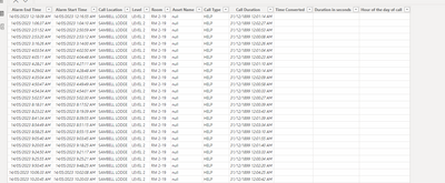
the three calculated columns are what I'm working with - the 'duration in seconds' column is the one in question. It holds a calculated number that is extracted from the call duration column, and returns a whole number that is the number of seconds for that call.
Hope that helps!
- Mark as New
- Bookmark
- Subscribe
- Mute
- Subscribe to RSS Feed
- Permalink
- Report Inappropriate Content
Hi @Anonymous ,
It seems that the calculated columns in your screenshot all return blank.
Can you share a sample file with me and show me a screenshot with the result you want. This will make it easier for me to find the solution.
Best Regards,
Rico Zhou
If this post helps, then please consider Accept it as the solution to help the other members find it more quickly.
- Mark as New
- Bookmark
- Subscribe
- Mute
- Subscribe to RSS Feed
- Permalink
- Report Inappropriate Content
Hi,
thanks so much for your help - I'm new to BE and just starting to figure out some of the underlying concepts. I've attached a spreadsheet with the data in it - the 'room' column has been changed for privacy.
| Call Location | Level | Room | Asset Name | Call Type | Call Duration | Time Converted | Duration in seconds | Hour of the day of call |
| SAMBELL LODGE | LEVEL 1 | RM 1-01 | null | HELP | 0:00:10 | 0:00:10 | 10 | 00 |
| SAMBELL LODGE | GROUND DOORS | RM 1-02 | null | DOOR | 0:00:18 | 0:00:18 | 18 | 00 |
| SAMBELL LODGE | GROUND DOORS | RM 1-03 | null | DOOR | 0:00:12 | 0:00:12 | 12 | 00 |
| SAMBELL LODGE | LEVEL 1 | RM 1-04 | null | HELP | 0:00:04 | 0:00:04 | 4 | 00 |
| SAMBELL LODGE | LEVEL 1 | RM 1-05 | null | HELP | 0:00:03 | 0:00:03 | 3 | 00 |
| SAMBELL LODGE | LEVEL 1 | RM 1-06 | null | HELP | 0:00:06 | 0:00:06 | 6 | 00 |
| SAMBELL LODGE | LEVEL 1 | RM 1-07 | null | HELP | 0:00:17 | 0:00:17 | 17 | 00 |
| SAMBELL LODGE | GROUND DOORS | RM 1-08 | null | DOOR | 0:00:13 | 0:00:13 | 13 | 00 |
| SAMBELL LODGE | GROUND DOORS | RM 1-09 | null | DOOR | 0:00:20 | 0:00:20 | 20 | 00 |
| SAMBELL LODGE | GROUND DOORS | RM 1-10 | null | DOOR | 0:00:16 | 0:00:16 | 16 | 00 |
| SAMBELL LODGE | GROUND DOORS | RM 1-11 | null | DOOR | 0:00:12 | 0:00:12 | 12 | 00 |
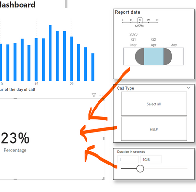
With the display of the data, This is a rough idea of what I need:
One of our KPIs is how many calls are completed in a set time. This needs to be calculated based on the data that is filtered by the date and type slicers. Once I have the data, we then need to use another slider (at the bottom) to allow the user to do some 'what if' analysis of what percentage of calls meet a particular KPI. Aim is to encourage users to think about making the KPI tighter to help produce better data and care.
Hope that helps.
Helpful resources

Microsoft Fabric Learn Together
Covering the world! 9:00-10:30 AM Sydney, 4:00-5:30 PM CET (Paris/Berlin), 7:00-8:30 PM Mexico City

Power BI Monthly Update - April 2024
Check out the April 2024 Power BI update to learn about new features.

| User | Count |
|---|---|
| 111 | |
| 95 | |
| 80 | |
| 68 | |
| 59 |
| User | Count |
|---|---|
| 150 | |
| 119 | |
| 104 | |
| 87 | |
| 67 |


