New Offer! Become a Certified Fabric Data Engineer
Check your eligibility for this 50% exam voucher offer and join us for free live learning sessions to get prepared for Exam DP-700.
Get Started- Power BI forums
- Get Help with Power BI
- Desktop
- Service
- Report Server
- Power Query
- Mobile Apps
- Developer
- DAX Commands and Tips
- Custom Visuals Development Discussion
- Health and Life Sciences
- Power BI Spanish forums
- Translated Spanish Desktop
- Training and Consulting
- Instructor Led Training
- Dashboard in a Day for Women, by Women
- Galleries
- Community Connections & How-To Videos
- COVID-19 Data Stories Gallery
- Themes Gallery
- Data Stories Gallery
- R Script Showcase
- Webinars and Video Gallery
- Quick Measures Gallery
- 2021 MSBizAppsSummit Gallery
- 2020 MSBizAppsSummit Gallery
- 2019 MSBizAppsSummit Gallery
- Events
- Ideas
- Custom Visuals Ideas
- Issues
- Issues
- Events
- Upcoming Events
Don't miss out! 2025 Microsoft Fabric Community Conference, March 31 - April 2, Las Vegas, Nevada. Use code MSCUST for a $150 discount. Prices go up February 11th. Register now.
- Power BI forums
- Forums
- Get Help with Power BI
- Desktop
- Calculation Groups and Formatting in a Matrix Visu...
- Subscribe to RSS Feed
- Mark Topic as New
- Mark Topic as Read
- Float this Topic for Current User
- Bookmark
- Subscribe
- Printer Friendly Page
- Mark as New
- Bookmark
- Subscribe
- Mute
- Subscribe to RSS Feed
- Permalink
- Report Inappropriate Content
Calculation Groups and Formatting in a Matrix Visual
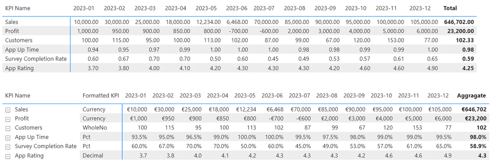
I am seeking to display a matrix visual where the different Key Performance Indicators (KPIs) are displayed with the appropriate aggregation and the appropriate format. I've almost cracked it but am forced to display the format names to get the matrix to work. The top visual is how I want to layout to look but it does not have the correct formats for the measure. The bottom visual has the correct formats but forces me to display the name of the aggrigation group.

Each of the calculation items the code is similar - here's the one for currency:
IF ( SELECTEDVALUE ( 'KPI List'[Format] ) = "currency", SELECTEDMEASURE (), BLANK () )
I created a seperate table with each of the KPIs listed and the format I want to display and Joined this to my data table. While this is dummy data, in the real business scenario I have many more KPIs and records by date, hence the need to keep the matris as neat as possible
I tried adding the calculation group as a filter for the visual but it only displayed correctly when I chose one calculation item. Choosing more than one caused the numbers to disappear. Amy assistance appreciated.
- Mark as New
- Bookmark
- Subscribe
- Mute
- Subscribe to RSS Feed
- Permalink
- Report Inappropriate Content
Hi @Sullyball
SELECTEDMEASURE is calculated for Measure in context, can you provide the formula for the corresponding Measure? If so, please provide the sample data so that we can help you better. How to provide sample data in the Power BI Forum - Microsoft Fabric Community Or show it as a screenshot or pbix. Please remove any sensitive data in advance. If uploading pbix files please do not log into your account.
Best Regards,
Yulia Xu
Helpful resources
| User | Count |
|---|---|
| 117 | |
| 73 | |
| 58 | |
| 49 | |
| 48 |
| User | Count |
|---|---|
| 171 | |
| 122 | |
| 60 | |
| 59 | |
| 56 |


