FabCon is coming to Atlanta
Join us at FabCon Atlanta from March 16 - 20, 2026, for the ultimate Fabric, Power BI, AI and SQL community-led event. Save $200 with code FABCOMM.
Register now!- Power BI forums
- Get Help with Power BI
- Desktop
- Service
- Report Server
- Power Query
- Mobile Apps
- Developer
- DAX Commands and Tips
- Custom Visuals Development Discussion
- Health and Life Sciences
- Power BI Spanish forums
- Translated Spanish Desktop
- Training and Consulting
- Instructor Led Training
- Dashboard in a Day for Women, by Women
- Galleries
- Data Stories Gallery
- Themes Gallery
- Contests Gallery
- QuickViz Gallery
- Quick Measures Gallery
- Visual Calculations Gallery
- Notebook Gallery
- Translytical Task Flow Gallery
- TMDL Gallery
- R Script Showcase
- Webinars and Video Gallery
- Ideas
- Custom Visuals Ideas (read-only)
- Issues
- Issues
- Events
- Upcoming Events
View all the Fabric Data Days sessions on demand. View schedule
- Power BI forums
- Forums
- Get Help with Power BI
- Desktop
- Re: Calculating an average of hours worked for dif...
- Subscribe to RSS Feed
- Mark Topic as New
- Mark Topic as Read
- Float this Topic for Current User
- Bookmark
- Subscribe
- Printer Friendly Page
- Mark as New
- Bookmark
- Subscribe
- Mute
- Subscribe to RSS Feed
- Permalink
- Report Inappropriate Content
Calculating an average of hours worked for different 17-week periods
Hi all,
I need to make a report which shows how many employees in a company worked an average of 47 hours per week in a given 17-week period.
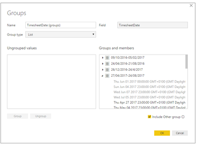
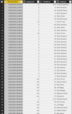
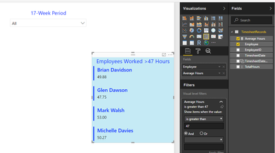
I have currently managed to group my date column outside of Power Query into multiple 17-week periods (as in the first image), and would like to use this group in PowerQuery to then group by this colum (the button shown in the second image) so that my table shows all hours worked in this 17-week period. I could then calculate an average, however from what I can tell, I am unable to use this group in Power Query. Therefore, I am looking for an alternative to my problem. The third image is my table of data so far.
Thanks
Solved! Go to Solution.
- Mark as New
- Bookmark
- Subscribe
- Mute
- Subscribe to RSS Feed
- Permalink
- Report Inappropriate Content
Hi @Macaurly,
First of all you are making the groups in PBI desktop part and this is not usable on the power query part, this are two separate parts on PBI you have the Query part that allows you to make a treatemtn of your data making calculation, additional columns, groupings, ..., (this works in M language) in order to have your information ready to make charts, and the "front office" on PBI where you have measures, columns, groupings, visuals,... (this as DAX language where needed).
What you need to do is add you groups to a visual (table or graph) and then just add the TotalHours and do the usm or average and you got what you need.
Regards,
MFelix
Regards
Miguel Félix
Did I answer your question? Mark my post as a solution!
Proud to be a Super User!
Check out my blog: Power BI em Português- Mark as New
- Bookmark
- Subscribe
- Mute
- Subscribe to RSS Feed
- Permalink
- Report Inappropriate Content
Hi again @MFelix,
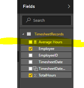
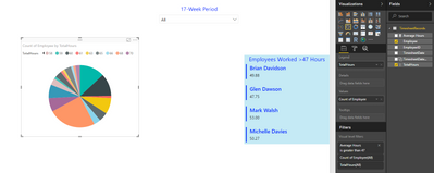
Thank you for your suggestion as it did help, and I have managed to show the employees who have worked over 47 hours in a period as a multi-row card (seen in the first image of this reply). However, it seems I can't use the average of total hours (or the equivalent measure I calculated as seen in the second image of this reply) in the legend field for a pie chart. My goal is to be able to see how many employees worked each of the average hour values in the selected time period. For example, in the pie chart (seen in the third image of this reply), I currently have each of the total hours values on the legend which isn't useful to show. I would like this to instead show each of the average values visually.
I hope this is clear enough and thanks again in advance.
- Mark as New
- Bookmark
- Subscribe
- Mute
- Subscribe to RSS Feed
- Permalink
- Report Inappropriate Content
Mfelix
Regards
Miguel Félix
Did I answer your question? Mark my post as a solution!
Proud to be a Super User!
Check out my blog: Power BI em Português- Mark as New
- Bookmark
- Subscribe
- Mute
- Subscribe to RSS Feed
- Permalink
- Report Inappropriate Content
Thanks Felix, this is great.
Helpful resources

Power BI Monthly Update - November 2025
Check out the November 2025 Power BI update to learn about new features.

Fabric Data Days
Advance your Data & AI career with 50 days of live learning, contests, hands-on challenges, study groups & certifications and more!

