- Power BI forums
- Updates
- News & Announcements
- Get Help with Power BI
- Desktop
- Service
- Report Server
- Power Query
- Mobile Apps
- Developer
- DAX Commands and Tips
- Custom Visuals Development Discussion
- Health and Life Sciences
- Power BI Spanish forums
- Translated Spanish Desktop
- Power Platform Integration - Better Together!
- Power Platform Integrations (Read-only)
- Power Platform and Dynamics 365 Integrations (Read-only)
- Training and Consulting
- Instructor Led Training
- Dashboard in a Day for Women, by Women
- Galleries
- Community Connections & How-To Videos
- COVID-19 Data Stories Gallery
- Themes Gallery
- Data Stories Gallery
- R Script Showcase
- Webinars and Video Gallery
- Quick Measures Gallery
- 2021 MSBizAppsSummit Gallery
- 2020 MSBizAppsSummit Gallery
- 2019 MSBizAppsSummit Gallery
- Events
- Ideas
- Custom Visuals Ideas
- Issues
- Issues
- Events
- Upcoming Events
- Community Blog
- Power BI Community Blog
- Custom Visuals Community Blog
- Community Support
- Community Accounts & Registration
- Using the Community
- Community Feedback
Register now to learn Fabric in free live sessions led by the best Microsoft experts. From Apr 16 to May 9, in English and Spanish.
- Power BI forums
- Forums
- Get Help with Power BI
- Desktop
- Re: CHARTICULATOR QUESTIONS (Max number of rows & ...
- Subscribe to RSS Feed
- Mark Topic as New
- Mark Topic as Read
- Float this Topic for Current User
- Bookmark
- Subscribe
- Printer Friendly Page
- Mark as New
- Bookmark
- Subscribe
- Mute
- Subscribe to RSS Feed
- Permalink
- Report Inappropriate Content
CHARTICULATOR QUESTIONS (Max number of rows & Problems with more than one measure)
Hi Community!
I started using Charticulator a few days ago and that throw me to some questions
1. Does anyone know certainly if there´s a limit in the number of rows for the Chart?
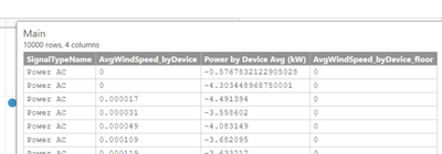
I´m working with much more than 10k rows, and the visual is just taking in ascending order the first 10k rows... How could I modify that behaviour to take random points and not points in an specific order?
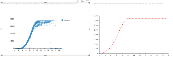
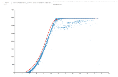
2. I´m trying to make one visual that combines a Scatter Chart and a Line Chart, the idea is to make something like this but merged in one visual instead or in two
Scatter chart: Xaxis: AvgWindSpeed_byDevice
Yaxis: Power by Device Avg (kW)
Line Chart: Xaxis: AvgWindSpeed_byDevice_floor
Yaxis: Power Expected WPC by Device AVG (kW)
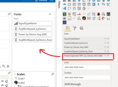
The main problem is that I can´t see the measure selected with a red box in the fields pane so i can not make the line chart
- Mark as New
- Bookmark
- Subscribe
- Mute
- Subscribe to RSS Feed
- Permalink
- Report Inappropriate Content
Hi,
According to the maximum number of rows that the visual can manage in the Charticulator, I can’t find any documents that talk about it, but when it refers to the rows of data you can import into Power BI, there is no limitation on it, Power BI offers two licenses, Power BI (free) and Power BI Pro, with different data capacity limits:
- Free users have a maximum of 1 GB data capacity.
- Pro users of Power BI Pro have 10 GB maximum capacity.
- Pro users can create groups, with a maximum of 10 GB data capacity each.
For more information, you can also refer to these documents:
https://powerbi.microsoft.com/en-us/blog/announcing-the-new-charticulator-visual-public-preview/
https://radacad.com/introduction-to-charticulator-create-custom-visual
https://www.kasperonbi.com/build-your-custom-visual-with-charticulator-and-power-bi/
Best Regards,
Community Support Team _Robert Qin
If this post helps, then please consider Accept it as the solution to help the other members find it more quickly.
- Mark as New
- Bookmark
- Subscribe
- Mute
- Subscribe to RSS Feed
- Permalink
- Report Inappropriate Content
Hi Robert
Thanks for your answer,
My question comes because when i see the preview table in charticulator, i cant see more than 10000 rows, and thats what makes me suspect that theres a limit in the number of rows that the visual can manage.
I tryed to find some information in the documentation about it but i wasnt lucky.
Best regards,
David
- Mark as New
- Bookmark
- Subscribe
- Mute
- Subscribe to RSS Feed
- Permalink
- Report Inappropriate Content
Hi,
Unfortunately, I can’t find any document that talks about this limitation either. But I think the 10000 rows may be the potential limitation according to your test.
Here’s an issue I’ve found that talks about this limitation, but no one replied:
https://github.com/microsoft/charticulator/issues/264
Step Beyond the 10GB Limitation of Power BI
Best Regards,
Community Support Team _Robert Qin
If this post helps, then please consider Accept it as the solution to help the other members find it more quickly.
- Mark as New
- Bookmark
- Subscribe
- Mute
- Subscribe to RSS Feed
- Permalink
- Report Inappropriate Content
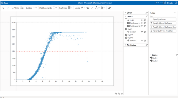
This is the closest i get to the visual but i still need the second measure "Power Expected WPC by Device AVG (kW)" for the Line chart to asign the Y values.
Thanks in advance!
regards,
David
- Mark as New
- Bookmark
- Subscribe
- Mute
- Subscribe to RSS Feed
- Permalink
- Report Inappropriate Content
Hi
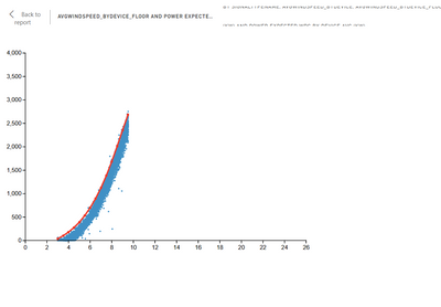
Finally, I achieve the Scatter and the Line chart with Charticulator in the same visual but I still need to know the maximum number of rows that the visual can manage because I´m working with much more than 10000 rows.
This is the visual when I filter to view only one item
When i unfilter to view more than one item, the curve reduce the number of points and gets cut so i can not see all the points.
Does anyone know how to view random points and not points in a specifical order?
Helpful resources

Microsoft Fabric Learn Together
Covering the world! 9:00-10:30 AM Sydney, 4:00-5:30 PM CET (Paris/Berlin), 7:00-8:30 PM Mexico City

Power BI Monthly Update - April 2024
Check out the April 2024 Power BI update to learn about new features.

| User | Count |
|---|---|
| 111 | |
| 100 | |
| 80 | |
| 64 | |
| 57 |
| User | Count |
|---|---|
| 145 | |
| 111 | |
| 92 | |
| 84 | |
| 66 |
