- Power BI forums
- Updates
- News & Announcements
- Get Help with Power BI
- Desktop
- Service
- Report Server
- Power Query
- Mobile Apps
- Developer
- DAX Commands and Tips
- Custom Visuals Development Discussion
- Health and Life Sciences
- Power BI Spanish forums
- Translated Spanish Desktop
- Power Platform Integration - Better Together!
- Power Platform Integrations (Read-only)
- Power Platform and Dynamics 365 Integrations (Read-only)
- Training and Consulting
- Instructor Led Training
- Dashboard in a Day for Women, by Women
- Galleries
- Community Connections & How-To Videos
- COVID-19 Data Stories Gallery
- Themes Gallery
- Data Stories Gallery
- R Script Showcase
- Webinars and Video Gallery
- Quick Measures Gallery
- 2021 MSBizAppsSummit Gallery
- 2020 MSBizAppsSummit Gallery
- 2019 MSBizAppsSummit Gallery
- Events
- Ideas
- Custom Visuals Ideas
- Issues
- Issues
- Events
- Upcoming Events
- Community Blog
- Power BI Community Blog
- Custom Visuals Community Blog
- Community Support
- Community Accounts & Registration
- Using the Community
- Community Feedback
Register now to learn Fabric in free live sessions led by the best Microsoft experts. From Apr 16 to May 9, in English and Spanish.
- Power BI forums
- Forums
- Get Help with Power BI
- Desktop
- Best visual for total revenues contribution
- Subscribe to RSS Feed
- Mark Topic as New
- Mark Topic as Read
- Float this Topic for Current User
- Bookmark
- Subscribe
- Printer Friendly Page
- Mark as New
- Bookmark
- Subscribe
- Mute
- Subscribe to RSS Feed
- Permalink
- Report Inappropriate Content
Best visual for total revenues contribution
Hi,
company A has a frame agreement with a client. Company B is a subsidiary of A and does part of the job.
What is the best visual to show to stakeholders how the contribution B gives to total revenues changed year by year?
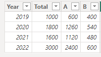
these are the values:
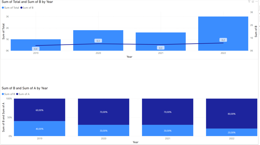
I've come up with this two solutions, but I think there could be a better way.
(labels of B in the first picture actually should be percentages, 40%, 30%...):
In the first chart, 2022 contribution seems higher than 2019 because of absolute values, so it can be misleading.
In the second chart proprortions are correct, but the variation of total revenues can't be represented.
Is there a better way to visualize everything?
Solved! Go to Solution.
- Mark as New
- Bookmark
- Subscribe
- Mute
- Subscribe to RSS Feed
- Permalink
- Report Inappropriate Content
Hi , @peps984
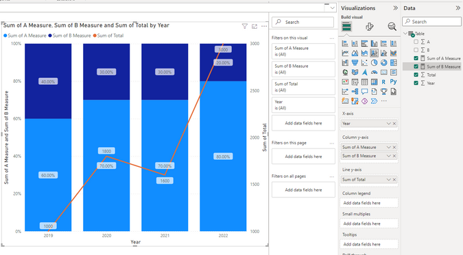
According to your description, you want to use the "100% stacked bar chart" and add a line graph as the total sum.
For your need , you can create two measures like this:
Sum of A Measure = DIVIDE( SUM('Table'[A]) , SUM('Table'[Total]))Sum of B Measure = DIVIDE( SUM('Table'[B]) , SUM('Table'[Total]))Then we can put this fields on the visual and we can get this:
If this method does not meet your needs, you can provide us with your special sample data and the desired output sample data in the form of tables, so that we can better help you solve the problem. (You can also upload you sample .pbix [without sensitive data] to the OneDrive and share with the OneDrive link to me ! )
Thank you for your time and sharing, and thank you for your support and understanding of PowerBI!
Best Regards,
Aniya Zhang
If this post helps, then please consider Accept it as the solution to help the other members find it more quickly
- Mark as New
- Bookmark
- Subscribe
- Mute
- Subscribe to RSS Feed
- Permalink
- Report Inappropriate Content
Hi,
thanks for your message. It certainly is a better solution than mine, but it still seems misleading because it's not so easy to visually compare the evolution of B over the years.
But your answer made me think, what if I use a 100% stacked bar chart (like my 2nd solution) and add a line graph as the total sum? Would it be possible in Power BI?
- Mark as New
- Bookmark
- Subscribe
- Mute
- Subscribe to RSS Feed
- Permalink
- Report Inappropriate Content
Hi , @peps984
According to your description, you want to use the "100% stacked bar chart" and add a line graph as the total sum.
For your need , you can create two measures like this:
Sum of A Measure = DIVIDE( SUM('Table'[A]) , SUM('Table'[Total]))Sum of B Measure = DIVIDE( SUM('Table'[B]) , SUM('Table'[Total]))Then we can put this fields on the visual and we can get this:
If this method does not meet your needs, you can provide us with your special sample data and the desired output sample data in the form of tables, so that we can better help you solve the problem. (You can also upload you sample .pbix [without sensitive data] to the OneDrive and share with the OneDrive link to me ! )
Thank you for your time and sharing, and thank you for your support and understanding of PowerBI!
Best Regards,
Aniya Zhang
If this post helps, then please consider Accept it as the solution to help the other members find it more quickly
- Mark as New
- Bookmark
- Subscribe
- Mute
- Subscribe to RSS Feed
- Permalink
- Report Inappropriate Content
Hi Aniya,
your solution fits perfectly with my needs! Thanks for your help
And thanks to @vicky_ for the inspiration!
- Mark as New
- Bookmark
- Subscribe
- Mute
- Subscribe to RSS Feed
- Permalink
- Report Inappropriate Content
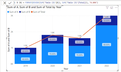
There's the built-in line and column graph that might be useful. I used the custom labels from the May 2023 version to show the percentages in the columns, but keep the line graph as the total sum.
Helpful resources

Microsoft Fabric Learn Together
Covering the world! 9:00-10:30 AM Sydney, 4:00-5:30 PM CET (Paris/Berlin), 7:00-8:30 PM Mexico City

Power BI Monthly Update - April 2024
Check out the April 2024 Power BI update to learn about new features.

| User | Count |
|---|---|
| 106 | |
| 104 | |
| 79 | |
| 68 | |
| 61 |
| User | Count |
|---|---|
| 143 | |
| 104 | |
| 103 | |
| 82 | |
| 70 |


