- Power BI forums
- Updates
- News & Announcements
- Get Help with Power BI
- Desktop
- Service
- Report Server
- Power Query
- Mobile Apps
- Developer
- DAX Commands and Tips
- Custom Visuals Development Discussion
- Health and Life Sciences
- Power BI Spanish forums
- Translated Spanish Desktop
- Power Platform Integration - Better Together!
- Power Platform Integrations (Read-only)
- Power Platform and Dynamics 365 Integrations (Read-only)
- Training and Consulting
- Instructor Led Training
- Dashboard in a Day for Women, by Women
- Galleries
- Community Connections & How-To Videos
- COVID-19 Data Stories Gallery
- Themes Gallery
- Data Stories Gallery
- R Script Showcase
- Webinars and Video Gallery
- Quick Measures Gallery
- 2021 MSBizAppsSummit Gallery
- 2020 MSBizAppsSummit Gallery
- 2019 MSBizAppsSummit Gallery
- Events
- Ideas
- Custom Visuals Ideas
- Issues
- Issues
- Events
- Upcoming Events
- Community Blog
- Power BI Community Blog
- Custom Visuals Community Blog
- Community Support
- Community Accounts & Registration
- Using the Community
- Community Feedback
Register now to learn Fabric in free live sessions led by the best Microsoft experts. From Apr 16 to May 9, in English and Spanish.
- Power BI forums
- Forums
- Get Help with Power BI
- Desktop
- Bar charts based on customer purchasing patterns
- Subscribe to RSS Feed
- Mark Topic as New
- Mark Topic as Read
- Float this Topic for Current User
- Bookmark
- Subscribe
- Printer Friendly Page
- Mark as New
- Bookmark
- Subscribe
- Mute
- Subscribe to RSS Feed
- Permalink
- Report Inappropriate Content
Bar charts based on customer purchasing patterns
Hello,
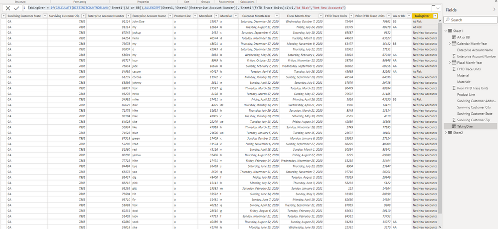
I'm looking to create a 4 bar charts that are dependent on a customer's purchasing pattern in 2021 and 2020. I have two files. File 1 has customer's purchasing pattern across a plethora of products (names: a, b, c, d, e, f, g, h, i, etc.) in 2020 and 2021. File 2 assigns the manufacturer (AA or BB) per product name (a, b, c, etc.). File 2 is important as it list out products that are similar to each other, but manufactured by two different organizations. I've established a relationship between the two files via product name. This allows me to look at the purchasing patterns of customers based on the two different manufactures who make similar products. I have two columns with formulas and attached images of my data.
Column 1: AA or BB = LOOKUPVALUE('Sheet2'[Mfg AA or BB],'Sheet2'[catalog number],'Sheet1'[Material#])
Bar chart 1 - will only show only customer names that have purchase products manufactured by BB in 2021 and 2020
Bar chart 2 - will show customer names where the number of units purchased from manufacturer AA in 2021 is >50% of the units purchased from manufacturer BB in 2020 and the number of units purchased from manufacturer BB in 2021 is <45% of the units purchased from manufacturer in 2020
Bar chart 3 - will show customer names where the number of units purchased from manufacturer AA in 2021 is >90% of the units purchased from manufacturer BB in 2020 and the number of units purchased from manufacturer BB in 2021 is <5% of the units purchased from manufacturer in 2020
bar chart 4 - will only show customers who have purchased product manufactured by AA in 2021 and 2020
Below is an image of my data.
- Mark as New
- Bookmark
- Subscribe
- Mute
- Subscribe to RSS Feed
- Permalink
- Report Inappropriate Content
Please provide actual sample data (not an image)
Did I answer your question? Mark my post as a solution!
In doing so, you are also helping me. Thank you!
Proud to be a Super User!
Paul on Linkedin.
- Mark as New
- Bookmark
- Subscribe
- Mute
- Subscribe to RSS Feed
- Permalink
- Report Inappropriate Content
Updated my post with the power bi file and excel file
- Mark as New
- Bookmark
- Subscribe
- Mute
- Subscribe to RSS Feed
- Permalink
- Report Inappropriate Content
Thanks for the sample files. When does the fiscal year end? Can you please create a mockup of the bar chart your are looking for in Excel and post here? I am not sure what the charts need to show.
Did I answer your question? Mark my post as a solution!
In doing so, you are also helping me. Thank you!
Proud to be a Super User!
Paul on Linkedin.
- Mark as New
- Bookmark
- Subscribe
- Mute
- Subscribe to RSS Feed
- Permalink
- Report Inappropriate Content
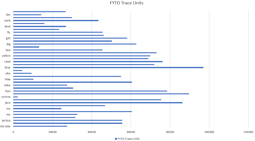
Sure. The bar chart will have FYTD Trace Units on the x-axis and enterprise account names on the y-axis (see example image below)
The fiscal year starts in Oct. 2020 and ends Sept. 2021. In the excel file, there is a column for fiscal month-year so you could just use that.
Helpful resources

Microsoft Fabric Learn Together
Covering the world! 9:00-10:30 AM Sydney, 4:00-5:30 PM CET (Paris/Berlin), 7:00-8:30 PM Mexico City

Power BI Monthly Update - April 2024
Check out the April 2024 Power BI update to learn about new features.

| User | Count |
|---|---|
| 117 | |
| 107 | |
| 70 | |
| 70 | |
| 43 |
| User | Count |
|---|---|
| 148 | |
| 106 | |
| 104 | |
| 89 | |
| 65 |


