Join us at the 2025 Microsoft Fabric Community Conference
Microsoft Fabric Community Conference 2025, March 31 - April 2, Las Vegas, Nevada. Use code FABINSIDER for a $400 discount.
Register now- Power BI forums
- Get Help with Power BI
- Desktop
- Service
- Report Server
- Power Query
- Mobile Apps
- Developer
- DAX Commands and Tips
- Custom Visuals Development Discussion
- Health and Life Sciences
- Power BI Spanish forums
- Translated Spanish Desktop
- Training and Consulting
- Instructor Led Training
- Dashboard in a Day for Women, by Women
- Galleries
- Webinars and Video Gallery
- Data Stories Gallery
- Themes Gallery
- Power BI DataViz World Championships Gallery
- Quick Measures Gallery
- R Script Showcase
- COVID-19 Data Stories Gallery
- Community Connections & How-To Videos
- 2021 MSBizAppsSummit Gallery
- 2020 MSBizAppsSummit Gallery
- 2019 MSBizAppsSummit Gallery
- Events
- Ideas
- Custom Visuals Ideas
- Issues
- Issues
- Events
- Upcoming Events
The Power BI DataViz World Championships are on! With four chances to enter, you could win a spot in the LIVE Grand Finale in Las Vegas. Show off your skills.
- Power BI forums
- Forums
- Get Help with Power BI
- Desktop
- Bar chart with data label percentage
- Subscribe to RSS Feed
- Mark Topic as New
- Mark Topic as Read
- Float this Topic for Current User
- Bookmark
- Subscribe
- Printer Friendly Page
- Mark as New
- Bookmark
- Subscribe
- Mute
- Subscribe to RSS Feed
- Permalink
- Report Inappropriate Content
Bar chart with data label percentage
Hello guys,
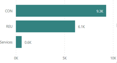
Need advice with bar chart visual, can we have the data label shows the percentage instead value ?
So, the normal is like this ->
So instead the value 9.3k. it is displaying the percentage. Or is there custom visual that can make it the same result ?
Thanks
Solved! Go to Solution.
- Mark as New
- Bookmark
- Subscribe
- Mute
- Subscribe to RSS Feed
- Permalink
- Report Inappropriate Content
Hi VoltesDev
Try this and please leave kudos ...
- Select a table visual instead of a graph.
- Drag your category to the Axis
- Drag sales twice to the Values field well.
- Right click on the 1st sales values > Conditional formatting > Data bars.
- Right click on the 2nd sales values > Show values as > Percentage of grand total.
Voila … you now have both the value, % and a graph !
- Mark as New
- Bookmark
- Subscribe
- Mute
- Subscribe to RSS Feed
- Permalink
- Report Inappropriate Content
Hi,
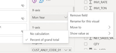
Right Click the Measure Value Change to Percent of grand total and
Measure Value Add in tooltips.
Thanks and Regards,
Thennarasu R
- Mark as New
- Bookmark
- Subscribe
- Mute
- Subscribe to RSS Feed
- Permalink
- Report Inappropriate Content
Hi VoltesDev
Try this and please leave kudos ...
- Select a table visual instead of a graph.
- Drag your category to the Axis
- Drag sales twice to the Values field well.
- Right click on the 1st sales values > Conditional formatting > Data bars.
- Right click on the 2nd sales values > Show values as > Percentage of grand total.
Voila … you now have both the value, % and a graph !
- Mark as New
- Bookmark
- Subscribe
- Mute
- Subscribe to RSS Feed
- Permalink
- Report Inappropriate Content
Great solution!
Did I answer your question? Mark my post as a solution!
In doing so, you are also helping me. Thank you!
Proud to be a Super User!
Paul on Linkedin.
- Mark as New
- Bookmark
- Subscribe
- Mute
- Subscribe to RSS Feed
- Permalink
- Report Inappropriate Content
Hi @speedramps ,
Yeah, it is actually a great idea and it's works!.
The only flaws is the data bar can't make it big enough, what I can is just increase the Row Padding to make it lools wide enough. But anyway it's a good trick!
Thanks again
- Mark as New
- Bookmark
- Subscribe
- Mute
- Subscribe to RSS Feed
- Permalink
- Report Inappropriate Content
You will only be able to show one value as a label, but you can include the other value as a tooltip, or even create a report tooltip to show more insights.
Did I answer your question? Mark my post as a solution!
In doing so, you are also helping me. Thank you!
Proud to be a Super User!
Paul on Linkedin.
- Mark as New
- Bookmark
- Subscribe
- Mute
- Subscribe to RSS Feed
- Permalink
- Report Inappropriate Content
Can't you create a % measure and use that instead in the bar chart?
Did I answer your question? Mark my post as a solution!
In doing so, you are also helping me. Thank you!
Proud to be a Super User!
Paul on Linkedin.
- Mark as New
- Bookmark
- Subscribe
- Mute
- Subscribe to RSS Feed
- Permalink
- Report Inappropriate Content
Ahh.. yaah I'm sorry, what was I thinking just now, of course I can do that 😂
However, is there by any chances we can have both displayed ?
or can we have two separate chart but control together, so I will 2 chart : one with value and one with percentage, for example in my visual over there is Vertical bar, when it has long list will have vertical scroll control, so we use this scroll, the 2 chart will scroll at the same time.
Thanks,
Helpful resources

Join us at the Microsoft Fabric Community Conference
March 31 - April 2, 2025, in Las Vegas, Nevada. Use code MSCUST for a $150 discount!

Power BI Monthly Update - February 2025
Check out the February 2025 Power BI update to learn about new features.

Join our Community Sticker Challenge 2025
If you love stickers, then you will definitely want to check out our Community Sticker Challenge!

| User | Count |
|---|---|
| 84 | |
| 69 | |
| 68 | |
| 39 | |
| 37 |


