Join us at the 2025 Microsoft Fabric Community Conference
March 31 - April 2, 2025, in Las Vegas, Nevada. Use code MSCUST for a $150 discount! Early bird discount ends December 31.
Register Now- Power BI forums
- Get Help with Power BI
- Desktop
- Service
- Report Server
- Power Query
- Mobile Apps
- Developer
- DAX Commands and Tips
- Custom Visuals Development Discussion
- Health and Life Sciences
- Power BI Spanish forums
- Translated Spanish Desktop
- Training and Consulting
- Instructor Led Training
- Dashboard in a Day for Women, by Women
- Galleries
- Community Connections & How-To Videos
- COVID-19 Data Stories Gallery
- Themes Gallery
- Data Stories Gallery
- R Script Showcase
- Webinars and Video Gallery
- Quick Measures Gallery
- 2021 MSBizAppsSummit Gallery
- 2020 MSBizAppsSummit Gallery
- 2019 MSBizAppsSummit Gallery
- Events
- Ideas
- Custom Visuals Ideas
- Issues
- Issues
- Events
- Upcoming Events
Be one of the first to start using Fabric Databases. View on-demand sessions with database experts and the Microsoft product team to learn just how easy it is to get started. Watch now
- Power BI forums
- Forums
- Get Help with Power BI
- Desktop
- Aggregates of counts over time
- Subscribe to RSS Feed
- Mark Topic as New
- Mark Topic as Read
- Float this Topic for Current User
- Bookmark
- Subscribe
- Printer Friendly Page
- Mark as New
- Bookmark
- Subscribe
- Mute
- Subscribe to RSS Feed
- Permalink
- Report Inappropriate Content
Aggregates of counts over time
Hi
I am still quite new to power BI and working as a BI analyst so please bare with me 🙂
The data that I am trying to work with is numeric.
Each item has what is called a work item ID (used to uniquely identify each work item) and a corresponding event time.
(there can be multiple line items with the same work item ID as the instruction moves through different queues).
The work item ID is a string of intergers ie: 3707193.
I am trying to calculate the average amount of instructions being created per hour.
It is easy to measure the totals as I can just plot my create date against the distinct count of work item IDs.
BUT when I try select average/median/etc it tries to give me the average my summed work item IDs.
For example, I get 3 instructions on Monday (week 1), 5 on Monday (week 2) and 12 on Monday (week 3).
My average should be 6.67 recurring.
But when I select average on power BI I get a massive number because it is summing the actual numbers given to each work item ID.
I need to find a way where I can aggregate counts only....
I've tried creating columns and measures of distinct (work item id) etc but all of my results are returning incorrect figures.
My ultimate goal is to show averages and medians of new instructions created by the hour as to measure head count needed to process those instructions.
Any ideas/advice will be greatly appreciated!
Thanks 🙂
Solved! Go to Solution.
- Mark as New
- Bookmark
- Subscribe
- Mute
- Subscribe to RSS Feed
- Permalink
- Report Inappropriate Content
Hi @MichaelK,
>>So I would like to calculate how the average moves through out the day
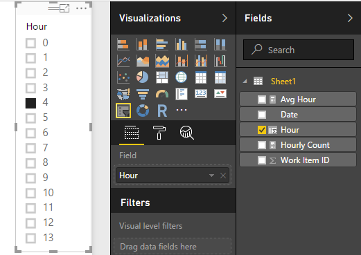
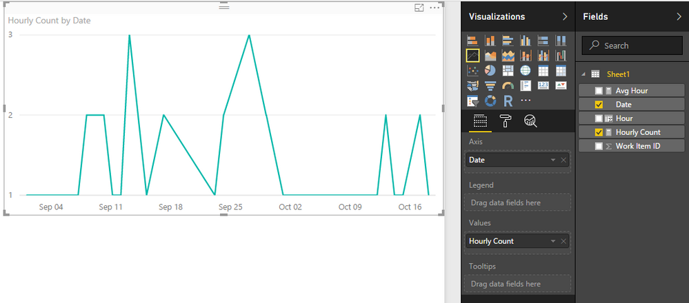
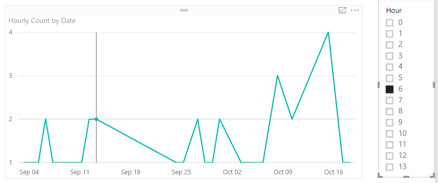
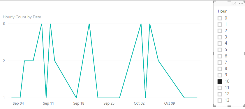
You can add a slicer to get the average moves through out the day.
Slicer:
Line chart:
Use slicer to filter the result of specify hour daily movement.
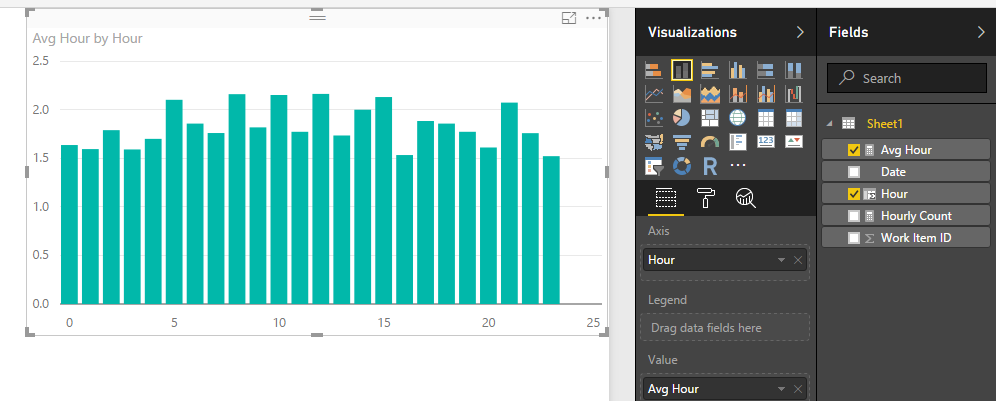
>>And then how that average changes from 11am to 12pm, 12pm - 1pm etc.
You can use below measure to see the hourly movement:
Average of hour:
Avg Hour = AVERAGEX(FILTER(all(Sheet1), Sheet1[Hour]=max(Sheet1[Hour])),[Hourly Count])
Notice: the hour means the hour:00~hour:59:59.
Regards,
Xiaoxin Sheng
If this post helps, please consider accept as solution to help other members find it more quickly.
- Mark as New
- Bookmark
- Subscribe
- Mute
- Subscribe to RSS Feed
- Permalink
- Report Inappropriate Content
Hi @MichaelK,
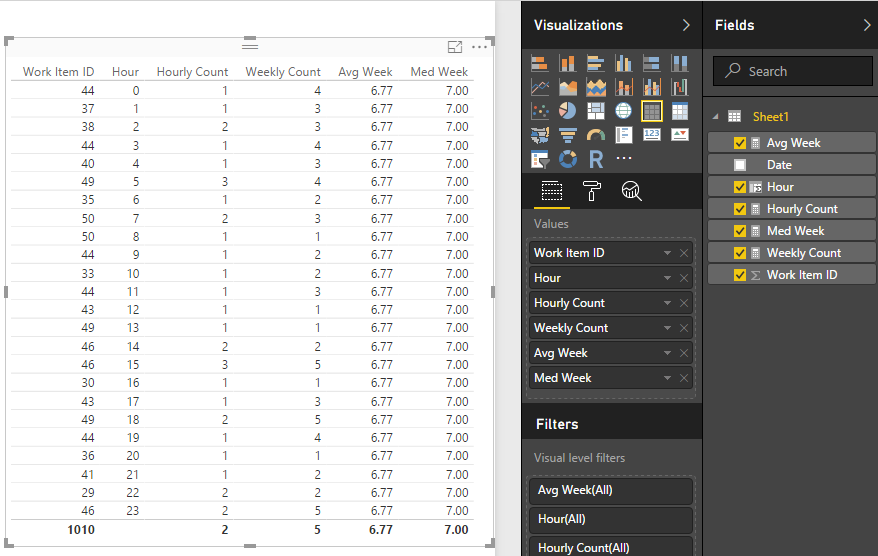
According to your description, you want to get the average and middle of weekly count,right?
You can refer to below sample:
Source table:
Measures:
Count of same date and hour:
Hourly Count = COUNTAX(FILTER(ALL(Sheet1), FORMAT([Date],"MM/dd/yyyy HH")=FORMAT(MAX([Date]),"MM/dd/yyyy HH")),[Work Item ID])
Count of same week and hour:
Weekly Count = COUNTAX(FILTER(ALL(Sheet1),WEEKNUM(Sheet1[Date])=WEEKNUM(MAX([Date]))&&HOUR([Date])=HOUR(MAX([Date]))),[Work Item ID])
Avg Week = AVERAGEX(ALL(Sheet1),[Weekly Count])
Med Week = MEDIANX(ALL(Sheet1),[Weekly Count])
Create a table visual to show the result:
Regards,
Xiaoxin Sheng
If this post helps, please consider accept as solution to help other members find it more quickly.
- Mark as New
- Bookmark
- Subscribe
- Mute
- Subscribe to RSS Feed
- Permalink
- Report Inappropriate Content
Power BI does not let me aggregate the measure.
I create a new measure named hourly count and when I try create a measure to aggregate it, the measure does not appear in the predictive text. When the measure is typed in manually it gives me an error.
Also I'm not sure if what you provided is what I am trying to go for.
What I actually want is a moving average and moving median.
To further explain our data, I only want to be working with WORK_ITEM_ID and CREATE_DATE at the moment.
I have extracted the hours of the day from CREATE_DATTE.
I have then plotted the hours of the day against distinct count of WORK_ITEM_ID.
This has given me the total amount of WORK_ITEM_ID received per hour.
Bevcause our data goes back about a year, for example, between 10am and 11am it will show 10 000 instructions (all instructions received since the beginning of time of our data set between 10am and 11am).
I'd like to see the average amount of instructions received between 10am and 11am.
And then how that average changes from 11am to 12pm, 12pm - 1pm etc.
So I would like to calculate how the average moves through out the day
- Mark as New
- Bookmark
- Subscribe
- Mute
- Subscribe to RSS Feed
- Permalink
- Report Inappropriate Content
Hi @MichaelK,
>>So I would like to calculate how the average moves through out the day
You can add a slicer to get the average moves through out the day.
Slicer:
Line chart:
Use slicer to filter the result of specify hour daily movement.
>>And then how that average changes from 11am to 12pm, 12pm - 1pm etc.
You can use below measure to see the hourly movement:
Average of hour:
Avg Hour = AVERAGEX(FILTER(all(Sheet1), Sheet1[Hour]=max(Sheet1[Hour])),[Hourly Count])
Notice: the hour means the hour:00~hour:59:59.
Regards,
Xiaoxin Sheng
If this post helps, please consider accept as solution to help other members find it more quickly.
- Mark as New
- Bookmark
- Subscribe
- Mute
- Subscribe to RSS Feed
- Permalink
- Report Inappropriate Content
Thank you!
Will give it a shot as soon as I get tthe time.
Thanks so much for the response!
- Mark as New
- Bookmark
- Subscribe
- Mute
- Subscribe to RSS Feed
- Permalink
- Report Inappropriate Content
Thanks a lot
Going to give it a try and will post feedback.
Helpful resources

Join us at the Microsoft Fabric Community Conference
March 31 - April 2, 2025, in Las Vegas, Nevada. Use code MSCUST for a $150 discount!

Microsoft Fabric Community Conference 2025
Arun Ulag shares exciting details about the Microsoft Fabric Conference 2025, which will be held in Las Vegas, NV.

| User | Count |
|---|---|
| 114 | |
| 76 | |
| 57 | |
| 52 | |
| 44 |
| User | Count |
|---|---|
| 164 | |
| 116 | |
| 63 | |
| 57 | |
| 50 |
